Author: Pedro Amado
-
2025 Display Type Explorations
A Typographic Showcase from the first assignment of the 2025 edition of the Masters’ in Graphic Design & Editorial Projects Type Design course. In the first major assignment of the Typeface Design course, students are challenged to design a display typeface beginning with a test word — typically “Raphesion123” — and develop a Variable Font…
-
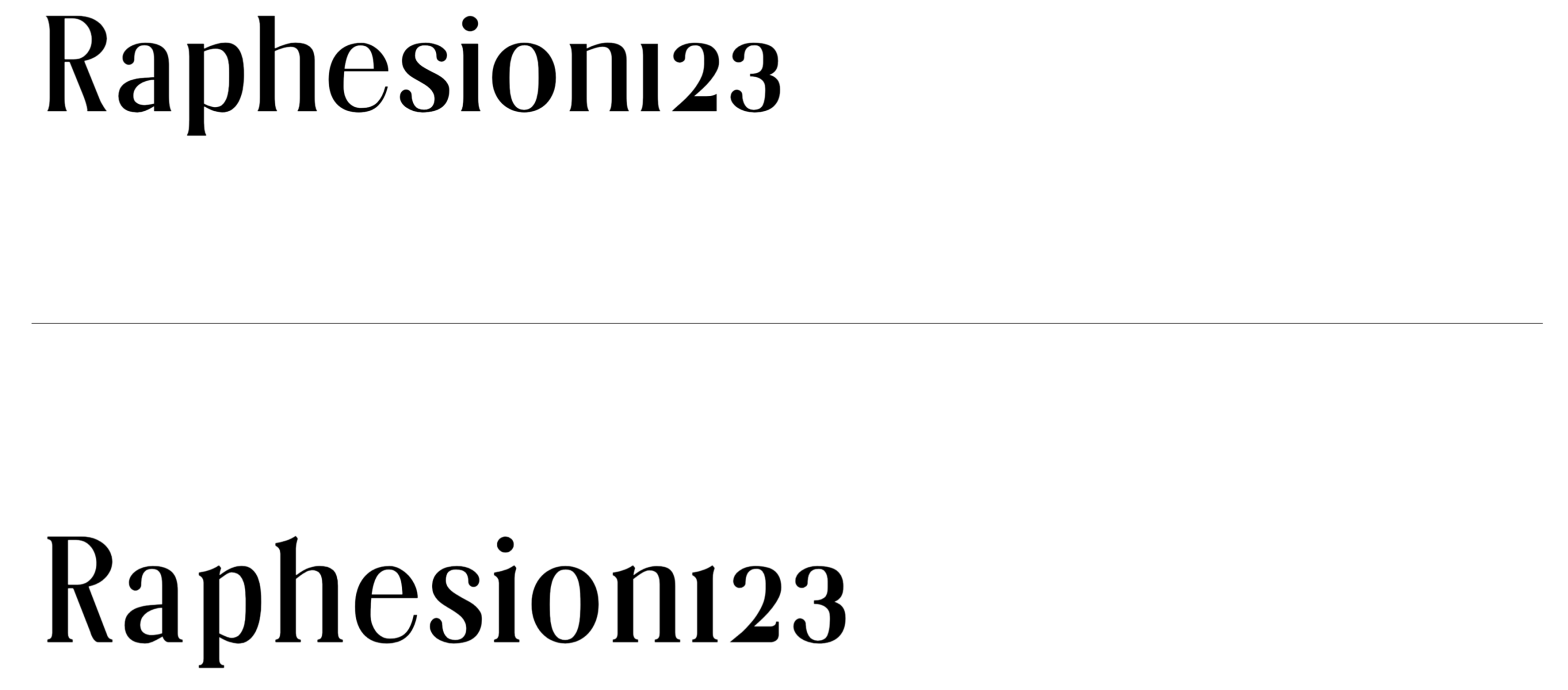
Butique
Student: Roberta MirandaClassification: Hybrid Display Serif – Modern/Rational with Transitional & Flare-Slab InfluencesVariation Axis: Serif Shapes (and optical Size) Butique is a hybrid serif display typeface created by a student in the 2024–25 Typeface Design course at FBAUP. Developed from the Foundational Hand and drawing from Gerrit Noordzij’s stroke theory, the project introduces students to…
-
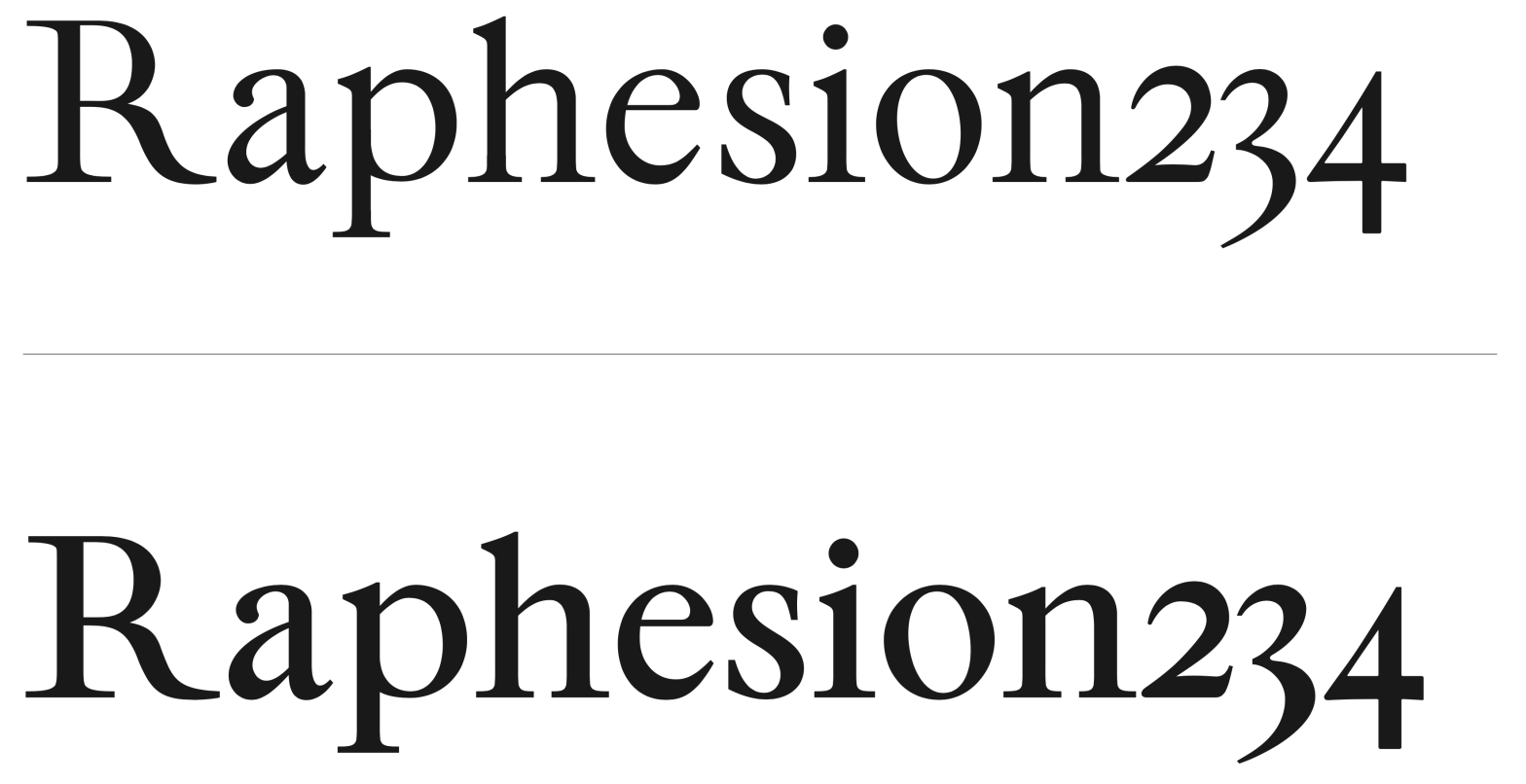
Villeneuf
Student: Rita SoaresClassification: Transitional Serif with Garalde InfluencesVariation Axis: Weight (with high stroke contrast) Villeneuf is a Transitional display typeface with Garalde influences, developed by a student in the 2024–25 Typeface Design course at FBAUP. The project reinterprets the historical JVilleneuve typeface (2006) by Portuguese sculptor and typographer Manuel Pereira da Silva, blending its heritage…
-
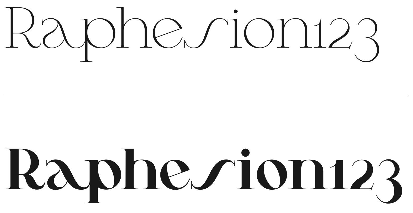
Pena
Student: Luís LopesClassification: Geometric Serif (Modern/Didone with Art Nouveau influences)Variation Axis: Weight (Regular–Bold) Pena is a geometric serif display typeface designed by a student in the 2024–25 Typeface Design course at FBAUP. The project explores revivalism through juxtaposition, blending 1920s Portuguese typographic aesthetics with the clarity and precision of contemporary digital design. Rooted in the…
-
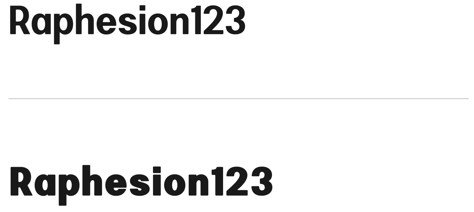
Bili
Student: Lília AmaroClassification: Hybrid Sans Serif — Geometric, Neo-Grotesque, and Neo-HumanistVariation Axis: Weight (emphasis on bold interpolation) Bili is a hybrid sans serif display typeface designed by a student in the 2024–25 Typeface Design course at FBAUP. It merges characteristics from three typographic traditions — geometric sans, neo-grotesque, and neo-humanist — resulting in a visually…
-

Cafuné
Student: Katharina Veronika FeddeClassification: Geometric Sans Serif (Vox-Atypi: Lineal – Geometric; DIN 16518: Constructed Grotesque)Variation Axis: Weight (Regular–ExtraBold) Cafuné is a geometric sans serif display typeface designed by a student in the 2024–25 Typeface Design course at FBAUP. Inspired by the uniform-line signage on a wrought iron gate near Porto’s Palácio de Cristal, the project…
-
Unnamed
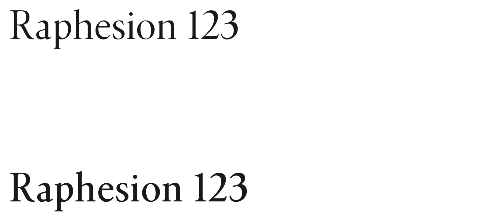
Student: Julien LimaClassification: Transitional Serif (Vox-Atypi)Variation Axis: Weight (Regular–SemiBold) Unnamed is a transitional serif typeface designed by a student in the 2024–25 Typeface Design course at FBAUP. Inspired by Minion Pro, it pays homage to late 18th-century Neoclassical serif types while aiming for balance, legibility, and editorial versatility. Conceived initially in Regular (400) and interpolated…
-
Janz Type
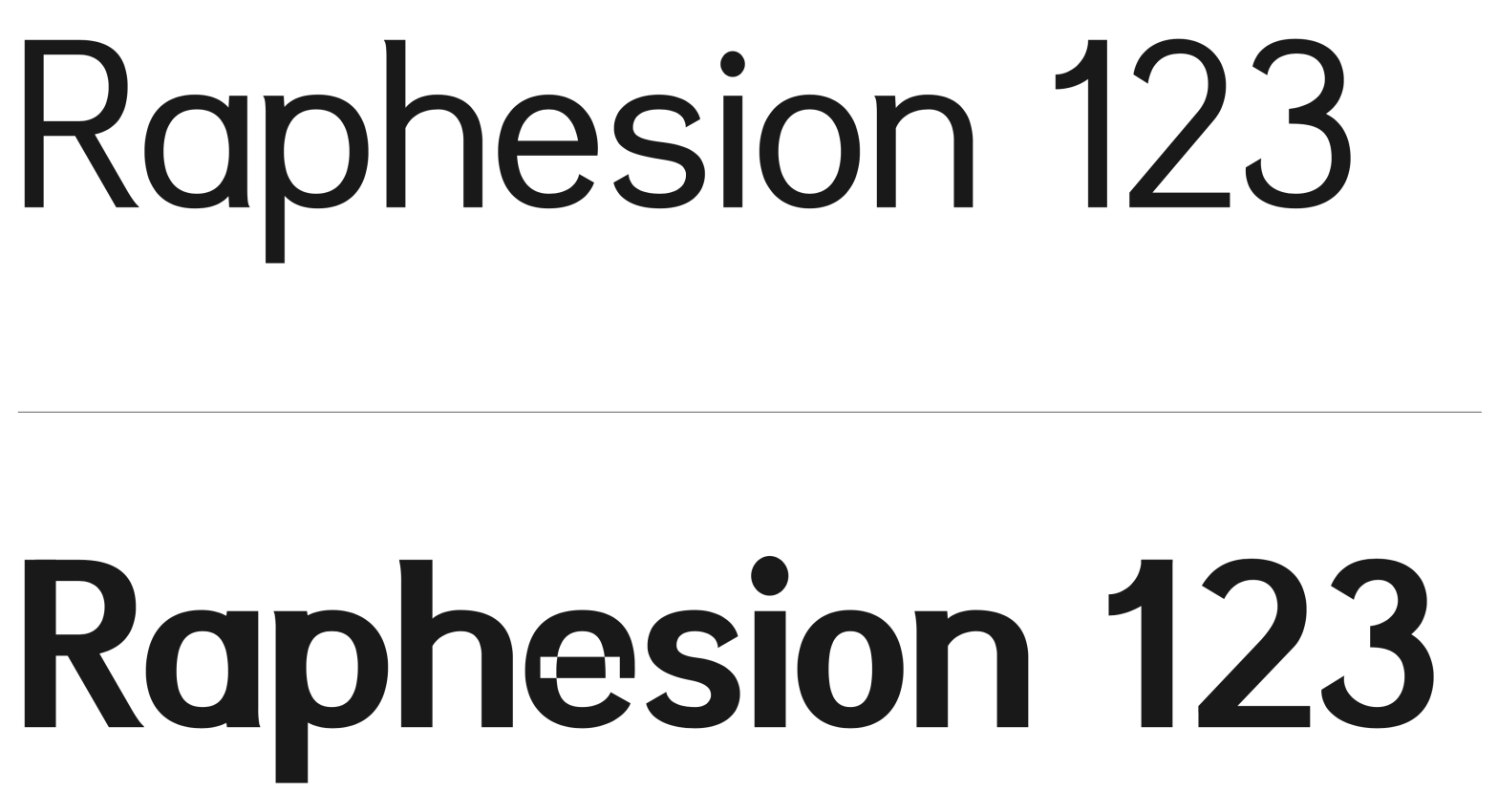
Student :Juan Sebastián Diaz HolguínClassification: Grotesque Sans Serif (Modern)Variation Axis: Weight (Regular–ExtraBold) Janz Type is a modern grotesque sans serif typeface developed by a student in the 2024–25 Typeface Design course at FBAUP. The name derives from the designer’s own — Juan Díaz — reflecting a personal approach to typographic identity and authorship. Inspired by…
-
Cunty
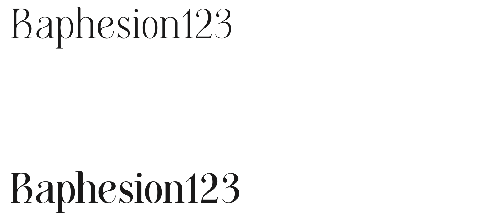
Student: João TomásClassification: Modern Serif (Didone, Vox-Atypi)Variation Axis: Weight (Regular–Bold) Cunty is a modern serif display typeface that draws inspiration from Bodoni and PP Editorial New, embracing the high contrast and vertical stress typical of Didone models. Designed by a student in the 2024–25 Typeface Design course at FBAUP, the typeface introduces a more fluid…
-

Orbis
Student: Bruna SilvaClassification: Geometric Sans Serif (Modern)Variation Axis: Weight (Regular–Bold) Orbis is a geometric sans serif display typeface designed by Bruna Silva, blending legibility and modularity in both print and digital contexts. Inspired by typefaces such as Futura and SK Nomerok, it draws from the Constructivist and Modernist visual traditions to convey a strong, expressive…