
![Claredon*t is an Egyptian [clarendon] typeface designed by Ana Rita Antunes, Beatriz Gomes, Diana Pereira in 2021.](https://typedesign.fba.up.pt/wp-content/uploads/2023/04/Screenshot-2021-12-13-at-12.18.45-1536x1073-new-1024x576.jpg)
InkTrap is an online instance of the Type Design course taught at the Master in Graphic Design and Editorial Projects at the Faculty of Fine Arts of the University of Porto (FBAUP).
This website is an ongoing effort aimed at providing public news and resources to support and promote the activities held during classes, complementing the current online e-learning platforms and main bibliographic references.
Latest News
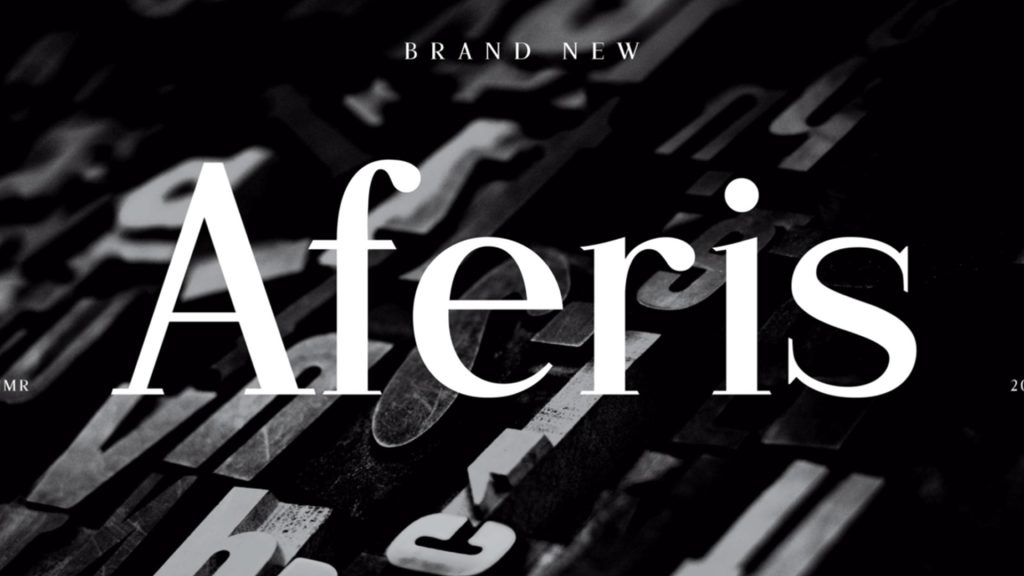
2025 Display Type Explorations
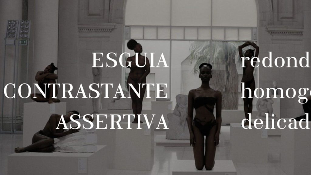
A Typographic Showcase from the first assignment of the 2025 edition of the Masters’ in Graphic Design & Editorial Projects Type Design course. In the first major assignment of the Typeface Design course, students are challenged to design a display typeface beginning with a test word — typically “Raphesion123” — and develop a Variable Font… Continue reading 2025 Display Type Explorations
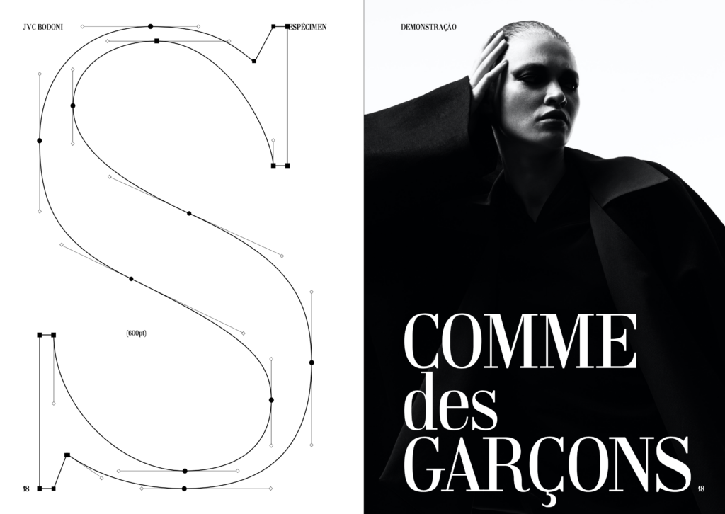
Type Specimen Test Sheet
Check out this very complete (and very useful) type specimen testing template [sheet] from Type Heist: https://typeheist.co/blog/type-testing-template/ This is the template I use to test all Typeheist fonts. As I added more and more characters and multi-linguals, I needed an easy way to test my typefaces without recreating the same thing each time (or worse… Continue reading Type Specimen Test Sheet
Vercetti Regular
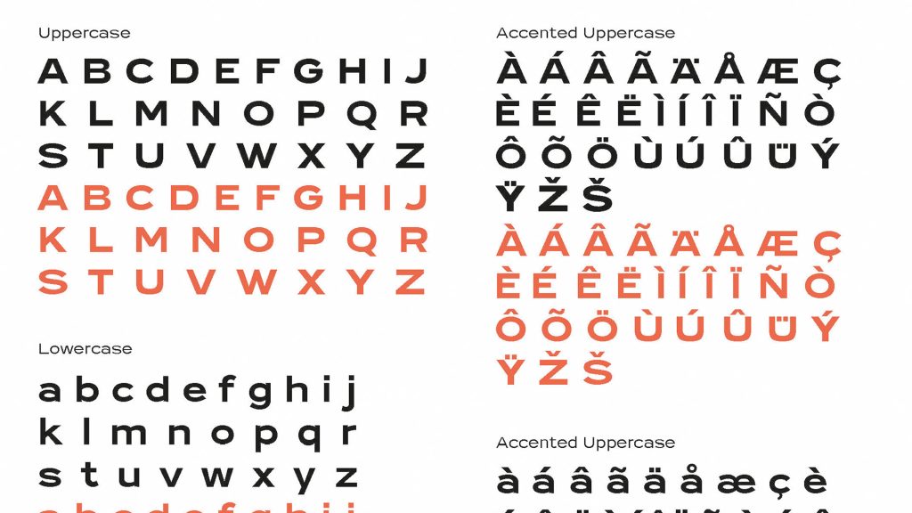
A nice new type from Filippos Fragkogiannis that reminds me of Kobalt, the final master’s project from Teresa Zagalo. Not only this is an interesting new font, but also the online specimen is very well put together. Free to download and use (if only there was a variable font version!…) Vercetti is a sans serif… Continue reading Vercetti Regular
From the Syllabus
Copyright Information
When a digital type design project is ready for publishing and distribution, it is important to check your legal information before exporting the final WOFF, OpenType and Variable Font files. This year, students have been asking how to do this. The final copyrights notice and legal (EULA) license information is the target of much discussion… Continue reading Copyright Information
Course Portfolio

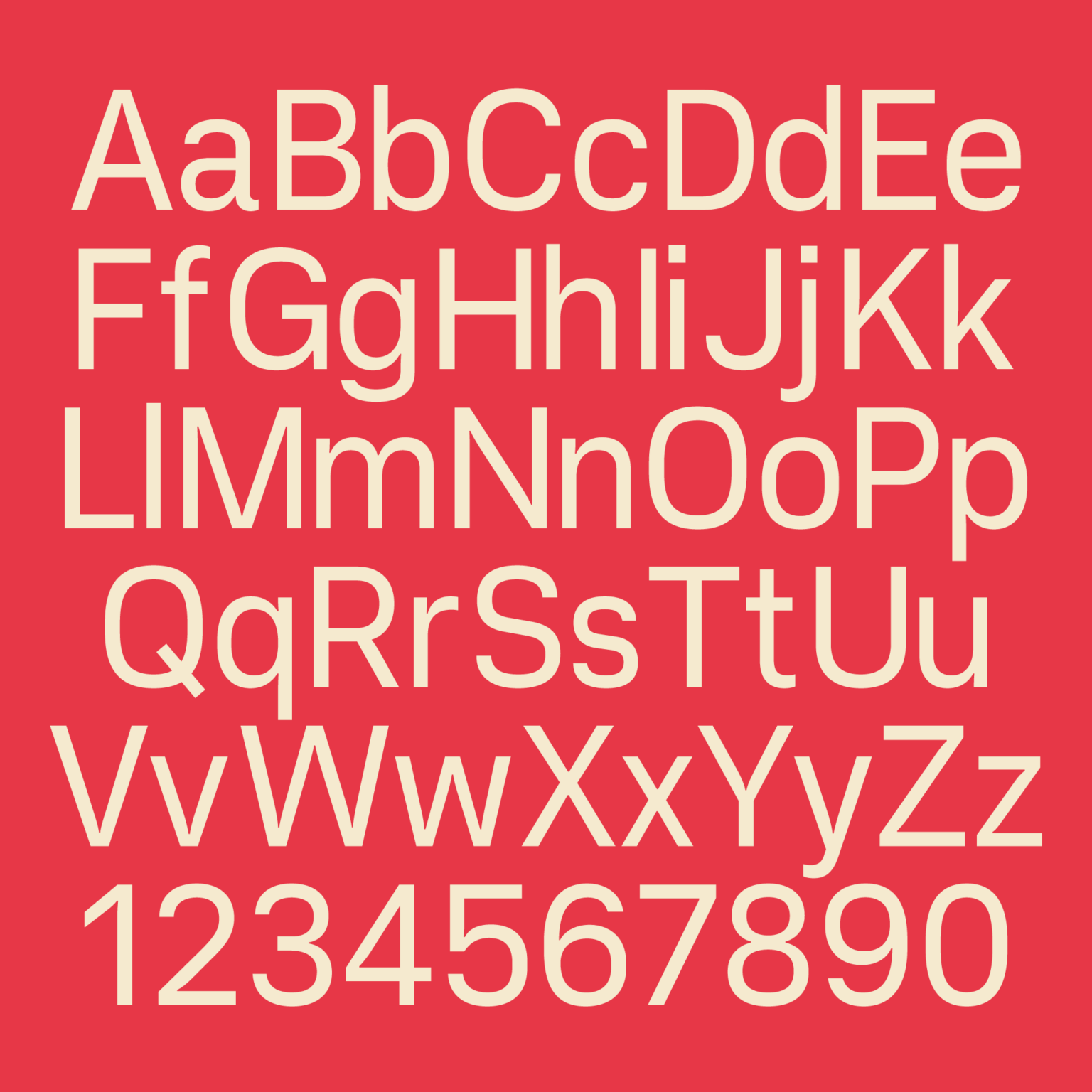
Kathow Sans
Kathow Sans is a geometric sans-serif typeface, designed by Filipa Moreira, João Cardoso, and Pedro Gil in 2024. Kathow Sans began as a revival project inspired by Manuel Pereira da Silva’s “Tia Lira,” but evolved into a distinctly original typeface influenced by classic geometric sans-serifs such as Adrian Frutiger’s Avenir and Journal Sans New from… Continue reading Kathow Sans
ManuEla
ManuEla is a modern sans-serif typeface, designed by Aurélia Ferreira, Maria Carlos, and Melissa Gaviria in 2024. ManuEla is more than a typeface—it’s a love letter. Named in tribute to Manuela, the wife of the late Portuguese typographer Manuel Pereira da Silva, the typeface honors her unseen but vital role in preserving Silva’s typographic legacy.… Continue reading ManuEla

Tia Viola
Tia Viola is a geometric sans serif typeface, designed by Christine Andres, Mafalda Ribeiro, and Sofia Silva in 2024. Tia Viola is a revival of Tia Lira (Bold), a typeface designed in 2004 by Portuguese sculptor and designer Manuel Pereira da Silva. With roots in geometric structure and typographic modernism, the original Tia Lira Bold… Continue reading Tia Viola
Character Design Patterns
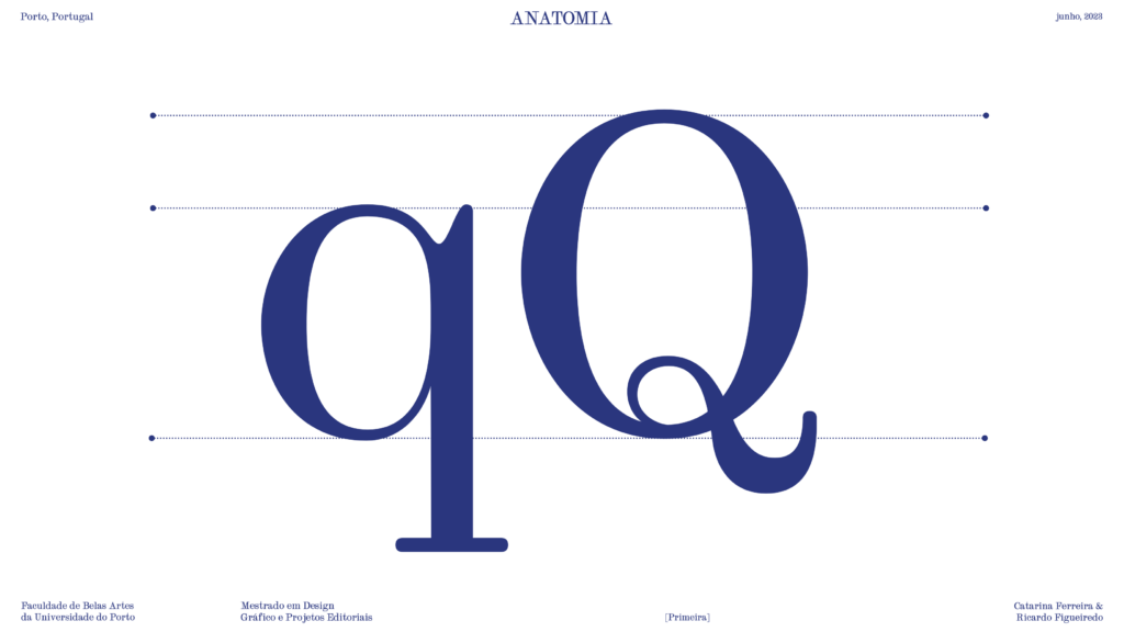
Ogee Curves
This is a character design pattern learned last week during John Stevens Capital’s Immersion Class — the Ogee Curve. Stevens used it to describe the small inward cup, or “dip” present in the Monumental Capital (AKA Trajan) top stem serif.