A Typographic Showcase from the first assignment of the 2025 edition of the Masters’ in Graphic Design & Editorial Projects Type Design course.
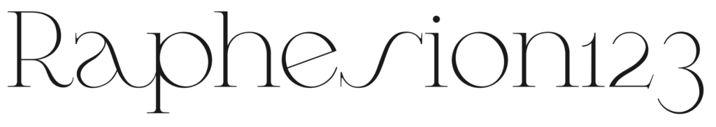
In the first major assignment of the Typeface Design course, students are challenged to design a display typeface beginning with a test word — typically “Raphesion123” — and develop a Variable Font with at least one interpolation axis (commonly weight). Rooted in the Foundational Hand and Gerrit Noordzij’s stroke theory, the assignment introduces core typographic principles such as contrast modulation, structural rhythm, and formal consistency.
Each student is encouraged to explore historical references, apply contemporary logic, and express original typographic voices through partial alphabets. The results offer an exciting range of stylistic interpretations — from rigorous revivals to bold hybrids — revealing emerging perspectives on form, function, and typographic identity.
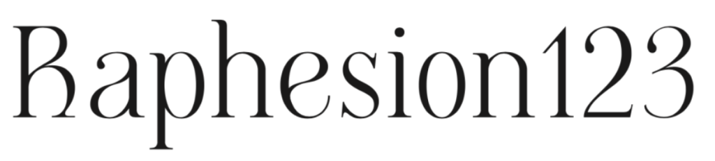
Off Serif – by André do Carmo Gonçalves. A high-contrast Didone with inverted serifs and bold terminals, balancing strangeness and elegance.

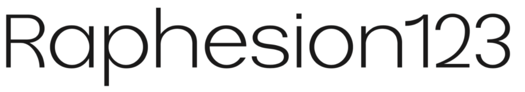
Orbis – by Bruna Silva. A Geometric Sans inspired by Futura and SK Nomerok, designed for digital/print headlines.
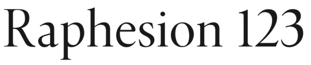
Cunty – by João Tomás. A fluid Modern Serif with teardrop terminals, reimagining Bodoni for expressive display use.

Janz Type – by Juan Sebastián Diaz Holguín. A Grotesque Sans referencing 20th-century modularity, built for long-form legibility and interface design.
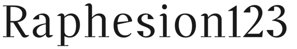
Unnamed – by Julien Lima. A Transitional Serif rooted in Minion Pro with wedge-shaped terminals, meant for compact editorial blocks.
Cafuné – by Katharina Veronika Fedde. A Geometric Sans inspired by signage and ironwork near Palácio de Cristal, designed with display clarity.

Bili – by Lília Amaro. A hybrid sans serif fusing geometric, neo-grotesque, and neo-humanist models for contemporary versatility.
Pena – by Luís Lopes. A revivalist geometric serif inspired by 1920s Portuguese typography, channeling Art Nouveau and silent film titling.

Villeneuf – by Rita Soares. A Transitional–Garalde hybrid reinterpreting JVilleneuve by Manuel Pereira da Silva with Old Style numerals and drop terminals.
Butique – by Roberta Miranda. A Modern/Transitional hybrid with flare-wedge serifs, blending retro flair and contemporary logic for decorative use.
This collection of the highlights from the first assignment of the class of 2025 reveals how young designers at FBAUP are approaching type with a deep understanding of historical models and a bold spirit of experimentation. From expressive serifs to minimalist sans, from high contrast Didones to hybrid grotesques, each project reflects a commitment to design thinking, typographic craft, and expressive functionality.
Stay tuned for updates of the course — despite these display font designs will not be actively pursued, — perhaps some of their ideas/features will make their way into their next designs, poster, publication, or product identity.