The purpose of InkTraps’s Character Design Patterns is to provide technical orientation, but manly visual guidelines for designing and producing Latin-based character shapes.
Currently, under development, this syllabus will soon present the necessary case studies covering the glyphs of the Latin alphabet, presenting the main proportions, structure, and visual features of the glyphs. It will follow closely the Microsoft Character Design Standards, Karen Cheng’s Designing Type, and Sofie Beier Type Tricks, among other sources.
Currently, it is being organized into the following sections:
- Lowercase characters;
- a-z (by alphabetical, or construction order)
- Uppercase characters;
- A-Z
- Numeral characters (figures)
- Lining
- Old Style
- Tabular
- Diacritics
- Marks
- Lower and uppercase combinations
- Punctuation
- Symbols
- Euro Sign and other currencies
- Typographical Marks
- Mathematical symbols
- Special features (a “catch-all” section for extra details and information)
- Terminals & flourishes
- Types of curves
- etc.
The Character Design Patterns are not a substitute for a comprehensive type design manual, such as Cheng’s or Messeguer’s. It will complement it with custom text and visual instructions. And in order to best make use of these standards, it is best to get acquainted with the type terminology and genealogy of type design.
Ogee Curves
This is a character design pattern learned last week during John Stevens Capital’s Immersion Class — the Ogee Curve. Stevens used it to describe the small inward cup, or “dip” present in the Monumental Capital (AKA Trajan) top stem serif.
Em Dash
The Em Dash is a long horizontal stroke or rule[r] that follows the same typographic expression of the typeface: weight, contrast, stress, and terminals. This means that in specific cases (eg. Humanist, Monospace, Script of Graphic) its terminals might be angled. It is vertically centered on the lowercase characters and has the width of the […]
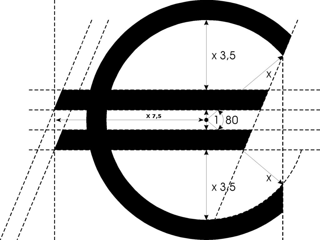
Euro
Wouldn’t it be great if a Type Designer worked at the European Union? Some thirty draft designs for a euro currency symbol were drawn up internally by the European Commission (…) Microsoft and other vendors have chosen to make glyphs for the symbol to be font and style specific (…) to make the euro symbol […]