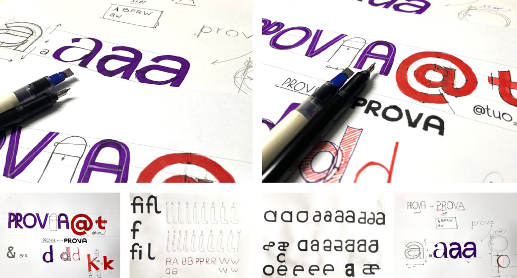
Prova is a geometric sans serif typeface, designed by Bruna Valoura, Bruno Barros, Cristiana Braz, and Inês Loureiro in 2024.
Prova is a revival of Tia Lira, one of the “first geometric typeface developed in Portugal” [please take this information with a slight grain of salt — see more infor about its origin in his autobiographicl book], originally designed by Manuel Pereira da Silva. With its clean forms and historical resonance, Prova brings new life to this experimental typeface first presented in 2003 but conceived decades earlier as a pedagogical tool.
While maintaining the rationality and precision of geometric sans serifs, Prova also draws on Art Deco influences, merging sharp functionality with elegant nostalgia. The project references not only Tialira’s legacy but also the lineage of modernist typefaces — from Futura and Kabel to Avenir and Gotham — establishing a clear dialogue with 20th-century design while remaining distinctly contemporary.
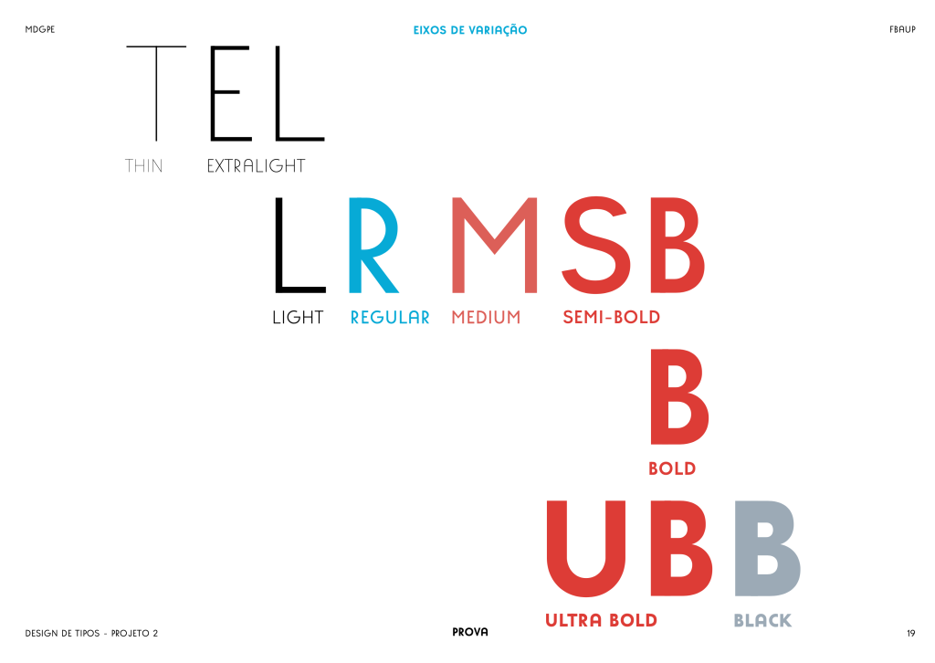
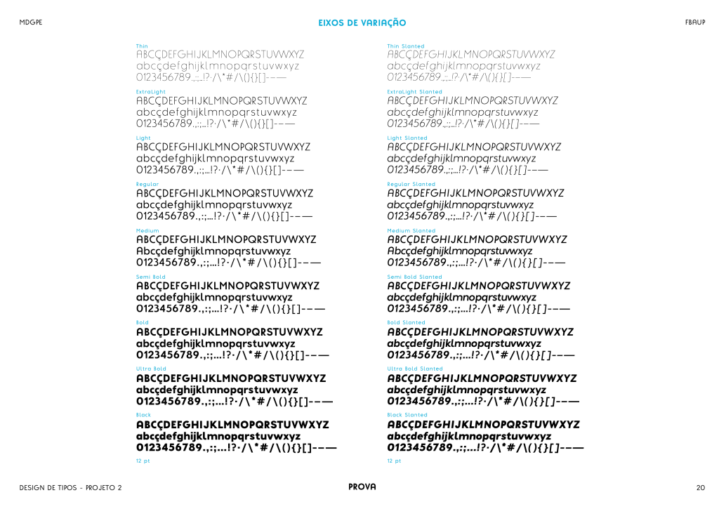


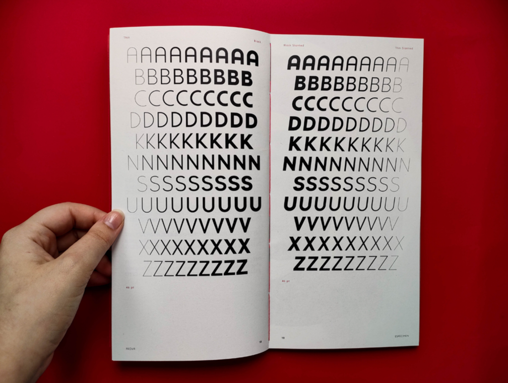
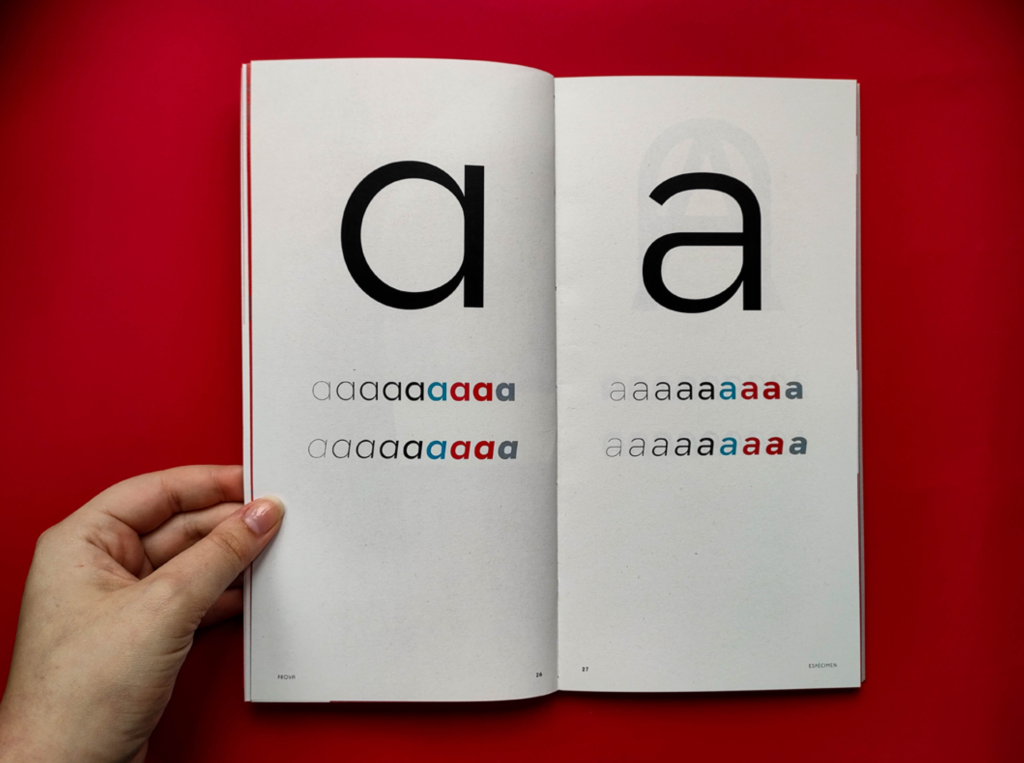

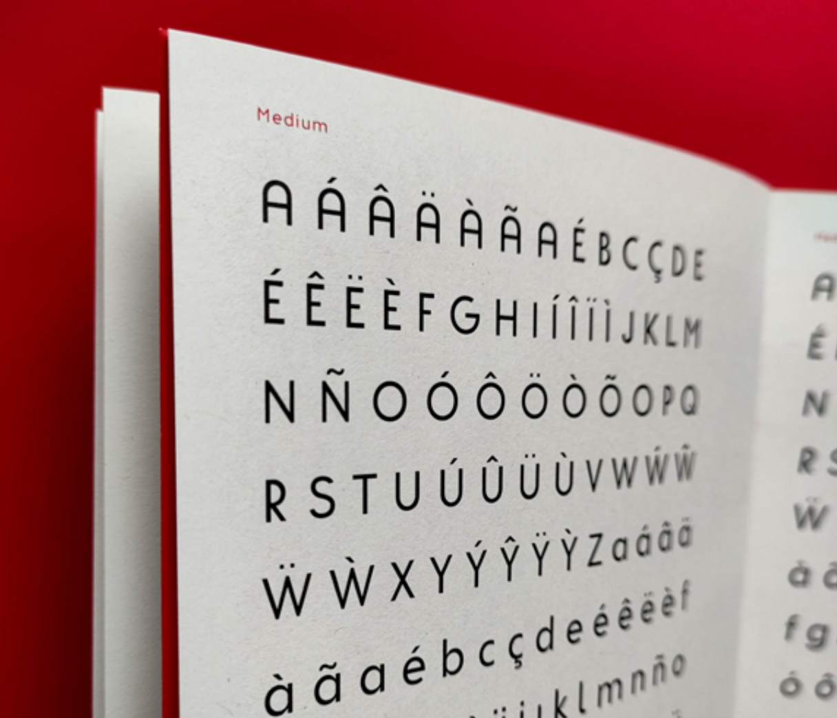
The typeface includes 9 weights, from Thin to Black, and is also available in a full Slanted variant, expanding its expressive versatility. It supports a wide character set (229 glyphs) with alternates for letters and numerals, allowing for custom tones and textures across branding, editorial, and display applications.
With its refined construction and dynamic structure, Prova offers a functional yet characterful response to the original spirit of Tia Lira — poised between pedagogical origins and professional adaptability.
See the full specimen booklet here: