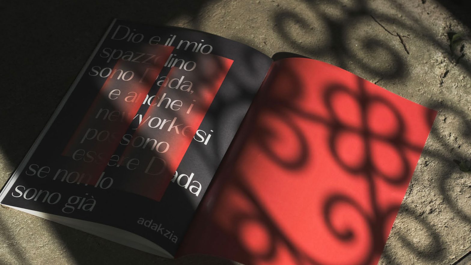
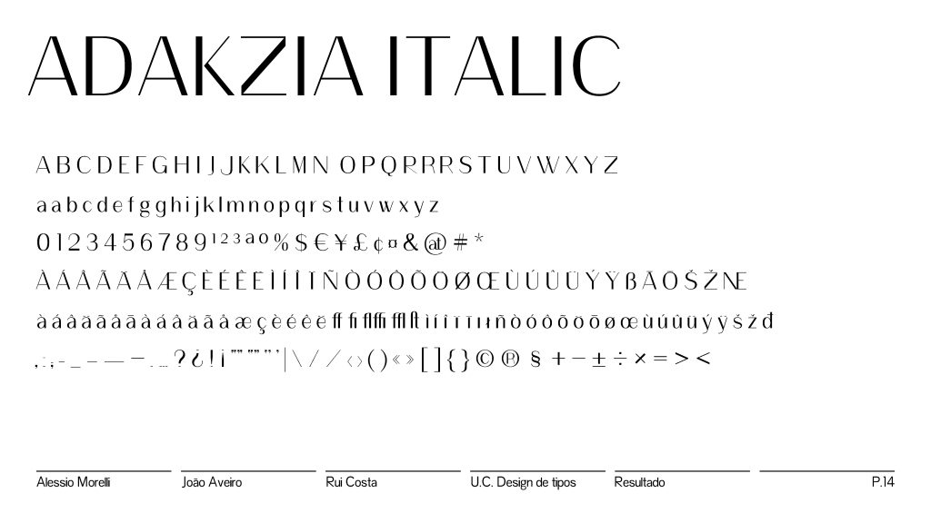
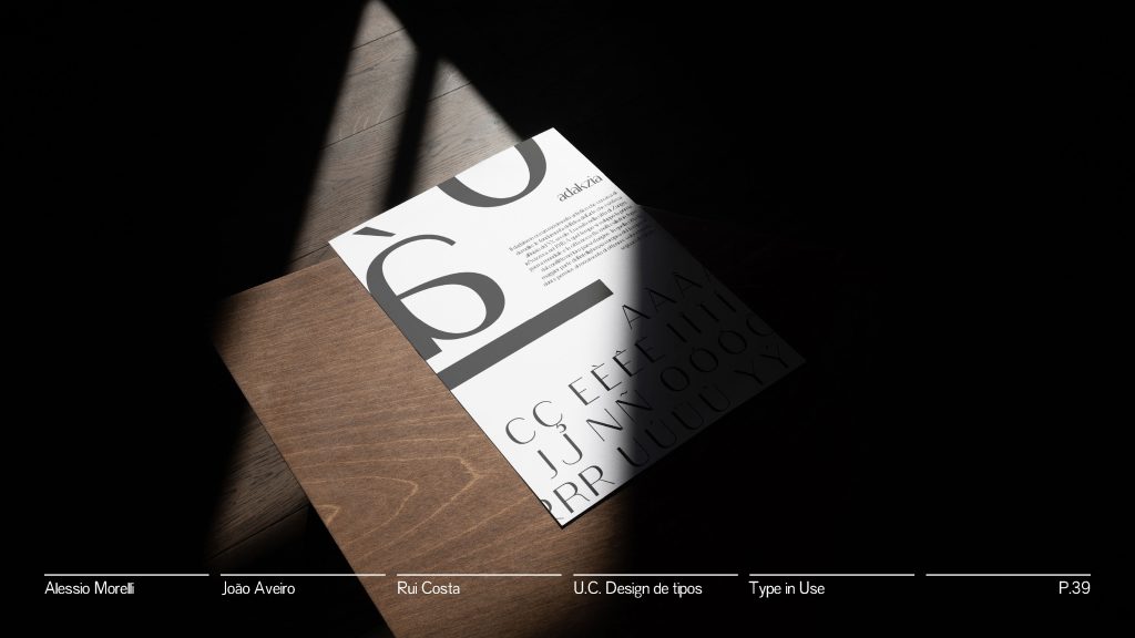
Adakzia is a Sans Serif “Frakenfont” Grotesque typeface revival, designed by Alessio Morelli, João Aveiro, and Rui Costa in 2022.
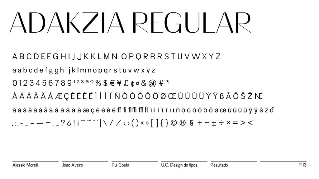
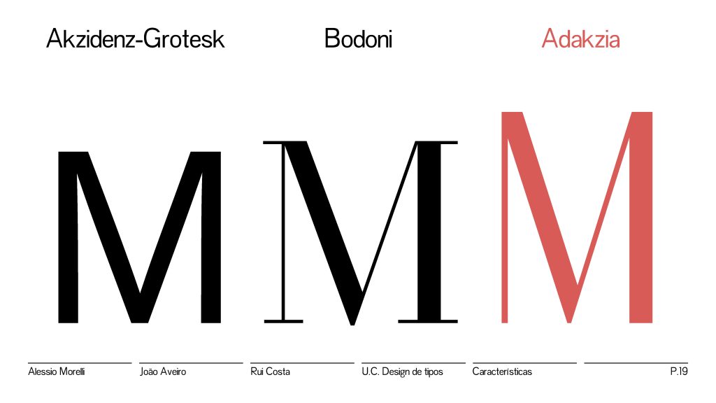
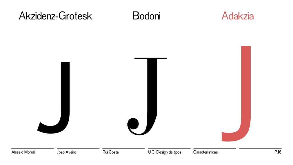
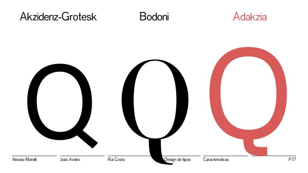
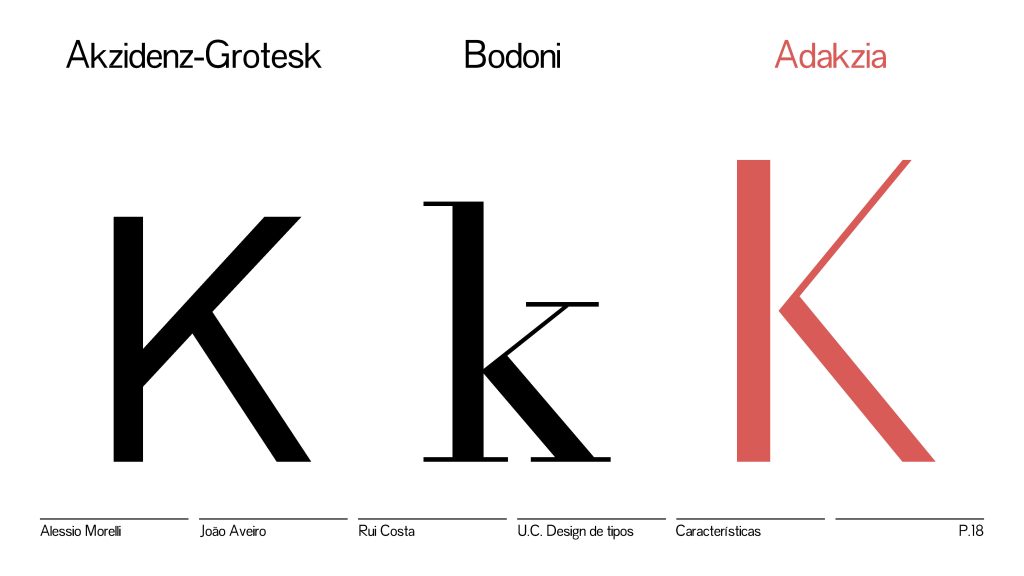
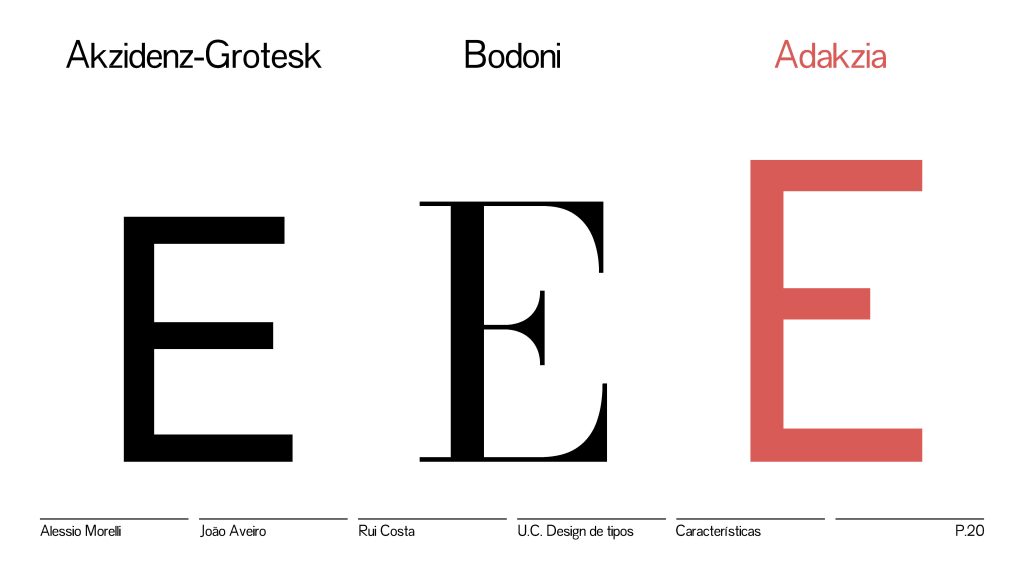
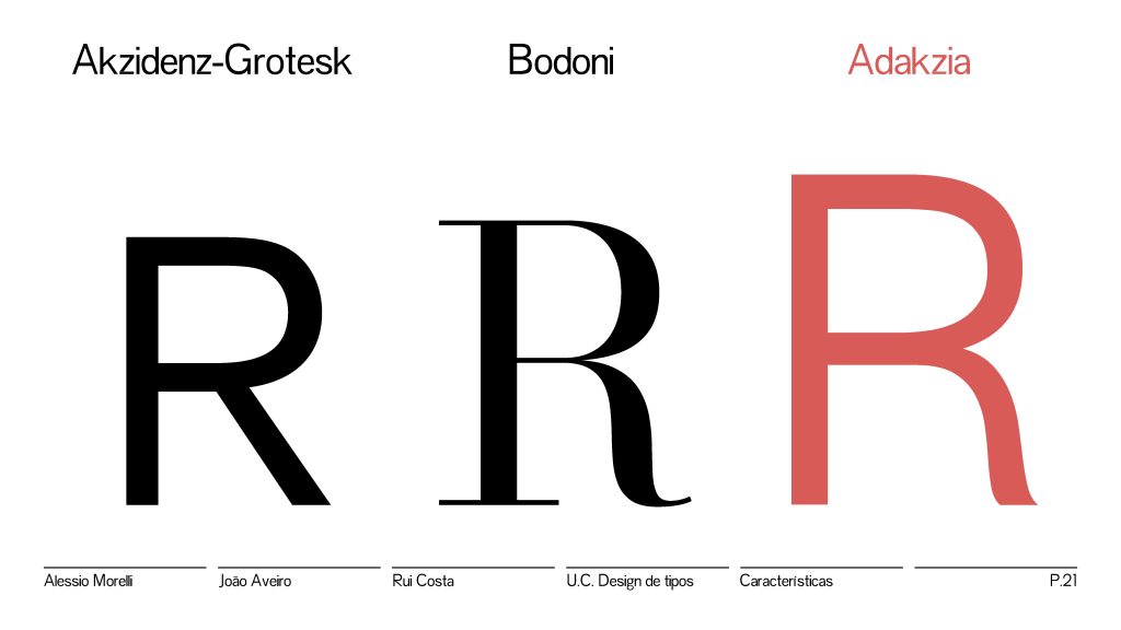
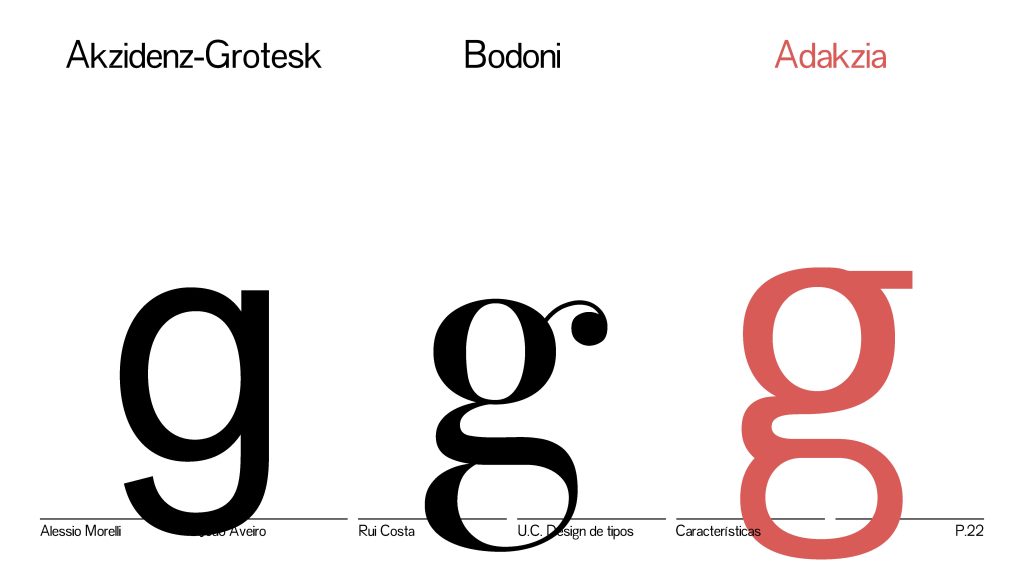
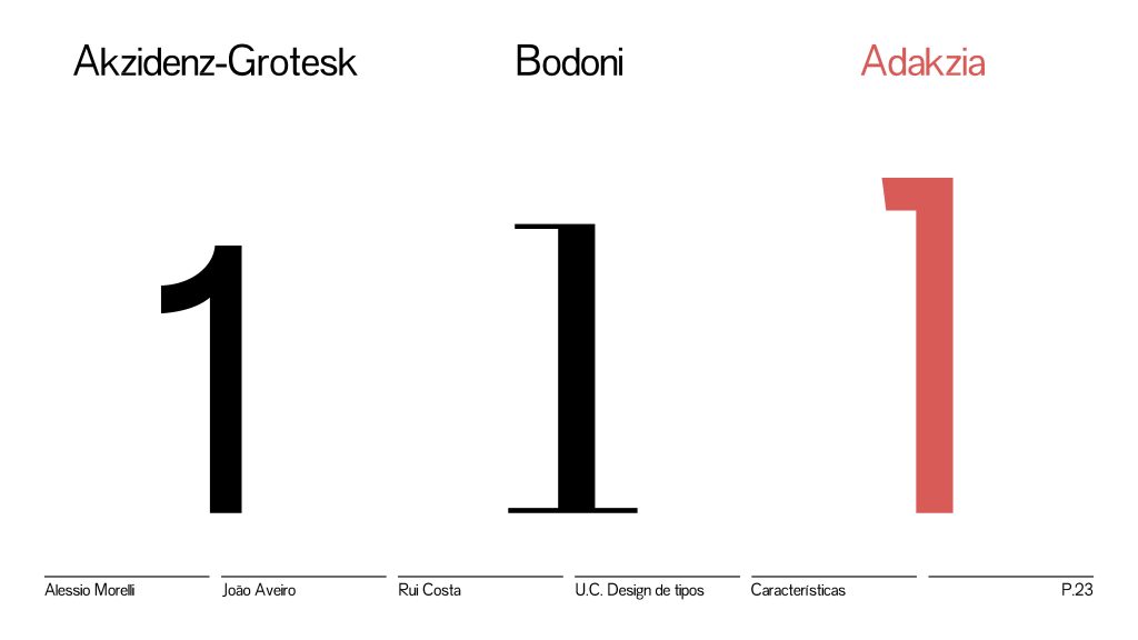
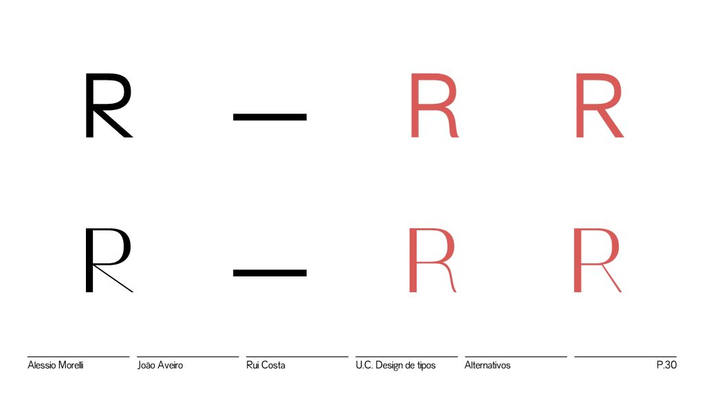
The entire project developed around the idea of creating something controversial, almost chaotic, and in line with a Dadaist idea (…) to create a single file that contained two sides of the same coin from a stylistic point of view. In this regard, the research phase saw two cornerstones of typographic culture as references, on the one hand Akzidenz-Grotesk, the progenitor of sans-serif typefaces and on the other the Bodoni
Adapted excerpt from the group final presentation
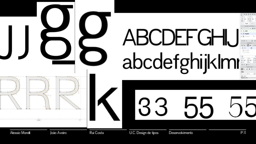
Although ambitious, designing “Frankenfonts” is seriously discouraged. Especially during this second assignment for designing and producing a working type revival variable font. Nevertheless, the group managed to pull it off with considerable consistency (for the timeframe given). Space is off. Stem and bowl consistency is also off. So it doesn’t really work as a text typeface as intended. But due to the difficulty, the result was interesting.
From the point of view of style and use, the two references are commentary, one being the opposite of the other. The challenge of this project is to propose a mediation that is uncompromising, a typeface that can be used on the keyboard and that manages to represent the two opposites of typographic culture and that is able to present itself as a provocation.
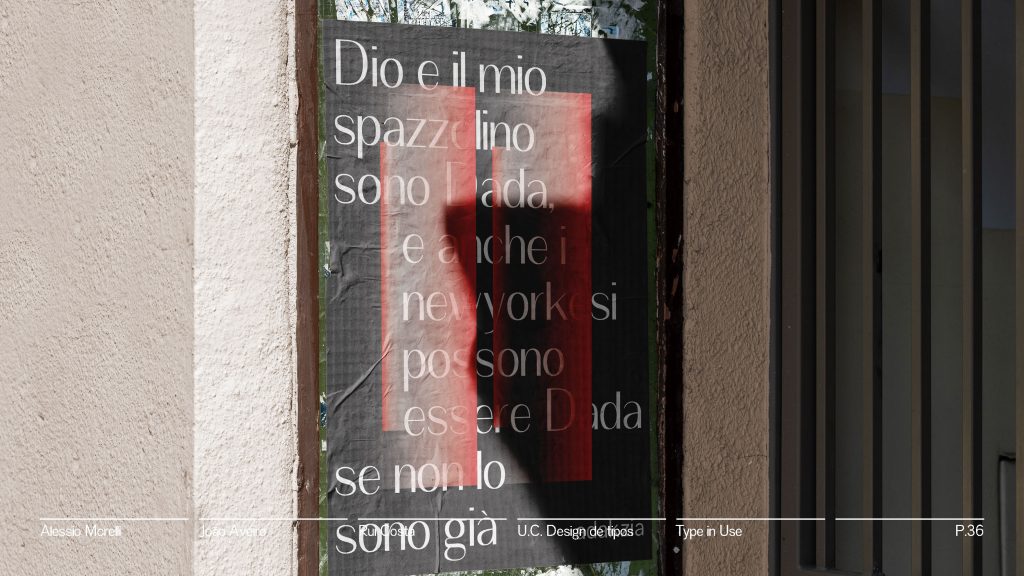
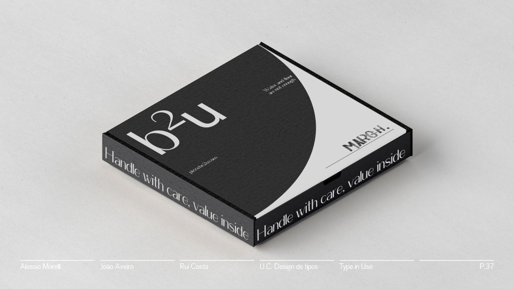
Adakzia wants to be now rustic and now elegant, in accordance with Dadaist ideals it wants to embrace the poetics of chaos and the fusion of variety.

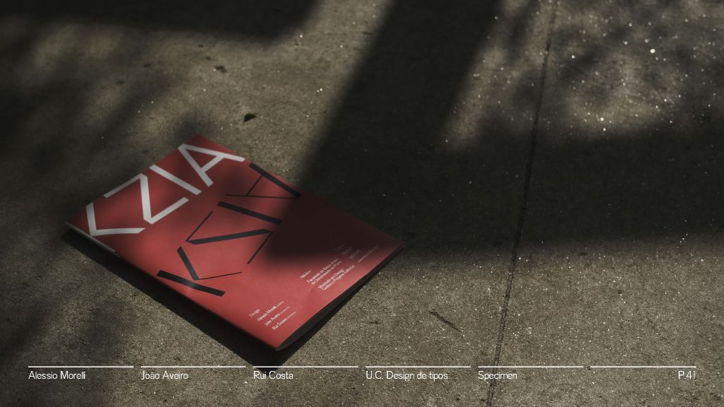
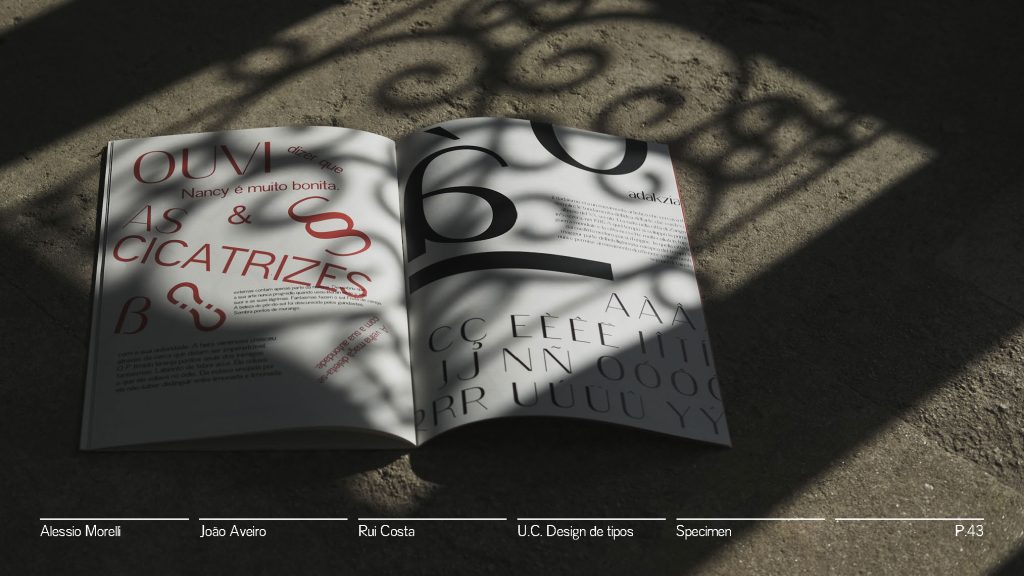
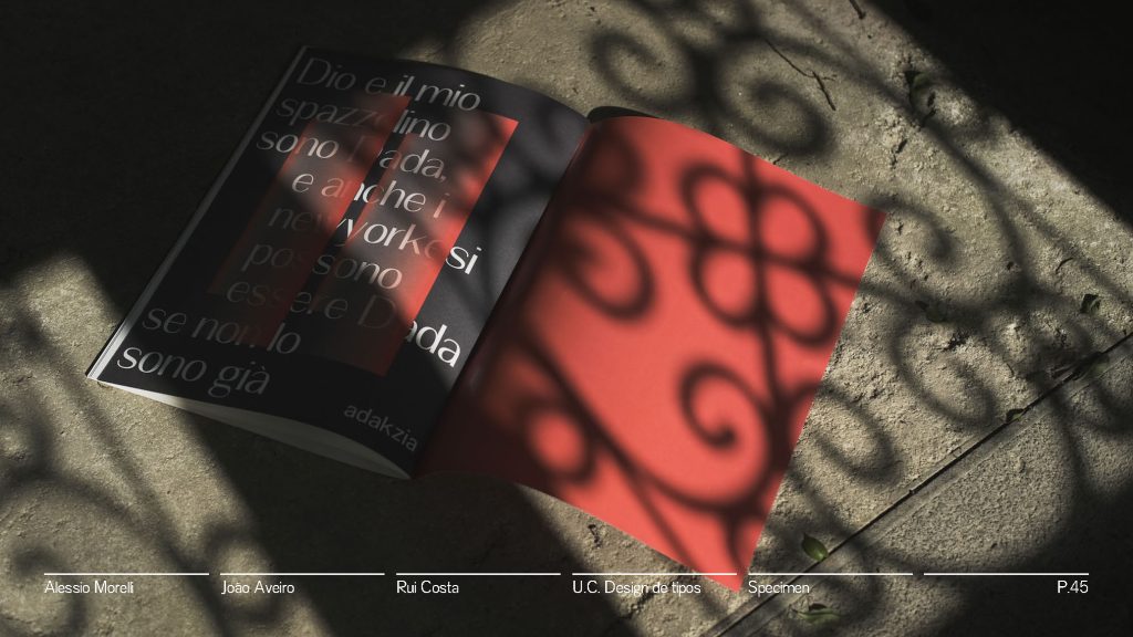
See the full specimen booklet here.
