
Student: Katharina Veronika Fedde
Classification: Geometric Sans Serif (Vox-Atypi: Lineal – Geometric; DIN 16518: Constructed Grotesque)
Variation Axis: Weight (Regular–ExtraBold)
Cafuné is a geometric sans serif display typeface designed by a student in the 2024–25 Typeface Design course at FBAUP. Inspired by the uniform-line signage on a wrought iron gate near Porto’s Palácio de Cristal, the project explores how geometry and construction-based lettering can evolve into a cohesive digital type design.
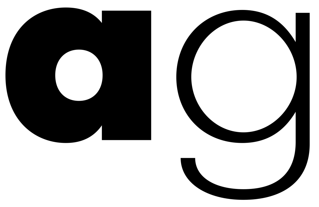
Rooted in a square-based modular system, Cafuné features monolinear strokes, single-storey ‘a’ and ‘g’, and nearly perfect circular curves. The short ascenders and descenders offer a compact, distinctive rhythm, deliberately departing from the proportions of Futura (Paul Renner, 1927), while contrasting with Avenir (Adrian Frutiger, 1988) in terms of counter size and stroke balance.
Designed with display use in mind, Cafuné emphasizes visual clarity and emotional immediacy in large sizes. The weight axis ranges from Regular to ExtraBold, maintaining a consistent structure while increasing the stroke thickness by a ratio of approximately 3.5× — a visual choice that enhances impact while preserving its geometric core.