Student :Juan Sebastián Diaz Holguín
Classification: Grotesque Sans Serif (Modern)
Variation Axis: Weight (Regular–ExtraBold)
Janz Type is a modern grotesque sans serif typeface developed by a student in the 2024–25 Typeface Design course at FBAUP. The name derives from the designer’s own — Juan Díaz — reflecting a personal approach to typographic identity and authorship.
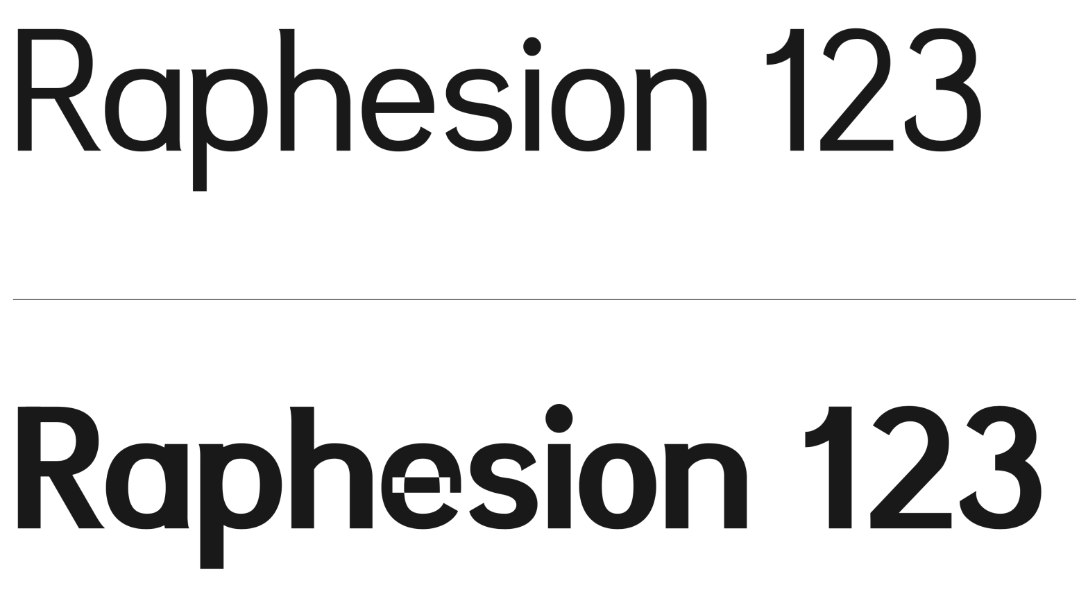
Inspired by the modular construction and geometric simplicity of 20th-century grotesques, Janz Type is designed for both digital and print contexts, prioritizing clarity and visual neutrality. Its minimalist structure, closed terminals, and minimal contrast across weights make it especially suitable for editorial design, signage, and UI applications.

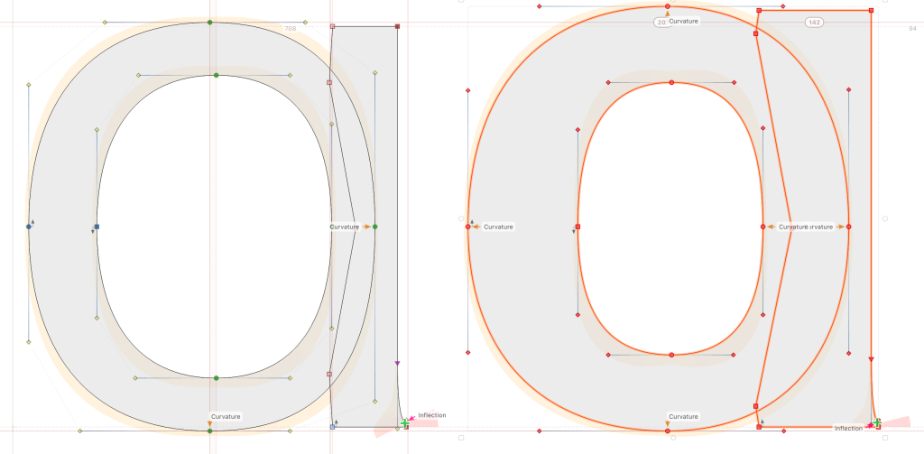
The typeface interpolates between Regular and ExtraBold, maintaining consistent legibility across weights and scales. A subtle detail that defines its tone is the gentle inward curve at the base of characters like the “a”, which softens the overall rigidity and introduces a hint of visual warmth — striking a balance between neutrality and personality.
