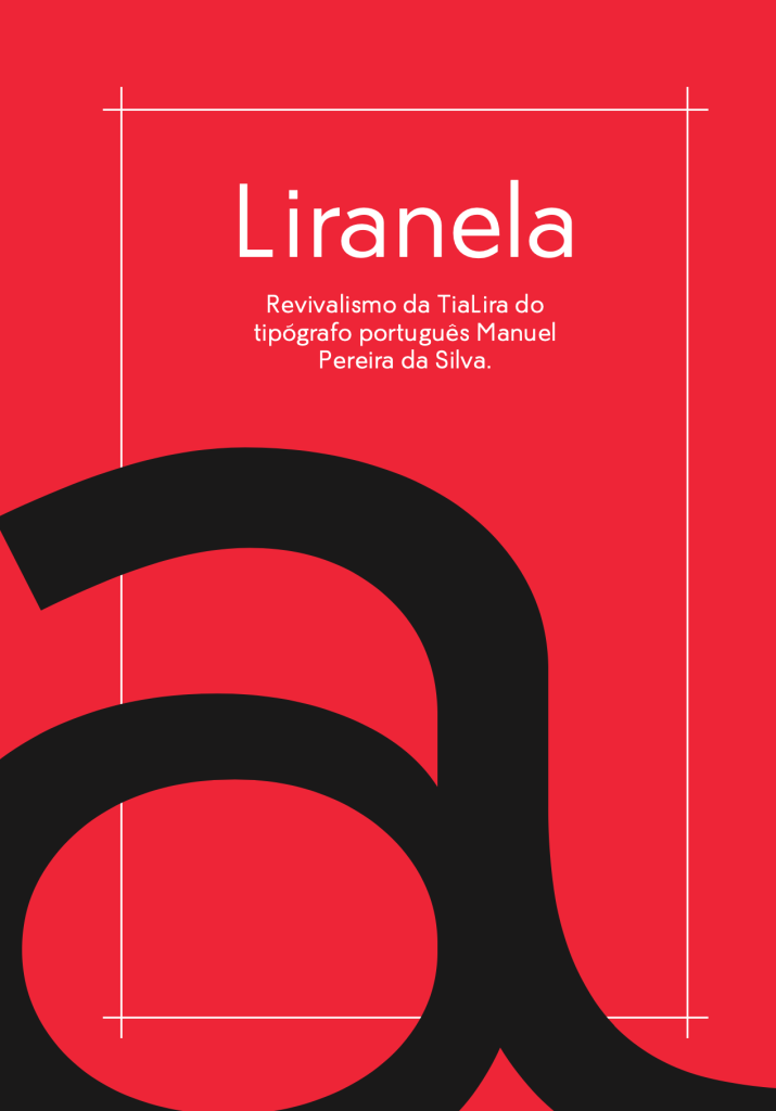
Liranela is a “Hibrid” Sans serif and script(ty) typeface revival, designed by in 2024 by Bernardo Xavier, João Janeiro, José Pelaio and Pedro Oliveira.
A “TIALIRA” FOI FEITA APENAS PARA CURTAS FRASES, DE SIMPLICIDADE SÓ APARENTE E TEM QUASE NADA A VER COM LETRA DE VERDADE.
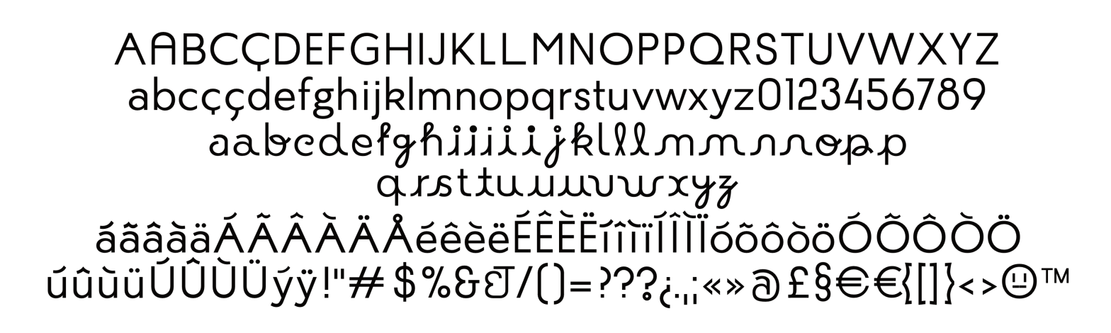
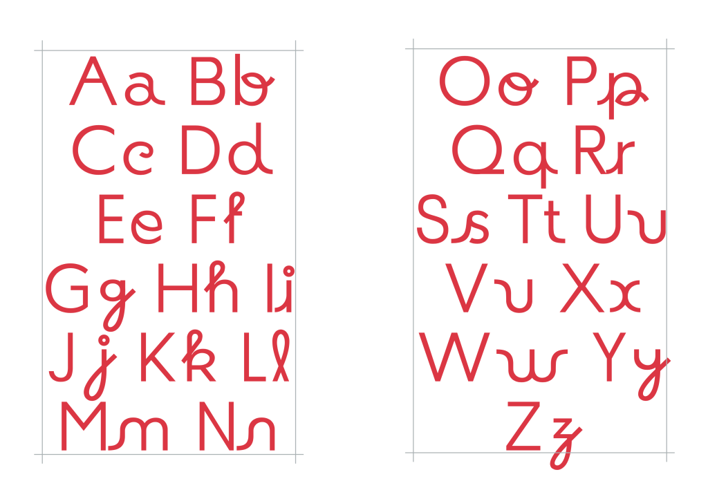
Liranela is a revival of TiaLira, a typeface originally designed by Portuguese typographer Manuel Pereira da Silva. Conceived as a typeface for continuous reading, Liranela balances apparent simplicity with typographic depth — a quality rooted in traditional text type design.
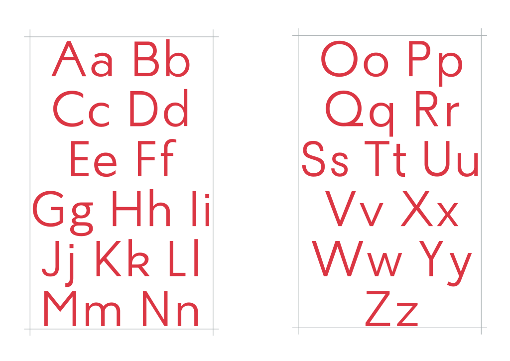
The revival focuses on ensuring legibility and comfort across long passages. It maintains a moderate contrast, a high x-height, and carefully calibrated spacing between characters and lines, making it ideal for body text. Its serif structure supports a fluid reading experience while referencing classic text faces like Times New Roman, but with a distinctly contemporary tone and historical sensitivity.
Liranela isn’t about flashy ornamentation; it’s about quiet efficiency, grounded in the reality of reading — a typeface that embraces “true letters” and the subtle complexity of their construction.
See the full specimen booklet here: