
ManuEla is a modern sans-serif typeface, designed by Aurélia Ferreira, Maria Carlos, and Melissa Gaviria in 2024.
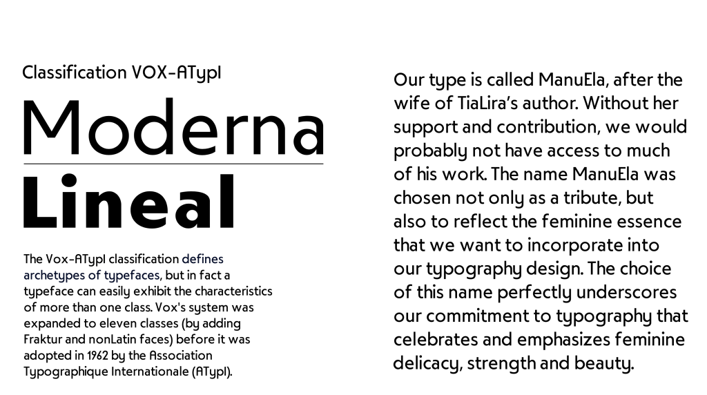
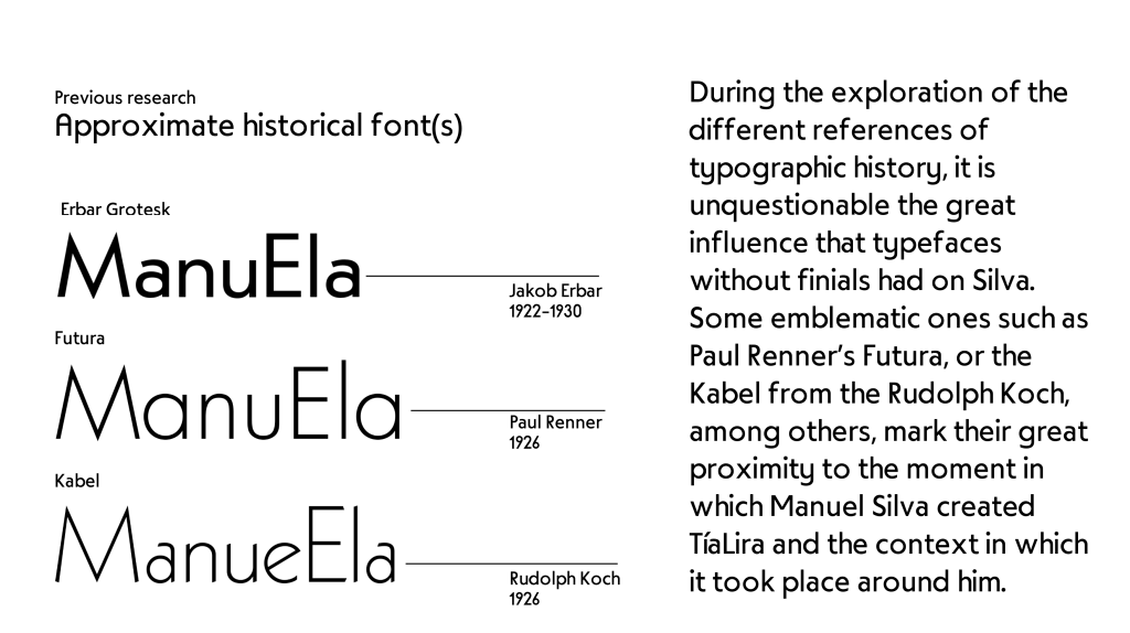
ManuEla is more than a typeface—it’s a love letter. Named in tribute to Manuela, the wife of the late Portuguese typographer Manuel Pereira da Silva, the typeface honors her unseen but vital role in preserving Silva’s typographic legacy. Drawing inspiration from his geometric and didactic type TiaLira, ManuEla reinterprets its structure through a soft, minimalist, and feminine lens.
This modern revival maintains a rational sans-serif structure while embracing humanistic warmth. Designed to be clean, legible, and emotionally resonant, ManuEla balances utility and elegance. The typeface blends characteristics of 20th-century sans-serifs like Futura and Kabel with a personal tone—what the designers describe as “created from love and for love.” It is intended not just as a design exercise, but as a tribute to both typographic heritage and emotional legacy.
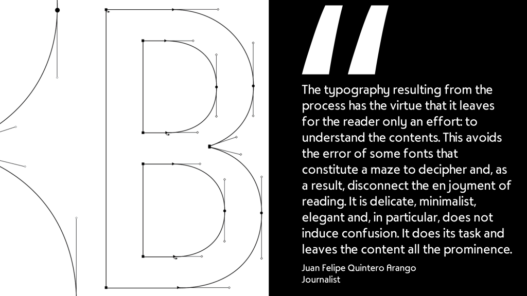
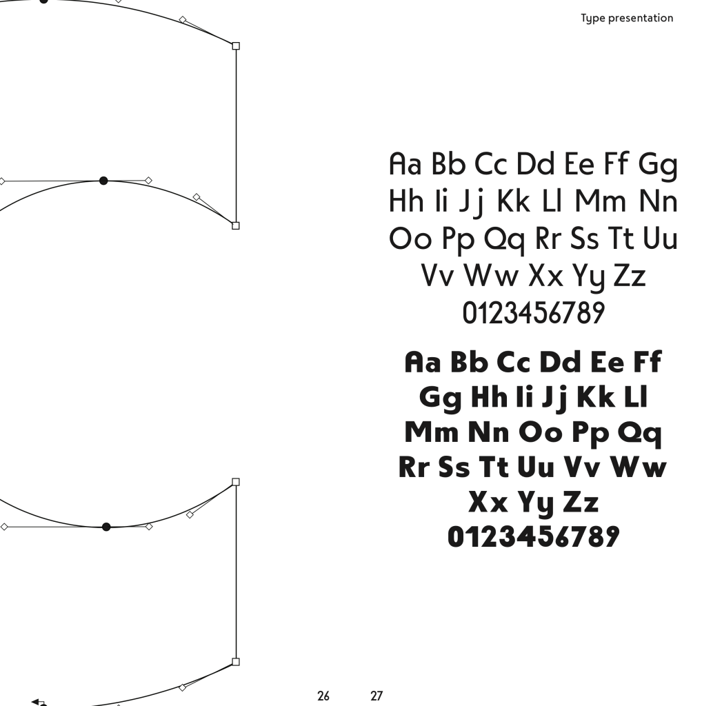
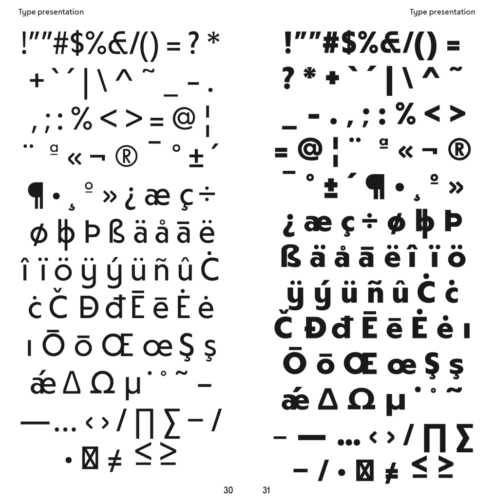
With open counters, geometric clarity, and subtle optical corrections, ManuEla offers a calm and kind reading experience. Its high x-height and clear contrast make it well-suited for both display and running text. Developed as a variable font with over 300 glyphs, it reflects a thoughtful, collaborative design process rooted in affection, pedagogy, and memory.
See the full specimen booklet here: