
Student: Bruna Silva
Classification: Geometric Sans Serif (Modern)
Variation Axis: Weight (Regular–Bold)
Orbis is a geometric sans serif display typeface designed by Bruna Silva, blending legibility and modularity in both print and digital contexts. Inspired by typefaces such as Futura and SK Nomerok, it draws from the Constructivist and Modernist visual traditions to convey a strong, expressive tone.
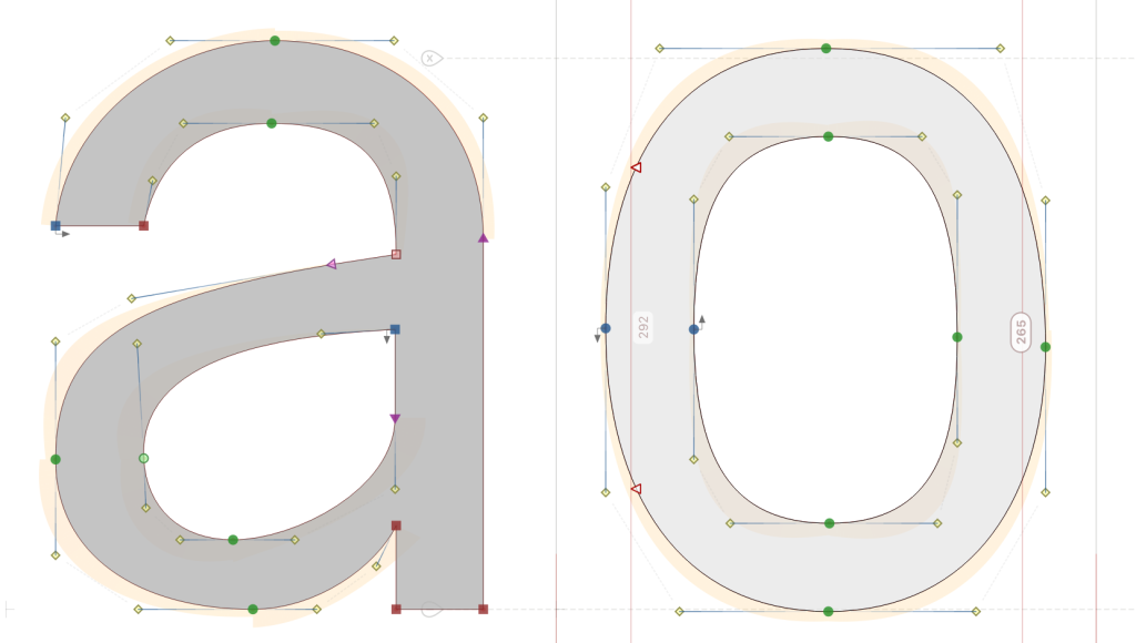
With a clean structure and simplified form, Orbis explores the Weight axis between Regular (400) and Bold (700), producing smooth transitions without radically changing the core shape. The typeface features angular, closed terminals and distinctive arched strokes in its bowls and stems, giving it a structured yet dynamic look — ideal for headlines and branding with a contemporary edge.