Tag: Serif
-
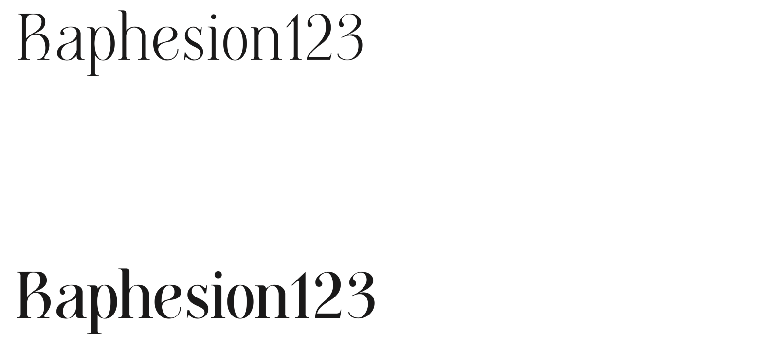
Butique
Student: Roberta MirandaClassification: Hybrid Display Serif – Modern/Rational with Transitional & Flare-Slab InfluencesVariation Axis: Serif Shapes (and optical Size) Butique is a hybrid serif display typeface created by a student in the 2024–25 Typeface Design course at FBAUP. Developed from the Foundational Hand and drawing from Gerrit Noordzij’s stroke theory, the project introduces students to…
-
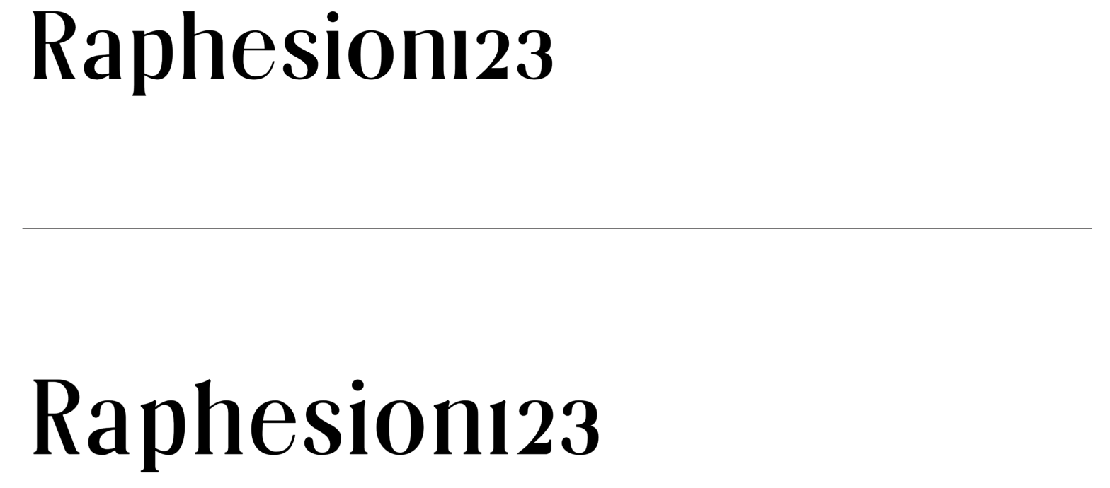
Villeneuf
Student: Rita SoaresClassification: Transitional Serif with Garalde InfluencesVariation Axis: Weight (with high stroke contrast) Villeneuf is a Transitional display typeface with Garalde influences, developed by a student in the 2024–25 Typeface Design course at FBAUP. The project reinterprets the historical JVilleneuve typeface (2006) by Portuguese sculptor and typographer Manuel Pereira da Silva, blending its heritage…
-
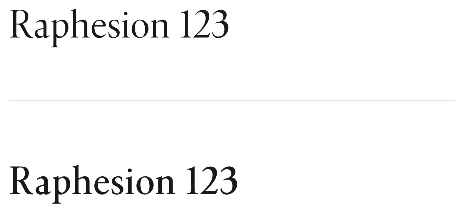
Unnamed
Student: Julien LimaClassification: Transitional Serif (Vox-Atypi)Variation Axis: Weight (Regular–SemiBold) Unnamed is a transitional serif typeface designed by a student in the 2024–25 Typeface Design course at FBAUP. Inspired by Minion Pro, it pays homage to late 18th-century Neoclassical serif types while aiming for balance, legibility, and editorial versatility. Conceived initially in Regular (400) and interpolated…
-
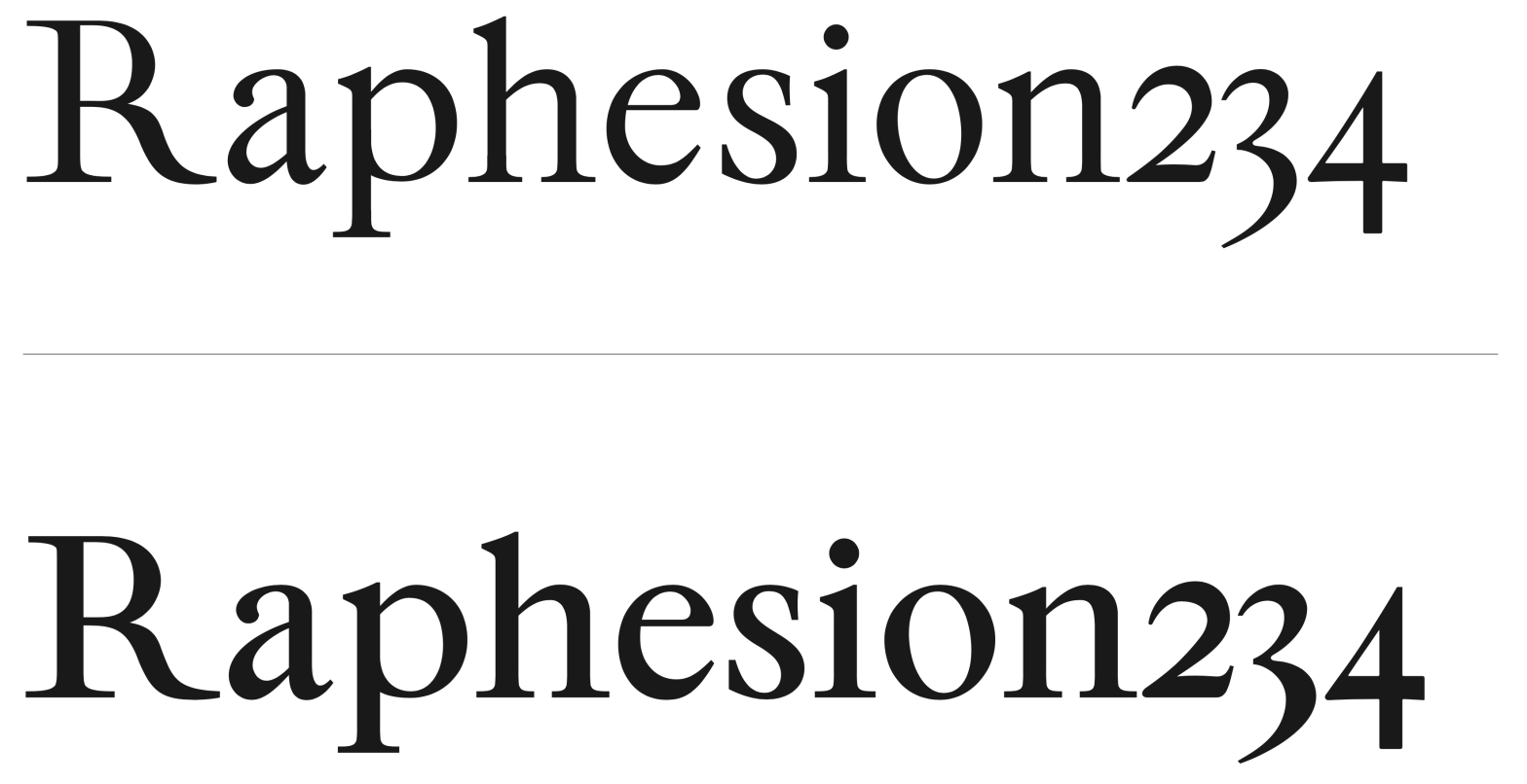
Cunty
Student: João TomásClassification: Modern Serif (Didone, Vox-Atypi)Variation Axis: Weight (Regular–Bold) Cunty is a modern serif display typeface that draws inspiration from Bodoni and PP Editorial New, embracing the high contrast and vertical stress typical of Didone models. Designed by a student in the 2024–25 Typeface Design course at FBAUP, the typeface introduces a more fluid…
-
Ogee Curves
This is a character design pattern learned last week during John Stevens Capital’s Immersion Class — the Ogee Curve. Stevens used it to describe the small inward cup, or “dip” present in the Monumental Capital (AKA Trajan) top stem serif.