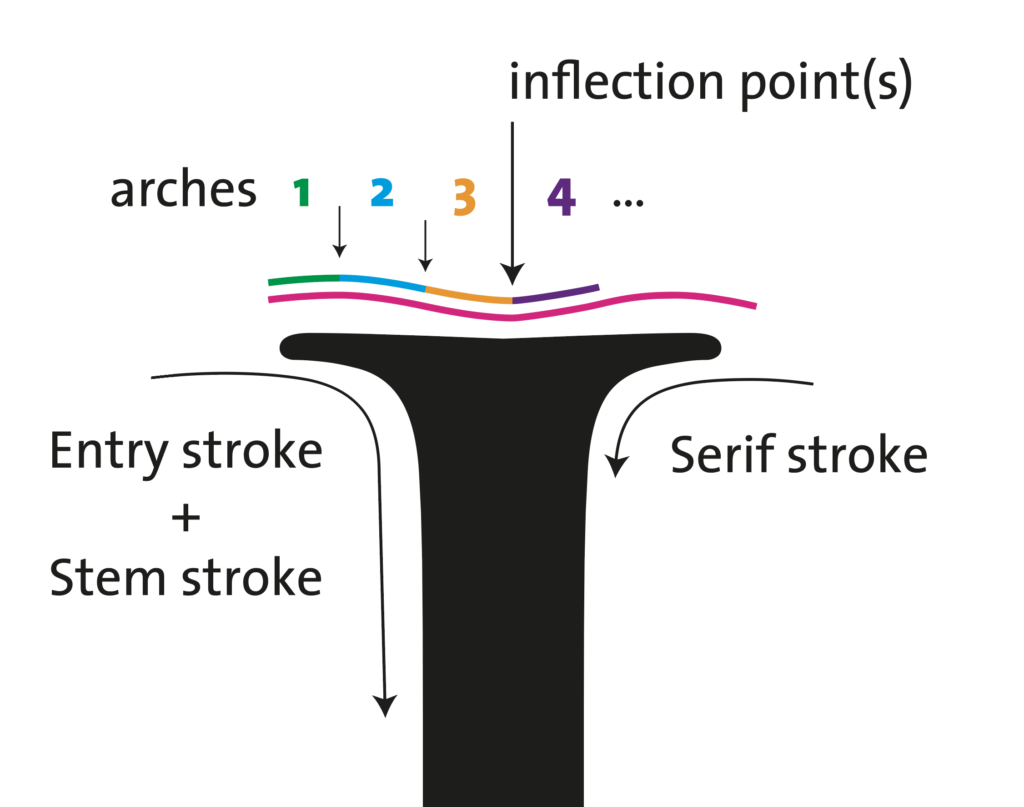
This is a character design pattern learned last week during John Stevens Capital’s Immersion Class — the Ogee Curve. Stevens used it to describe the small inward cup, or “dip” present in the Monumental Capital (AKA Trajan) top stem serif.
When googling this term, it appears to be a common term used in architecture to describe a complex double-curved shape made up of two arches in opposing directions, that produce inflection points:
…the predominant name given to objects, patterns, arches, elements, and curves that have a distinctive S-shape with an upper inward curve and a lower outward curve…
https://study.com/learn/lesson/ogee-arches.html
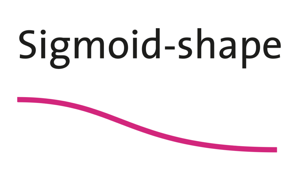
…name given to objects, elements, and curves—often seen in architecture and building trades—that have been variously described as serpentine-, extended S-, or sigmoid-shaped. Ogees consist of a “double curve”, the combination of two semicircular curves or arcs that, as a result of a point of inflection from concave to convex or vice versa, have ends of the overall curve that point in opposite directions (and have tangents that are approximately parallel)
https://en.wikipedia.org/wiki/Ogee
As always, the Wikipedia description is pretty thorough, but without the diagrams or explanations, it’s very abstract.
On a first interpretation, the spine [stem] of the S is basically an Ogee curve. It consists of two opposing arches with an inflection point. Having drawn enough S characters up until now, this is a very basic rendition of the spine of the S. We know and need more arches/contour points to get that counter-curve right. So, I’d leave the S out of this for now.
Following the definition, and coming back to the cupped serif dip shape John Stevens was mentioning in the Roman Capital letter, we’ll consider a horizontal double curve or counter-curve.
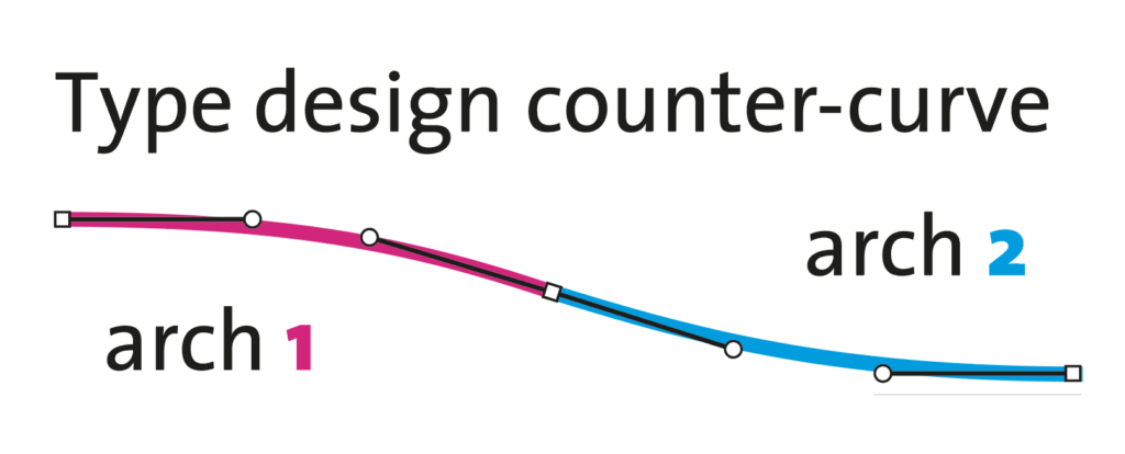
In type design, we have to use 2 arches to make a technically-correct counter curve.
This is still a “valid” Sigmoid or Ogee Curve.
But, coming back to Steven’s explanation, the topmost serif cup on the roman capital stem is not a simple Ogee. I believe he was mentioning it for the sake of clarity. Or at least simplicity in the explanation of drawing it with a pen or a brush, as the top part of the stem retains a small “dip” like inflection as the result of pulling the brush while rotating it. And, to avoid the swelling of the transition, we should avoid having the serifs on the horizontal, but slightly angled above the cap height and pointing inwards/downwards toward the stem. This produces cleaner transitions and more elegant tapered letters. In the end, I believe he was pointing this out just for us to learn how to “see” this dip as a smooth, continuous shape. And not a “notch” or vertex that you kind of get if you’re too “robotic” on your design.
Nevertheless, in the end, it’s impossible to get a single Ogee Curve… Even If you’d only design the arches 2-3 and 4-5 (see figure above) like you do when you draw them with a brush or pen.
Because, when you think of it, the topmost serif —at least when you have to vectorize it— has to be designed with two or more Ogee Curves, as each side’s serif stroke is actually an Ogee Curve by itself…. Probably he was referring to the dip produced by the transition from arch 3 to 4. But then it wouldn’t be an Ogee…
Anyway, one or two ogee discussions aside, I believe this is an original, interesting, and specific enough description to be referenced as a character design pattern. I will be referencing it during classes, and I suspect I will come back to it later in this section.