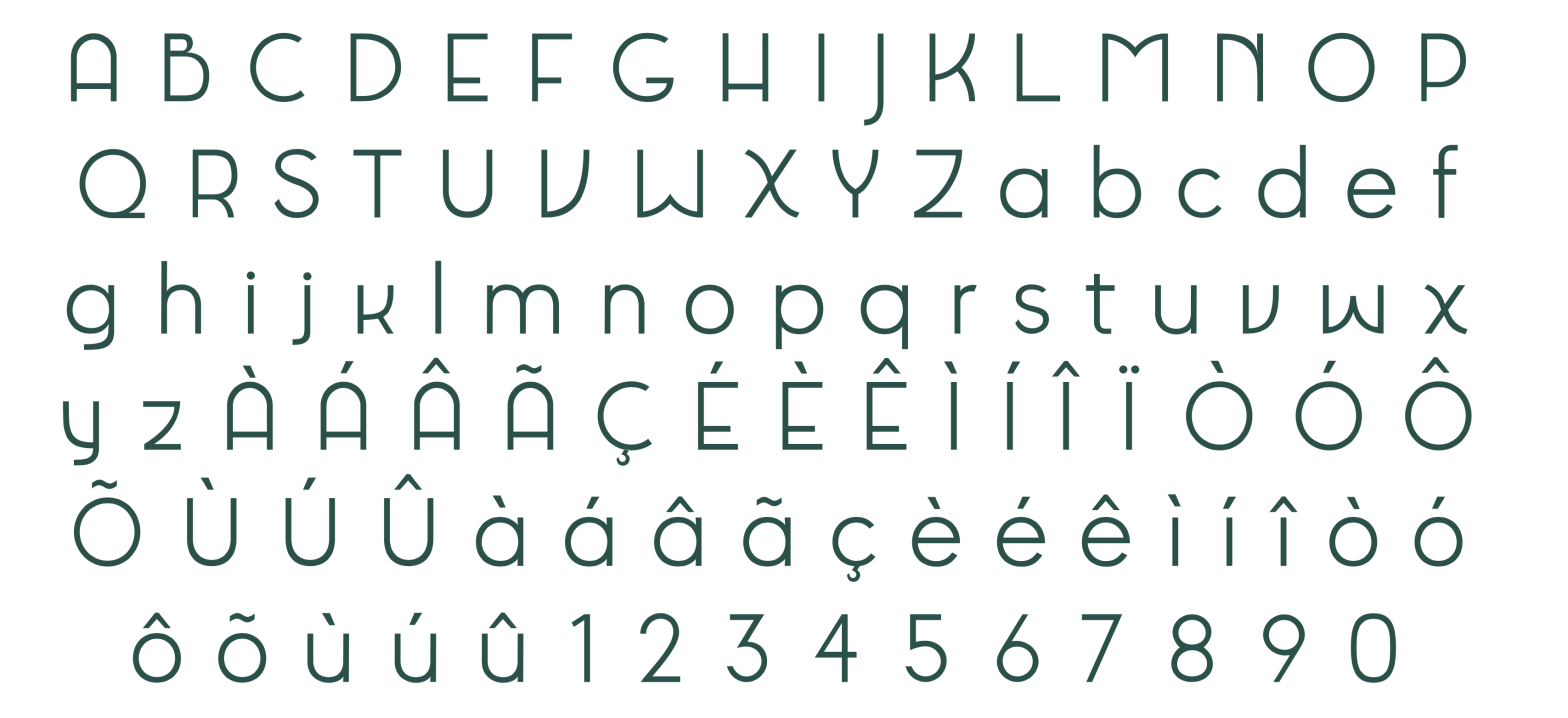
Tia Déco is a geometric sans serif typeface with strong Art Deco influences, designed by Alexandra Aidos, Fátima Ribeiro, and Francisca Paixão in 2024.
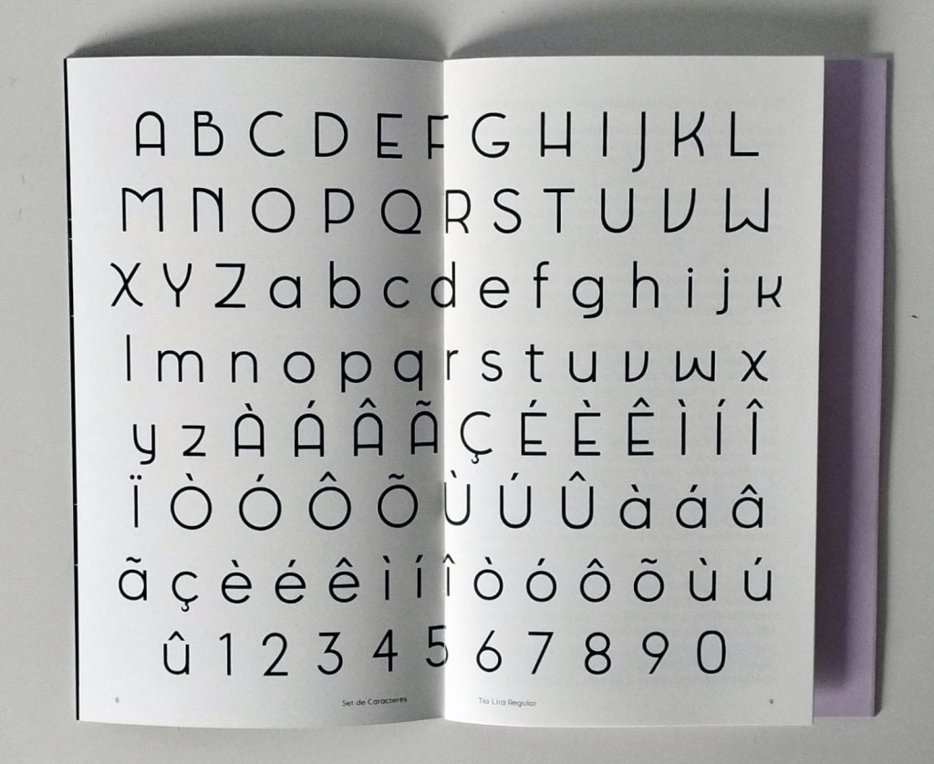
Tia Déco is a modern reinterpretation of Tia Lira, an experimental geometric typeface originally designed by Manuel Pereira da Silva in 2003. Drawing inspiration from the visual language of the Art Deco movement and early 20th-century design, this revival enhances and updates the original’s distinct identity for 21st-century applications.
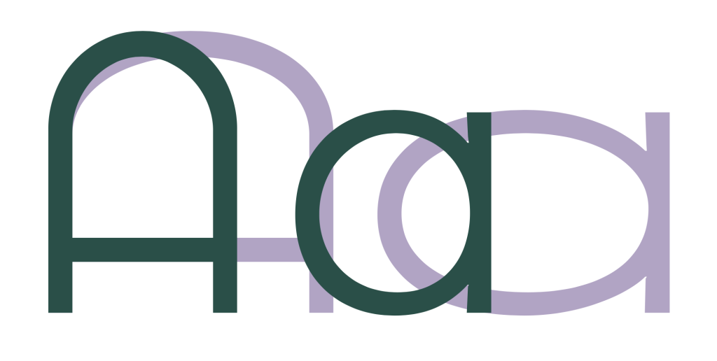
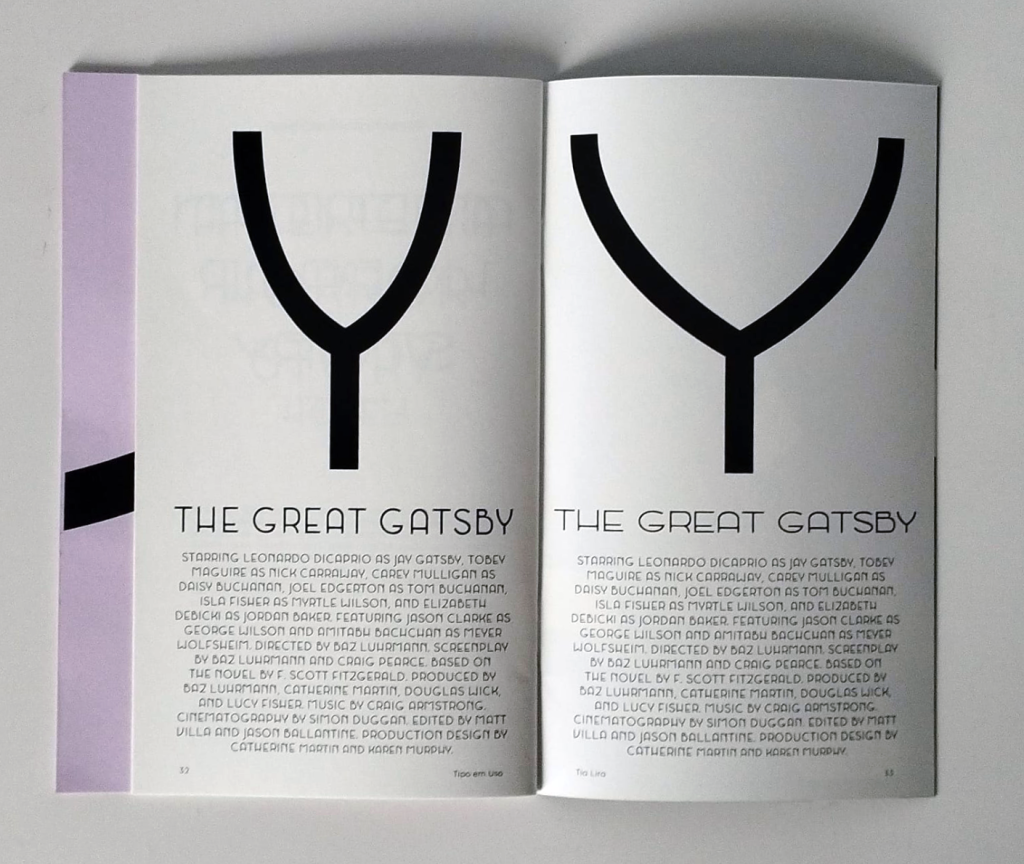
Influenced by the structural elegance of Kabel (Rudolf Koch, 1927), Tia Déco adopts a minimalist sans serif construction with bold stylistic gestures. It features reduced contrast, geometric rigidity, and carefully calculated flare in selected uppercase characters — such as “M,” “N,” “K,” and “X” — that add flair without sacrificing clarity.
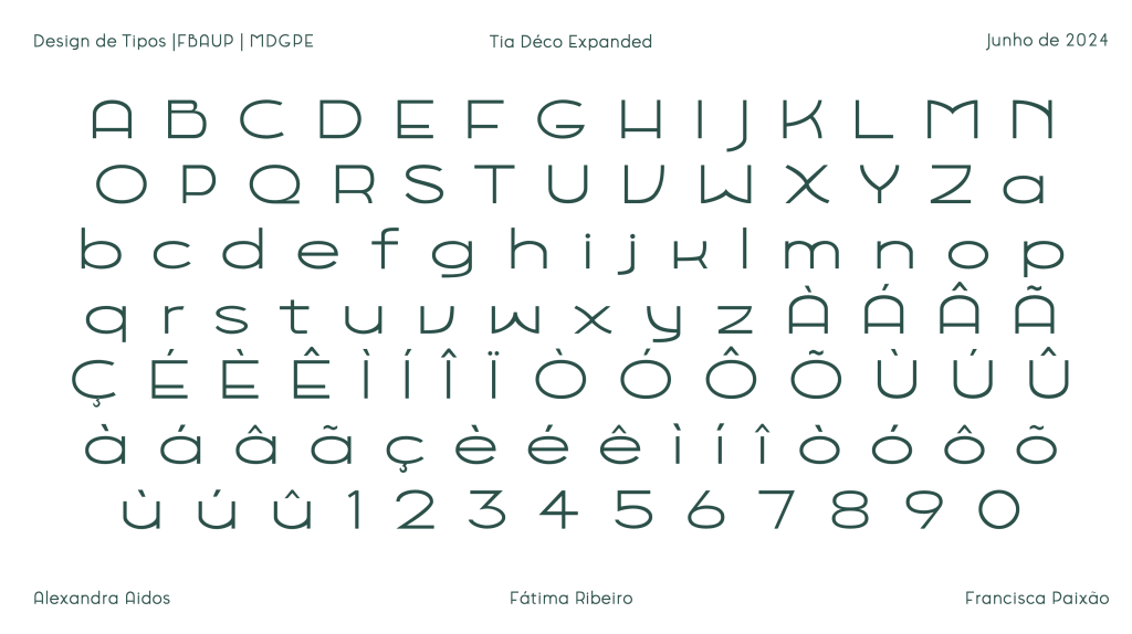
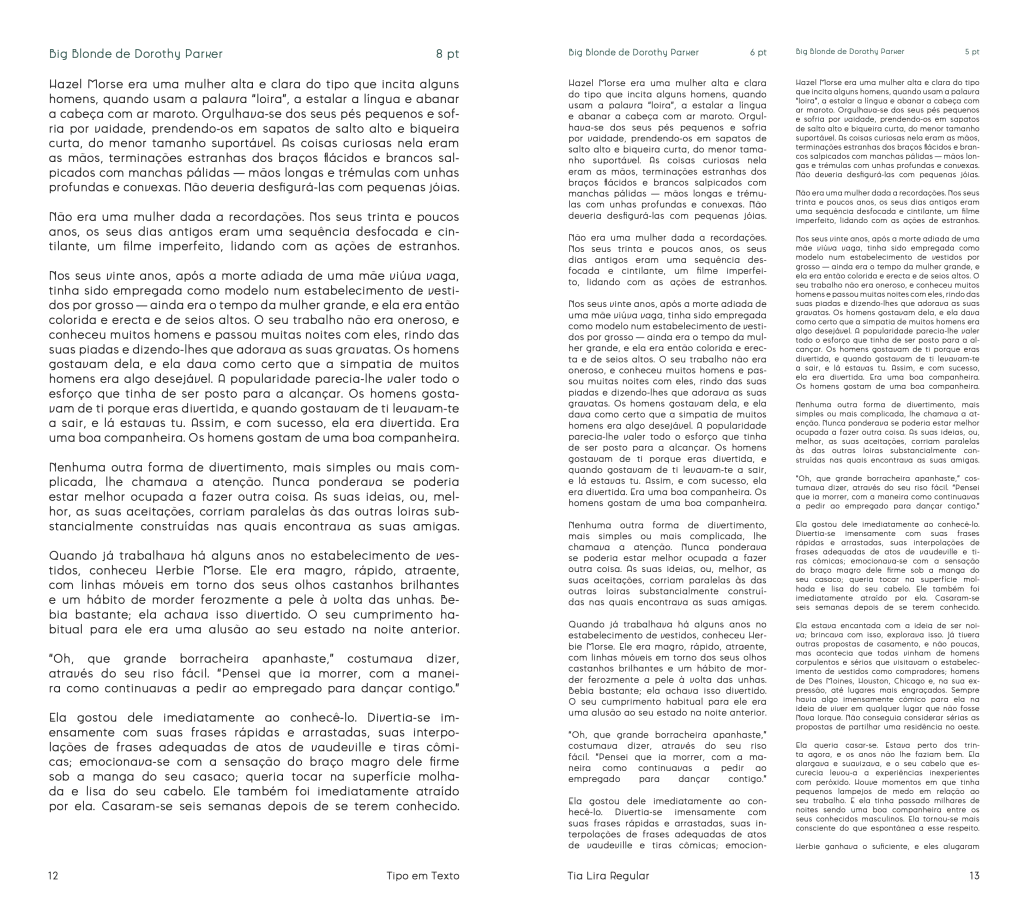
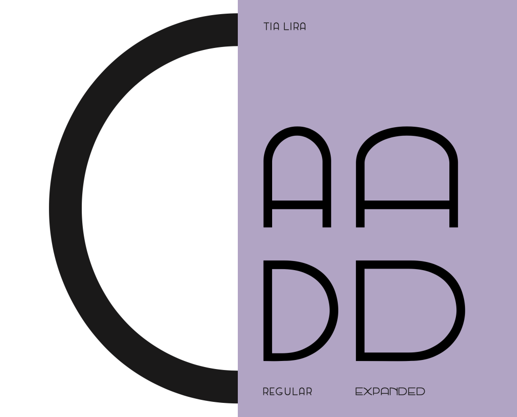
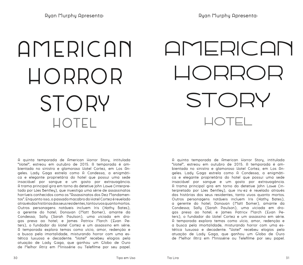
Designed as a variable font, Tia Déco includes a width axis, offering both a standard version and an expanded style that exaggerates horizontal proportions for impactful display use. This flexibility enables the typeface to function across both editorial body text and bold typographic headlines, combining expressive personality with editorial discipline.
Balancing legibility and distinctiveness, Tia Déco bridges the historical sophistication of Art Deco with the demands of contemporary design, making it ideal for branding, book covers, and visual identities that seek to evoke elegance with a playful twist.
See the full specimen booklet here: