
Following an extensive introductory overview of typographic history and the evolution of letterforms over the last 500 years, the Course Exercise 1 initiates the curriculum by requiring students to conduct a comprehensive morphological and structural analysis of a typeface of their choosing.

The analytical framework demands a structured layout—typically utilizing a visual illustration on the top half of the page and a detailed textual analysis on the bottom half. Students evaluate macro-structural elements—such as axis inclination, contrast modulation, proportions (x-height versus body), and curve tension—alongside micro-details, including serif structures, terminal joins, crossbar angles, counter apertures, and specific glyph profiles (such as the g, a, R, and Q). Crucial to this analysis is the application of two classification systems: the classic Vox-ATypI historical framework, and the R-Vox (Responsive Vox) system—a modern, four-tier pedagogical model developed at FBAUP that uses a scalable, Cartesian approach to map typefaces based on visual features rather than rigid historical categories, providing the flexibility needed to handle contemporary and hybrid designs.
The objective is threefold: to deepen historical understanding of typographic developments; to sharpen critical observation of core archetypes; and to identify the visual, structural, and semantic properties that define distinct typographic styles. The resulting analytical plates map technical parameters—including stem thickness, stroke obliquity, stress, optical overshoots, and visual tapering—providing the formal criteria and vocabulary that grounded critical in-class discussions throughout the rest of the semester.
Structural Classifications & Case Studies
The submissions demonstrate an advanced level of formal observation and graphic execution. While highlighting specific individual plates is always a delicate exercise, certain layout compositions captured the exact intended analytical depth of the assignment with exceptional clarity.
1. Modernist Neutrality & Systemic Grotesques
- Hugo Costa (LL Unica77): Delivered a highly successful, rigorous layout composition focusing on Lineto’s LL Unica77. The analysis mapped optical compensations, counterspaces, and proportional widths, establishing a contemporary baseline utilized by peer groups in subsequent semester projects.
- Vitor Almeida (ABC Monument Grotesk): Documented the raw, unpolished, and idiosyncratic shapes of early grotesque source material (the 1884 Palmer & Rey specimen) transitioned into contemporary digital cuts, including Mono and Semi-Mono weights.
- Andreia Catarina (Helvetica): Produced a structured anatomical breakdown of the Haas Type Foundry’s 1957 classic, focusing on structural neutrality, optical adjustments, and systematic homogeneity within the neo-grotesque paradigm.

2. Rationalism, Contrast, and Hybrid Execution
- Leonor Carvalho (Trump Mediaeval): Achieved an exemplary layout balance, utilizing precise diagramming and detailed structural pull-outs to analyze the “humanist modern” tension of Georg Trump’s 1954 design.
- Marta Cabral (EK Roumald): Delivered a highly organized layout characterized by clear anatomical extractions and a thorough text. The study successfully parsed Erkin Karamemet’s interpretation of 19th-century Scotch Roman and Century archetypes, highlighting the technical constraints and rounded ink traps driven by contemporary CNC router production.
- Arabela Nunes (Filosofia): Compiled a comprehensive study of Zuzana Licko’s 1996 interpretation of Bodoni. The plate contextualized Emigre’s pioneering role in digital font production and its contemporary reinterpretation of classical Didone models through reduced vertical contrast and geometric symmetry.
3. Historical Lineage & Expressive Display
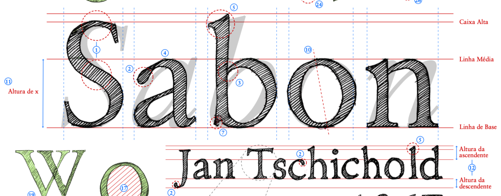
- Ana Rita Ribeiro (Sabon): Systematically traced the calligraphic heritage within Jan Tschichold’s 1967 Sabon. The analysis detailed its Renaissance Garalde archetype, stroke intersections, the specific descender profile of the italic f, and the modulation of its teardrop terminals.
- Inês Pinheiro (Cooper*): Provided a clear dissection of the formal, fluid variations within Owen Earl’s digital revival of Oswald Bruce Cooper’s iconic 1922 Oldstyle family, tracking its Art Nouveau influences and heavy, rounded structures.
- Rafaela Ribeiro (ABC Otto): Mapped out Sam de Groot & Laura Opsomer Mironov’s 2024 typeface across its entire character set. While this exhaustive overview resulted in a less compact layout for this specific format, the systematic approach effectively prepared the student for the broader technical production frameworks encountered in the later stages of the course.
These are but a few of the highlighted results posted and discussed upon the classroom wall. The exemplary analytical precision achieved in these plates set a rigorous standard for the practical type design phases that followed.
Acknowledgement & Transparency Note: This synthesis and its was compiled, structured, and edited with the assistance of Google Gemini 3.5 Pro, according to the course syllabus, assignment and evaluation criteria.