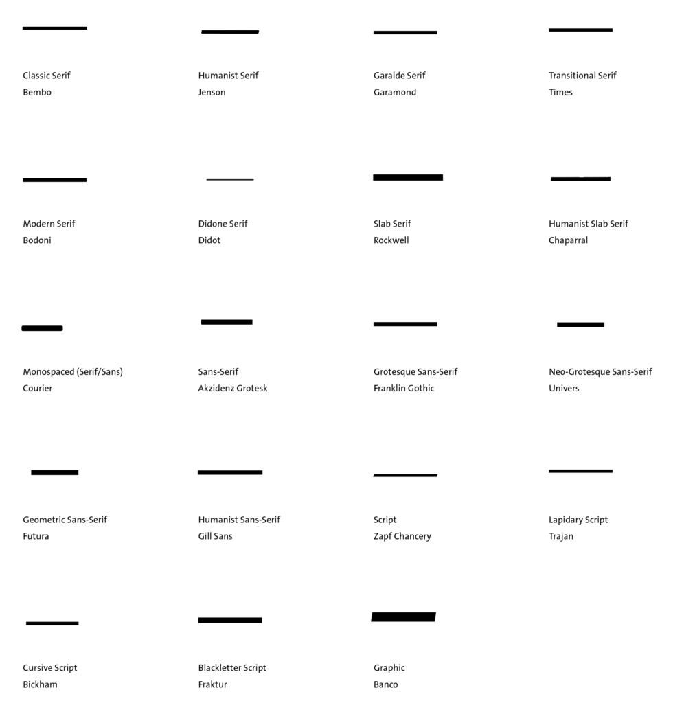
The Em Dash is a long horizontal stroke or rule[r] that follows the same typographic expression of the typeface: weight, contrast, stress, and terminals.
This means that in specific cases (eg. Humanist, Monospace, Script of Graphic) its terminals might be angled.
It is vertically centered on the lowercase characters and has the width of the Em Square. In a few examples, it has a thin hairline space in the sidebearings.