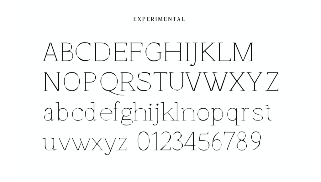
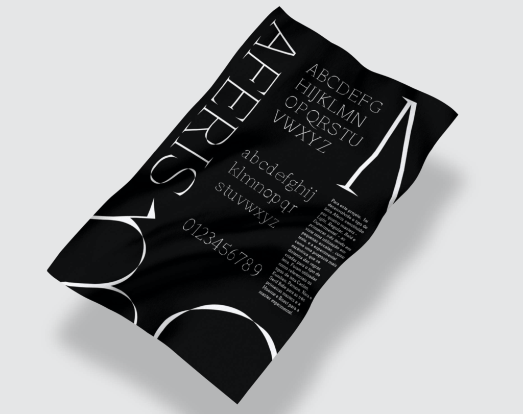
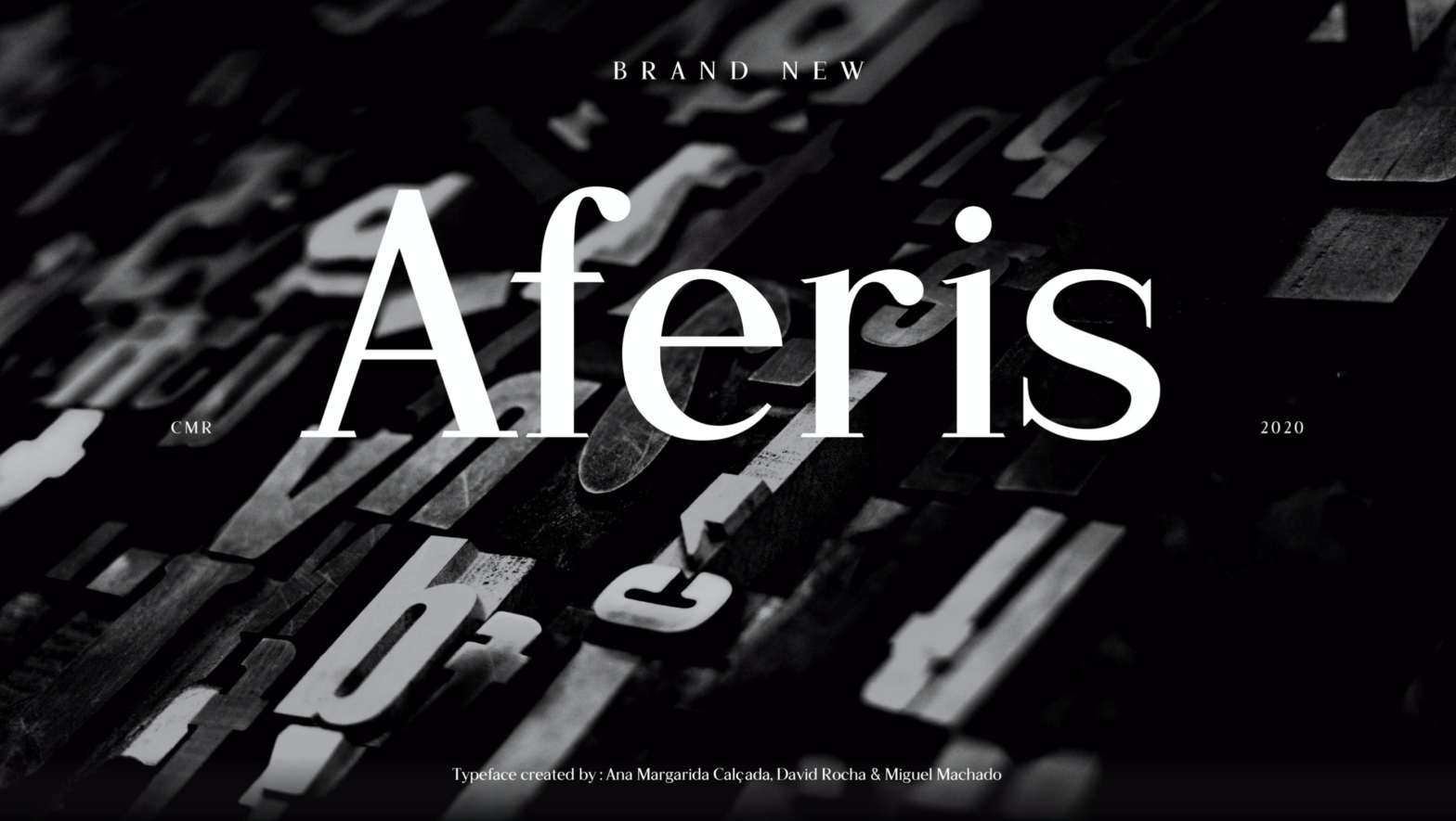
The Aferis variable font consists of a multi-weight serif typeface, whose name is a playful anagram from “Serif”. It presents an Experimental axis in defiance of the “Type for text” briefing. Designed by Ana Margarida Calçada, David Rocha and Miguel Machado in 2020.

The first three masters in the weight axis are intended for small scales, such as running text. And the fourth is intended to be used in a more experimental context, as a more eccentric proposal that distances itself from the rules created for the font.

The intention was to create a modern font, with a pronounced contrast. This work reinterprets and takes some of its features from Caslon and Kumlien (as historical references), Parnaso (as a national reference from Mário Feliciano), Nara and Serif Babe as more contemporary references. Hoome and Bisect typefaces directly inspired the creation of the experimental master.
