Student: Lília Amaro
Classification: Hybrid Sans Serif — Geometric, Neo-Grotesque, and Neo-Humanist
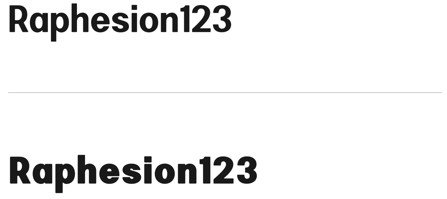
Variation Axis: Weight (emphasis on bold interpolation)
Bili is a hybrid sans serif display typeface designed by a student in the 2024–25 Typeface Design course at FBAUP. It merges characteristics from three typographic traditions — geometric sans, neo-grotesque, and neo-humanist — resulting in a visually balanced, structurally refined design with broad display applications.
The typeface is grounded in rational, 20th-century geometric principles, beginning with simple shapes that evolve into a slightly condensed, contemporary form. Drawing on the clear and functional aesthetics of 1950s Swiss design, Bili integrates neo-humanist features such as soft stroke variation and calligraphic fluency, culminating in rounded corners that soften its overall tone.

This fusion gives Bili its distinctive voice: bold and impactful, yet smooth and easy on the eyes. The variable weight axis supports dynamic visual presence, making the typeface especially effective for headlines and key messaging in both print and digital environments.