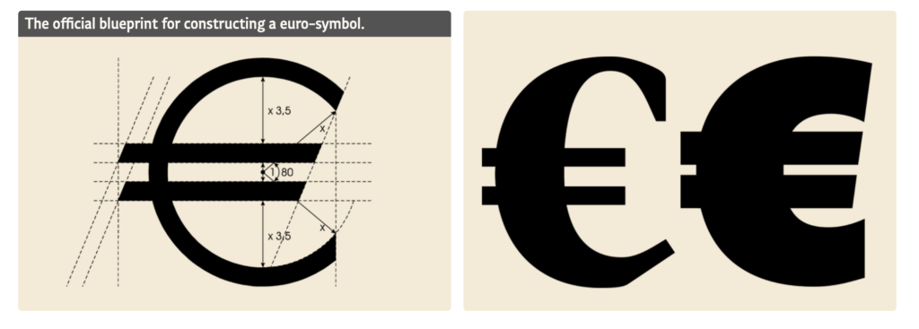
Wouldn’t it be great if a Type Designer worked at the European Union?
Some thirty draft designs for a euro currency symbol were drawn up internally by the European Commission (…) Microsoft and other vendors have chosen to make glyphs for the symbol to be font and style specific (…) to make the euro symbol the correct width for the Arial and Times New Roman fonts, the design had to be condensed compared to the European Commission design specification. This same design principle is recommended for currency symbols in general…
https://docs.microsoft.com/en-us/typography/develop/euro
More about the Euro: