Maenad was one of the typeface projects developed during the 2020 semester. Designed and developed as a variable font by Ana Silva, Eva Halfers, and Teresa Zagalo.
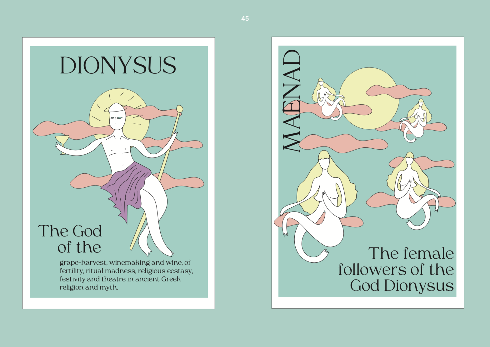
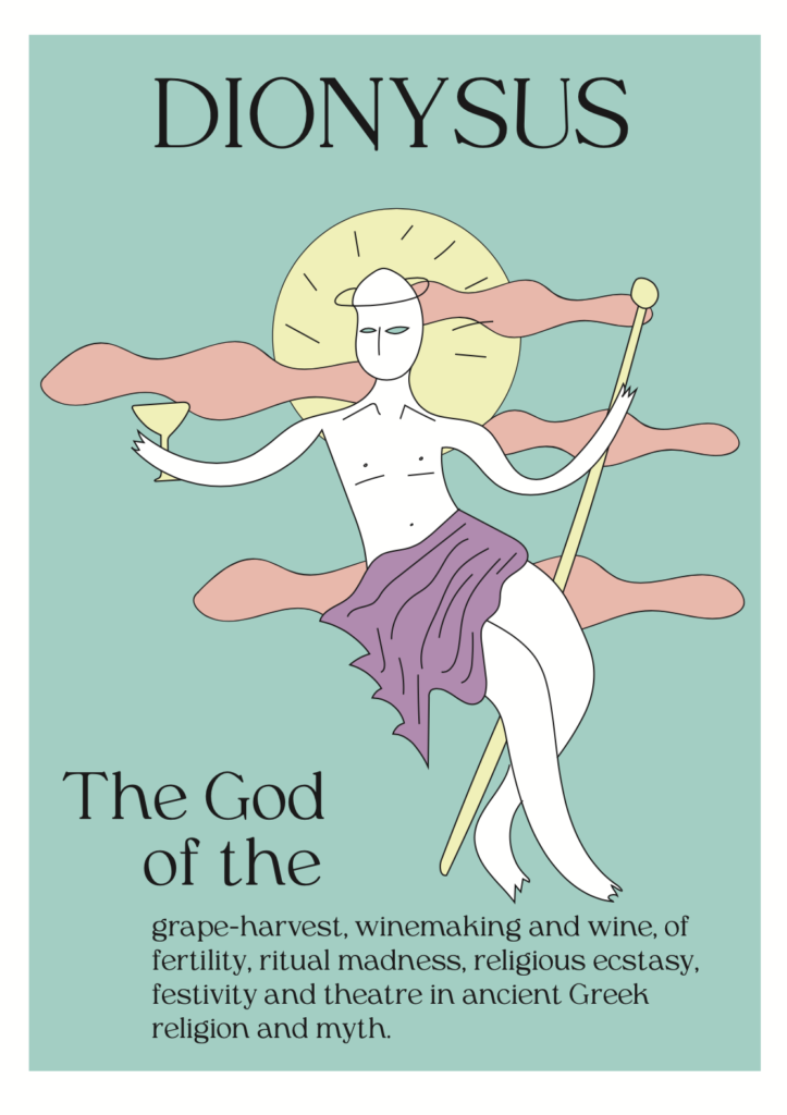
”Maenad” is a revival serif transitional text typeface based on Windsor and Americana typefaces. The concept was bringing the display feeling of the Windsor within the Americana. So as a revival type exercise, Windsor became our main reference for the typeface and Americana acts as a secondary one (…). In this way, greek mythology comes to our mind as an out-of-this-world natural ambient that fits perfectly in the typeface we have developed. So we named our typeface “Maenad” which means the female followers of Dionysus (…) Their name translated literally means “raving ones”.
Adapted excerpt from the final presentation
As part of their research, not only Windsor and Americana were researched. Additional typefaces and type designers were part of their raving research, such as Gliko from Rui Abreu, Francisco Torres & Catarina Vaz; Recoleta from Oswald Bruce Cooper (Latinotype); Egmont from Sjoerd Hendriks de Roos.
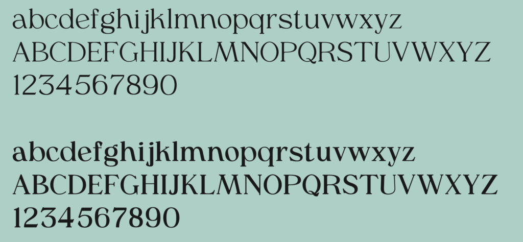
As a result, they’ve interpreted the original feeling of Windsor and incorporated a few additional and more contemporary attributes.
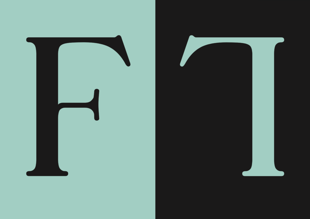
When partly working on a revival of Windsor we agreed that we had to keep the experimental spirit in our typeface. We conclude that we did this with awareness in order to understand what ‘rules’ we would break in our design. This resulted in us expanding the boundaries of a text type a little bit towards a display type. We are very pleased with our final result, as it not only shows input from Windsor and Americana but also from ourselves.