Student: André do Carmo Gonçalves
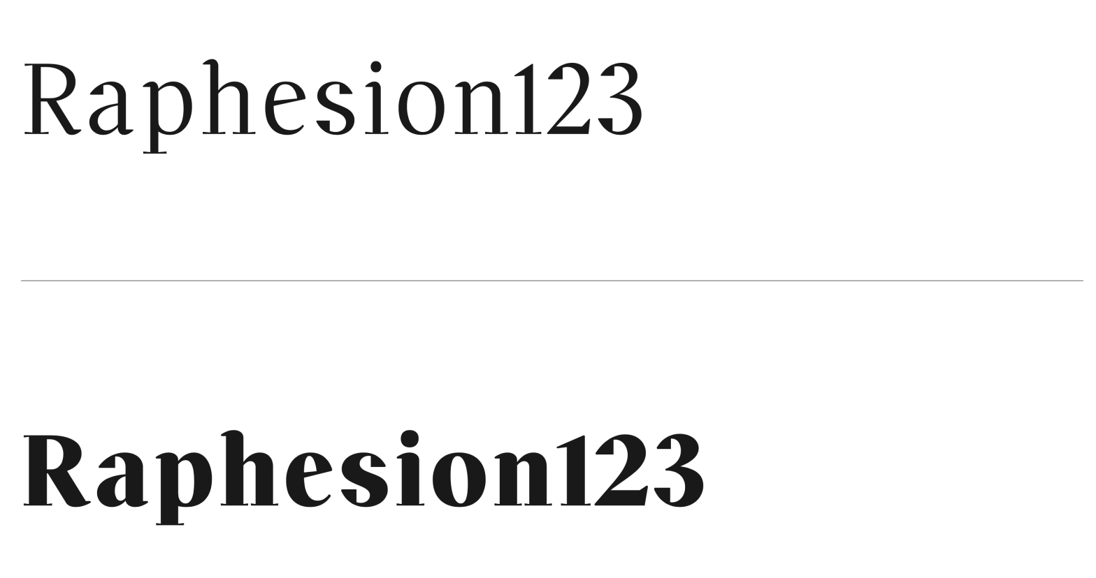
Classification: Didone (Modern Serif – R-Vox)
Variation Axis: Weight (5 instances: Regular to ExtraBold)
Off Serif is a high-contrast, modern serif display typeface developed as part of an assignment exploring the stroke theory of Gerrit Noordzij. While rooted in the foundational hand, it deliberately deviates from tradition to evoke a delicate balance between familiarity and strangeness — making it adaptable to diverse yet non-specific design contexts.
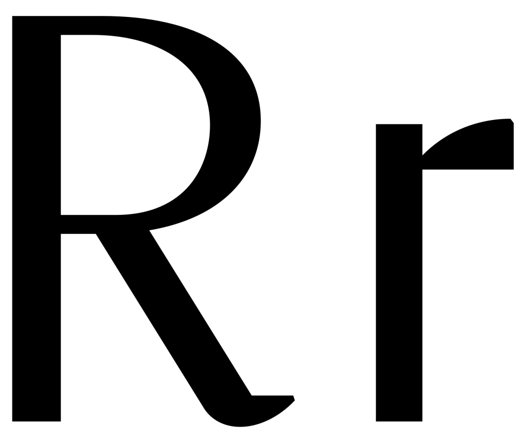
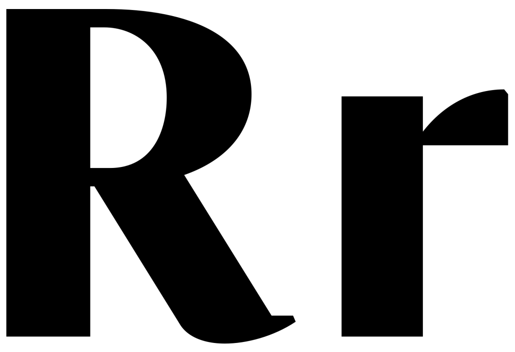
With a narrow width and sharp personality, Off Serif features thin, inverted serifs and rectangular, weighty terminals, particularly evident at higher weights. These unique traits lend the typeface both elegance and tension, offering a fresh take on the Didone model through five weight variations: Regular, Medium, SemiBold, Bold, and ExtraBold.