Student: Luís Lopes
Classification: Geometric Serif (Modern/Didone with Art Nouveau influences)
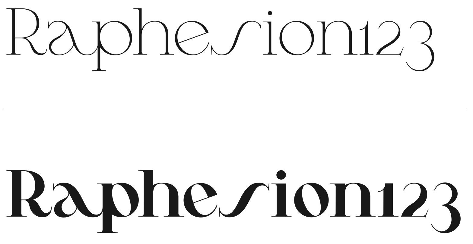
Variation Axis: Weight (Regular–Bold)
Pena is a geometric serif display typeface designed by a student in the 2024–25 Typeface Design course at FBAUP. The project explores revivalism through juxtaposition, blending 1920s Portuguese typographic aesthetics with the clarity and precision of contemporary digital design.
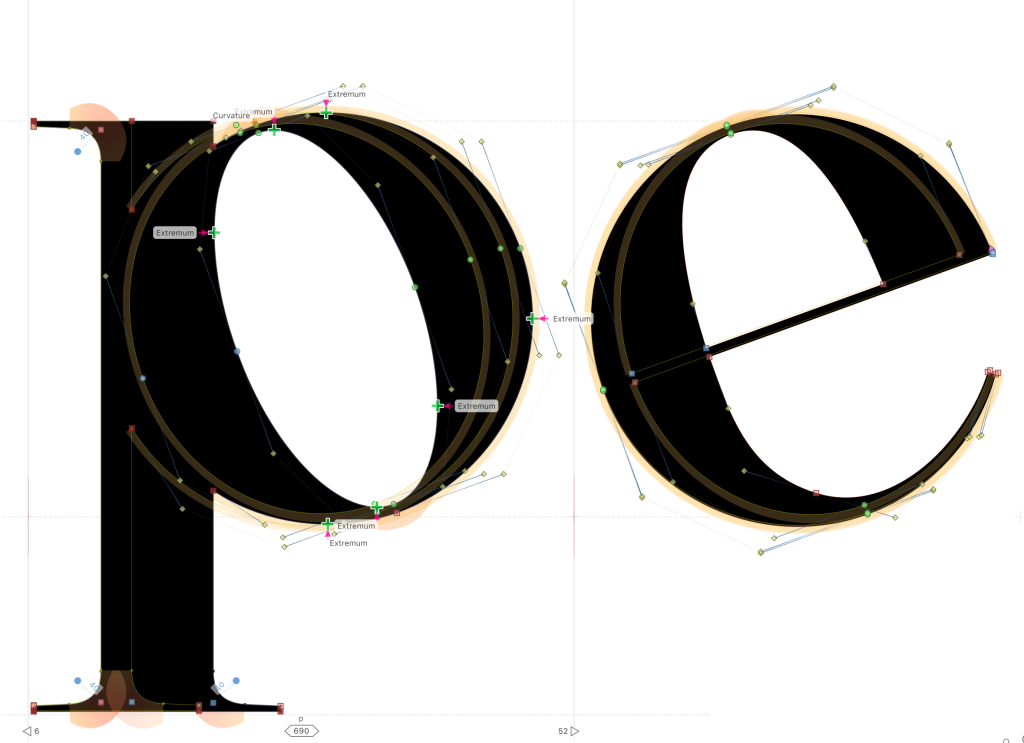
Rooted in the Modern/Didone tradition, Pena channels the sophistication and romanticism of early 20th-century letterforms — particularly those used in silent film intertitles and Art Nouveau-inspired editorial graphics — while integrating the minimalist discipline of modern typographic systems. This synthesis is especially apparent in the careful modulation of its geometric serifs and the elegance of its vertical stress.
The typeface spans from Regular (400) to Bold (700) in its variable axis, preserving a coherent structure while increasing visual weight. Pena is designed to capture attention in display settings, with an aesthetic that feels both nostalgic and fresh, ideal for cultural projects and expressive editorial work.