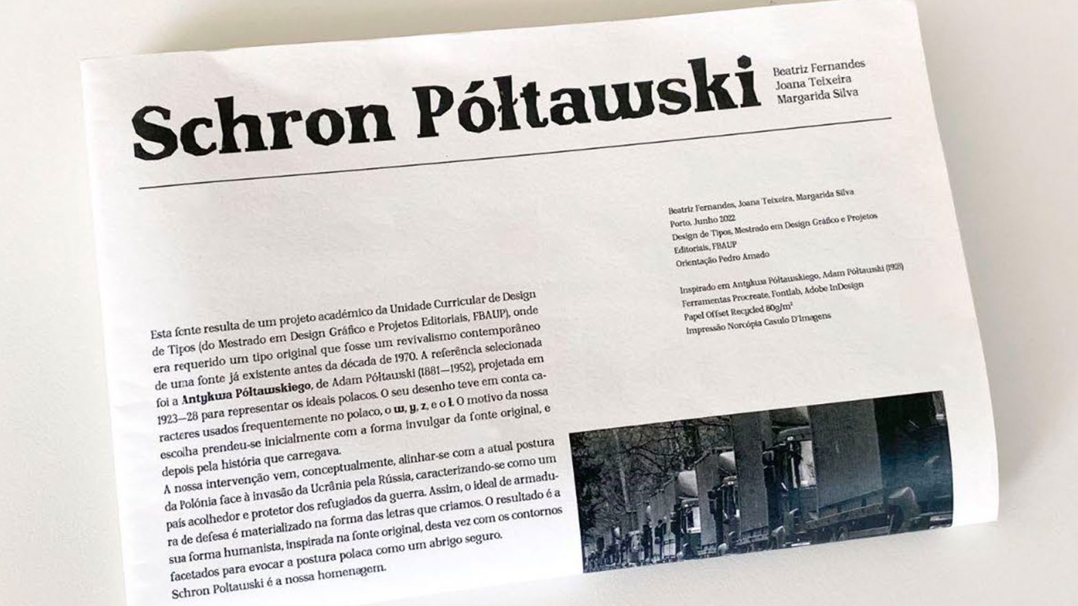
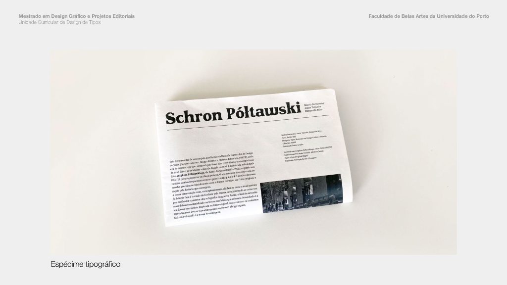
Schron Poltawski is based on a Glyphic (Old Style Geometric / Graphic or highly angled type of) typeface optimized for text and headlines, designed by Beatriz Fernandes, Joana Teixeira and Margarida Silva in 2022.
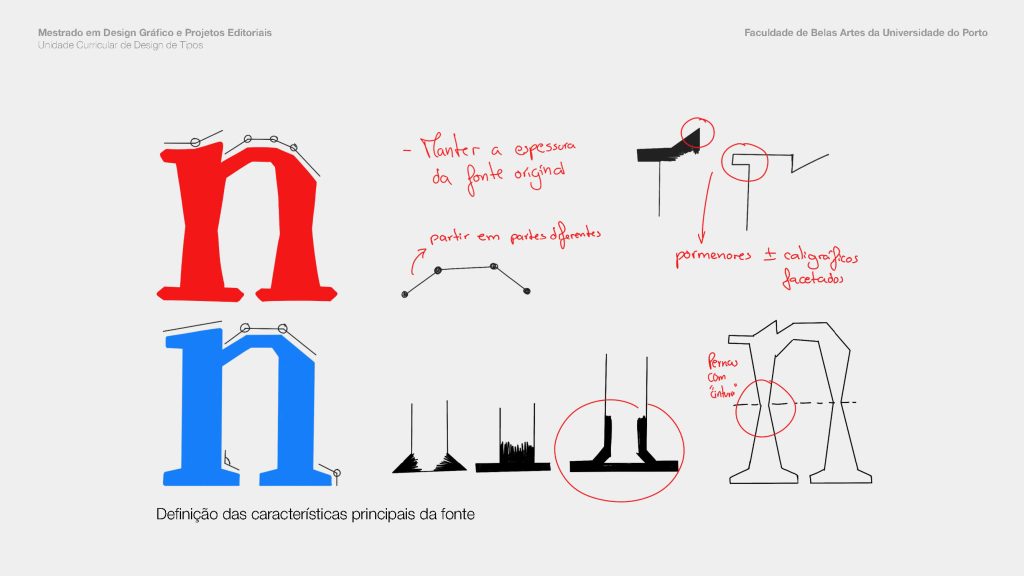
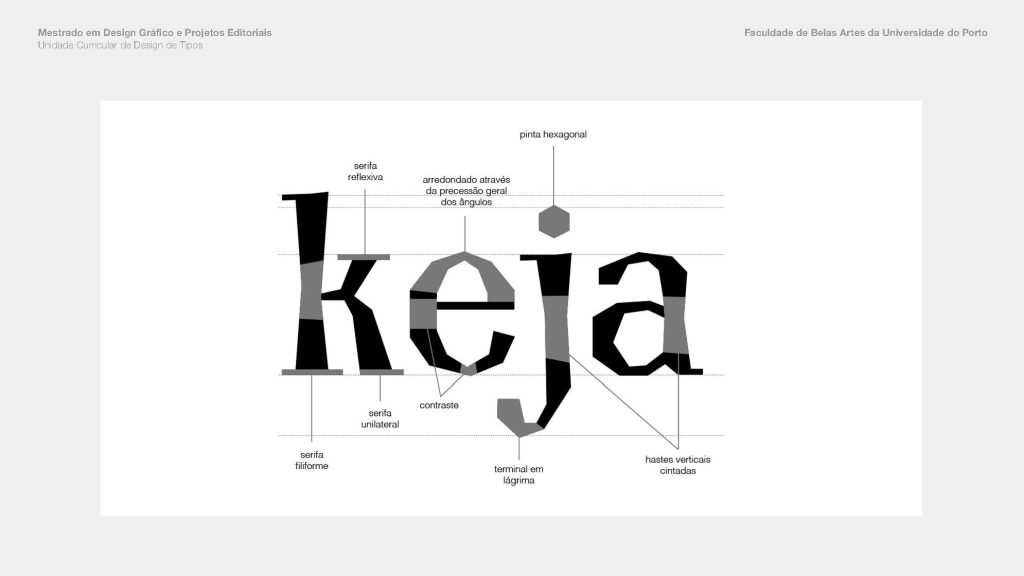
Detail of specimen anatomy details
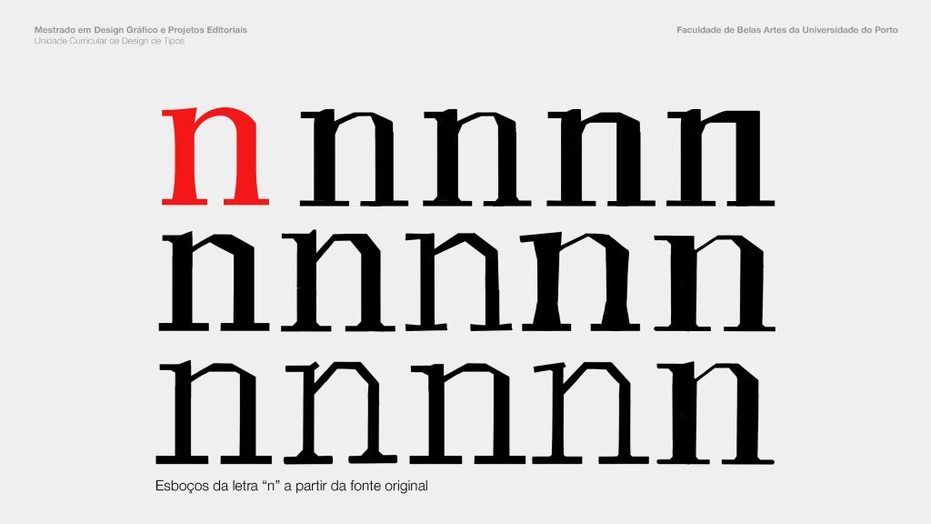
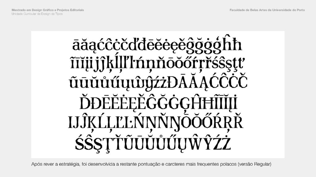
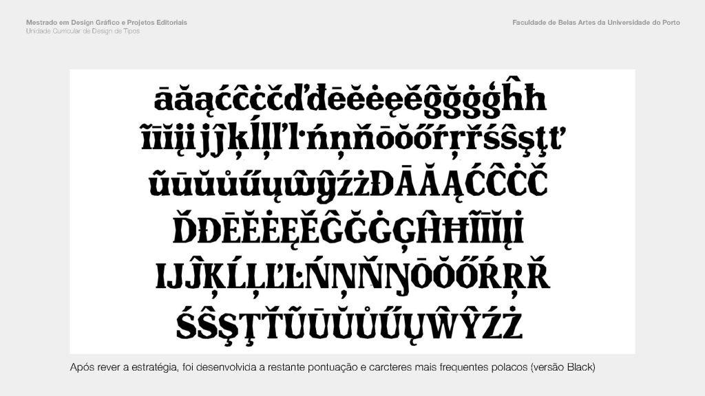
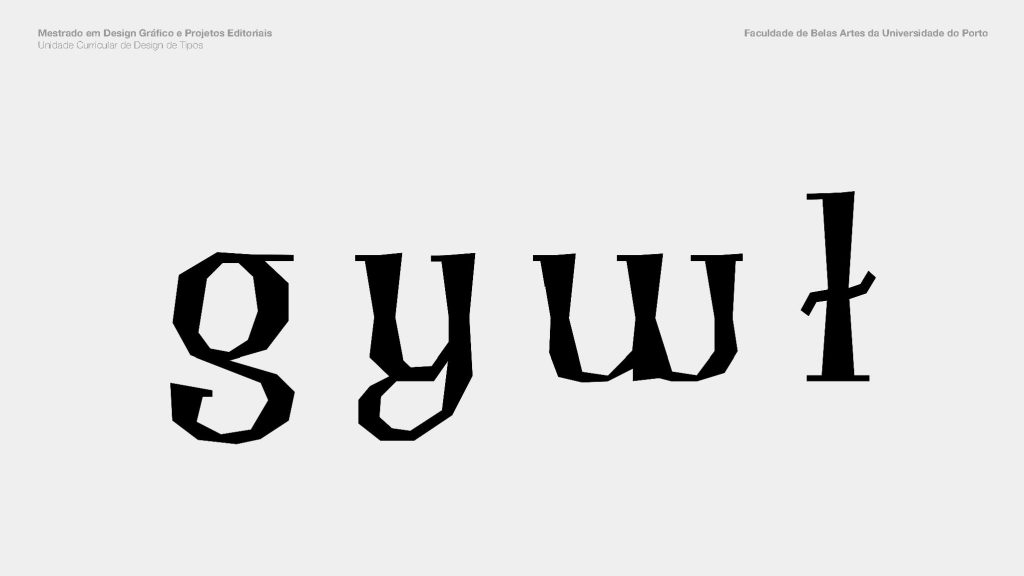
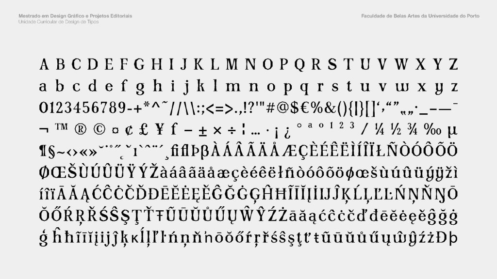
This font is the result of an academic project of the Curricular Unit of Type Design (from the Master in Graphic Design and Editorial Projects, FBAUP), where an original typeface was required that was a contemporary revival of a font that already existed before the 1970s. The selected reference was Antykwa Półtawskiego by Adam Półtawski (1881—1952), designed in 1923—28 to represent Polish ideals. His design considered characters frequently used in Polish, the ‘w’, ‘y’, ‘z’, and the ‘l’ slash.
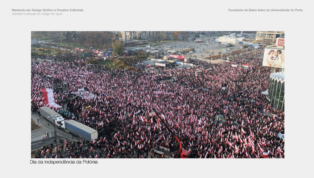
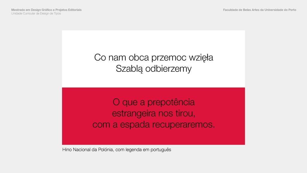
The reason for our choice was initially related to the unusual shape of the original font, and then to the history it carried. Our intervention is, conceptually, in line with Poland’s current position in the face of Russia’s invasion of Ukraine, characterizing itself as a country that welcomes and protects war refugees.
Thus, the ideal of defense armor is materialized in the form of the letters we create. The result is its humanistic form, inspired by the original font, this time with faceted contours to evoke the Polish stance as a safe haven. Schron Poltawski is our tribute.
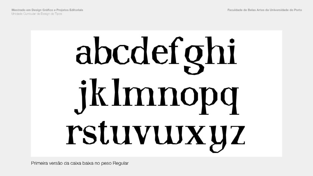
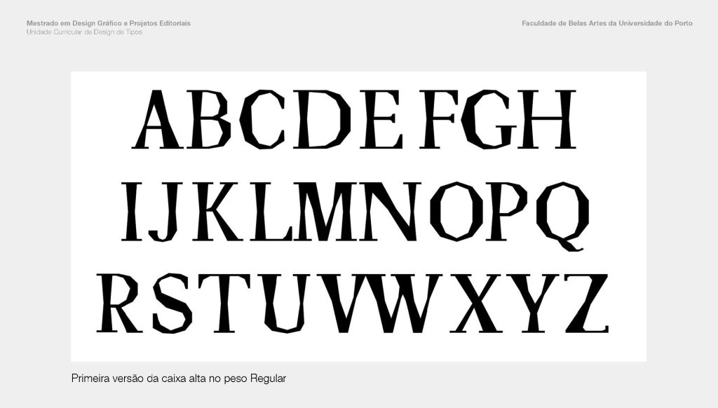
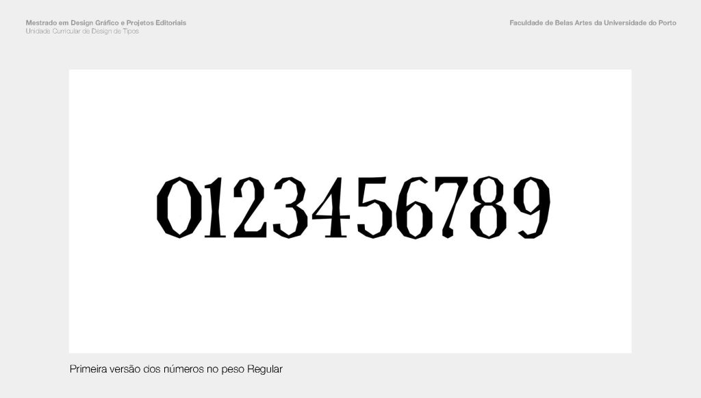
Adapted excerpt(s) and images from the final typeface group presentation