A nice new type from Filippos Fragkogiannis that reminds me of Kobalt, the final master’s project from Teresa Zagalo. Not only this is an interesting new font, but also the online specimen is very well put together. Free to download and use (if only there was a variable font version!…)
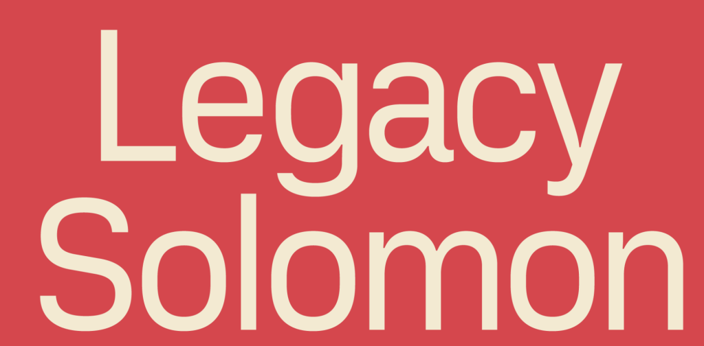
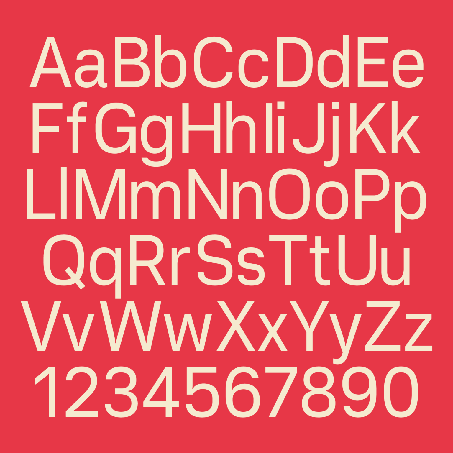
Vercetti is a sans serif font inspired by a humanistic design with a geometric touch. Its character structure is solid and moderately conventional, integrating smoothly into miscellaneous projects such as editorial design, branding, or advertising. It is also perfectly suitable for letterheads, website design, packaging, posters, and short texts.
Vercetti’s overall look is quite rectangular while preserving balanced proportions. These characteristics increase font legibility when being used in smaller sizes. Discrete ink traps contribute to the clarity and readability of the glyphs, even in narrow blocks of text.
From the project description. Read more at: https://filipposfragkogiannis.com/fonts/vercetti-regular/