
Kathow Sans is a geometric sans-serif typeface, designed by Filipa Moreira, João Cardoso, and Pedro Gil in 2024. Kathow Sans began as a revival project inspired by Manuel Pereira da Silva’s “Tia Lira,” but evolved into a distinctly original typeface influenced by classic geometric sans-serifs such as Adrian Frutiger’s Avenir and Journal Sans New from… Continue reading Kathow Sans
Tag: Sans
ManuEla
ManuEla is a modern sans-serif typeface, designed by Aurélia Ferreira, Maria Carlos, and Melissa Gaviria in 2024. ManuEla is more than a typeface—it’s a love letter. Named in tribute to Manuela, the wife of the late Portuguese typographer Manuel Pereira da Silva, the typeface honors her unseen but vital role in preserving Silva’s typographic legacy.… Continue reading ManuEla
Tia Viola

Tia Viola is a geometric sans serif typeface, designed by Christine Andres, Mafalda Ribeiro, and Sofia Silva in 2024. Tia Viola is a revival of Tia Lira (Bold), a typeface designed in 2004 by Portuguese sculptor and designer Manuel Pereira da Silva. With roots in geometric structure and typographic modernism, the original Tia Lira Bold… Continue reading Tia Viola
Fritura

Fritura is a geometric sans serif typeface, designed by Ana Leite, Daniel Sousa, and Rita Vieira in 2024. Fritura is a playful reinterpretation of two influential typefaces: Futura by Paul Renner (1927) and Tia Lira by Manuel Pereira da Silva (2004). It merges the clean, rational forms of Futura with the expressive, localized charm of… Continue reading Fritura
Pena
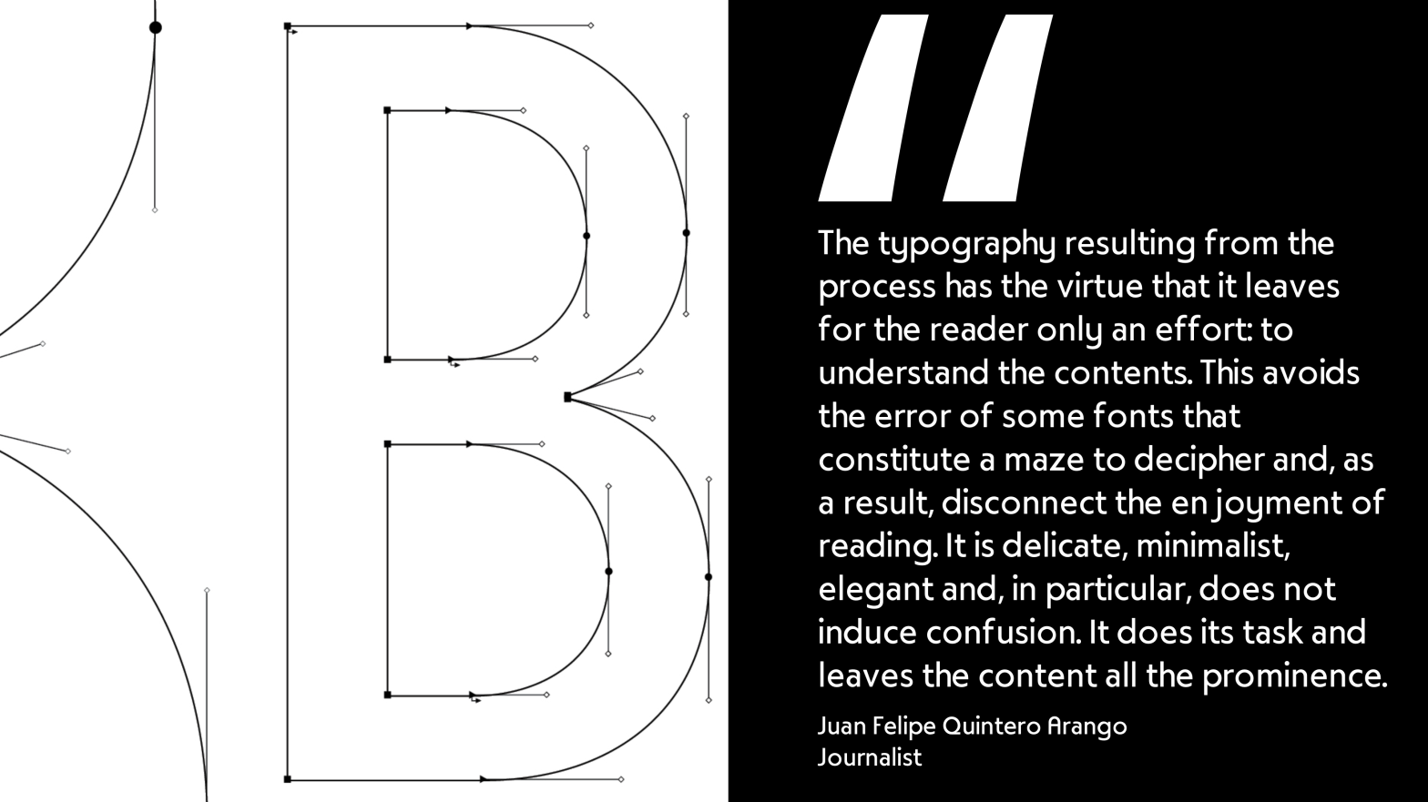
Student: Luís LopesClassification: Geometric Serif (Modern/Didone with Art Nouveau influences)Variation Axis: Weight (Regular–Bold) Pena is a geometric serif display typeface designed by a student in the 2024–25 Typeface Design course at FBAUP. The project explores revivalism through juxtaposition, blending 1920s Portuguese typographic aesthetics with the clarity and precision of contemporary digital design. Rooted in the… Continue reading Pena
Bili
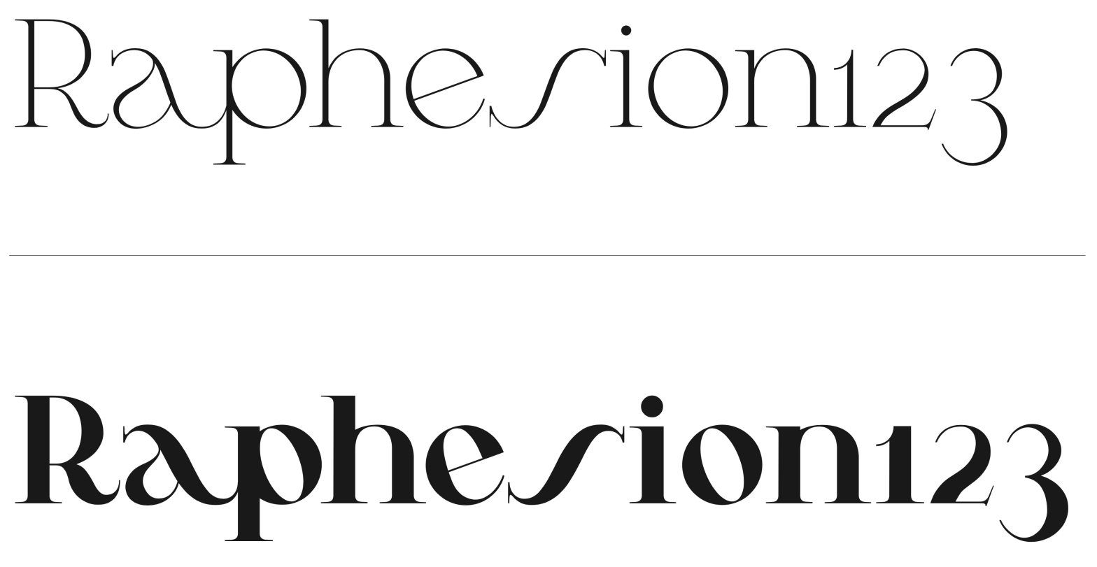
Student: Lília AmaroClassification: Hybrid Sans Serif — Geometric, Neo-Grotesque, and Neo-HumanistVariation Axis: Weight (emphasis on bold interpolation) Bili is a hybrid sans serif display typeface designed by a student in the 2024–25 Typeface Design course at FBAUP. It merges characteristics from three typographic traditions — geometric sans, neo-grotesque, and neo-humanist — resulting in a visually… Continue reading Bili
Cafuné

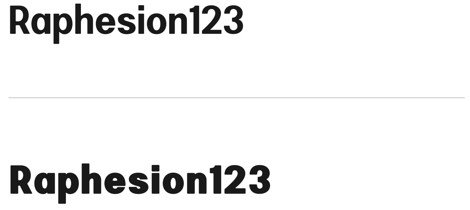
Student: Katharina Veronika FeddeClassification: Geometric Sans Serif (Vox-Atypi: Lineal – Geometric; DIN 16518: Constructed Grotesque)Variation Axis: Weight (Regular–ExtraBold) Cafuné is a geometric sans serif display typeface designed by a student in the 2024–25 Typeface Design course at FBAUP. Inspired by the uniform-line signage on a wrought iron gate near Porto’s Palácio de Cristal, the project… Continue reading Cafuné
Janz Type
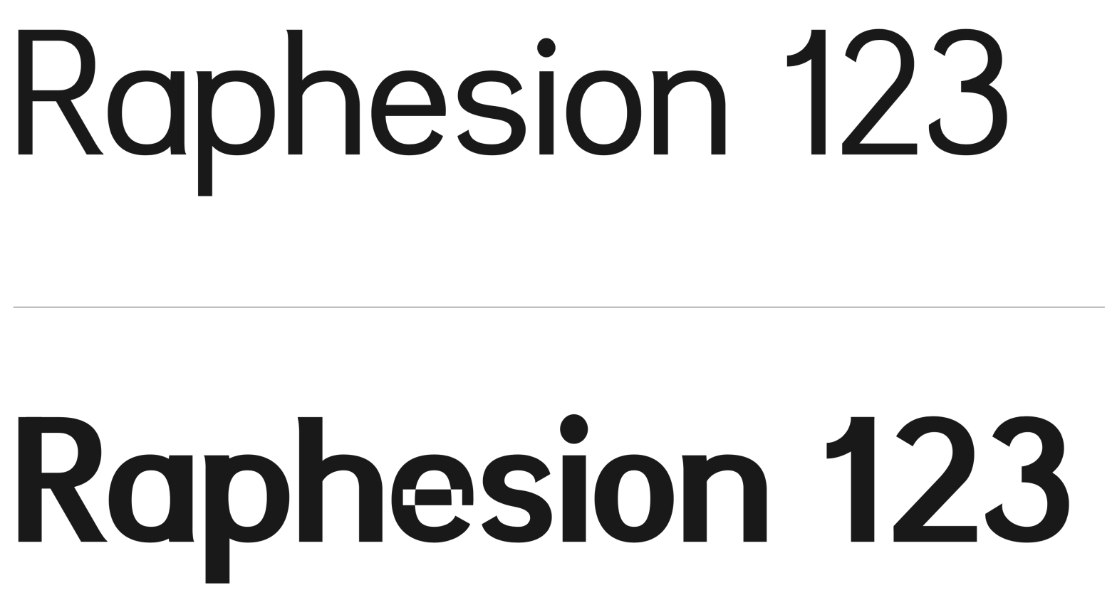
Student :Juan Sebastián Diaz HolguínClassification: Grotesque Sans Serif (Modern)Variation Axis: Weight (Regular–ExtraBold) Janz Type is a modern grotesque sans serif typeface developed by a student in the 2024–25 Typeface Design course at FBAUP. The name derives from the designer’s own — Juan Díaz — reflecting a personal approach to typographic identity and authorship. Inspired by… Continue reading Janz Type