Student: Rita Soares
Classification: Transitional Serif with Garalde Influences
Variation Axis: Weight (with high stroke contrast)
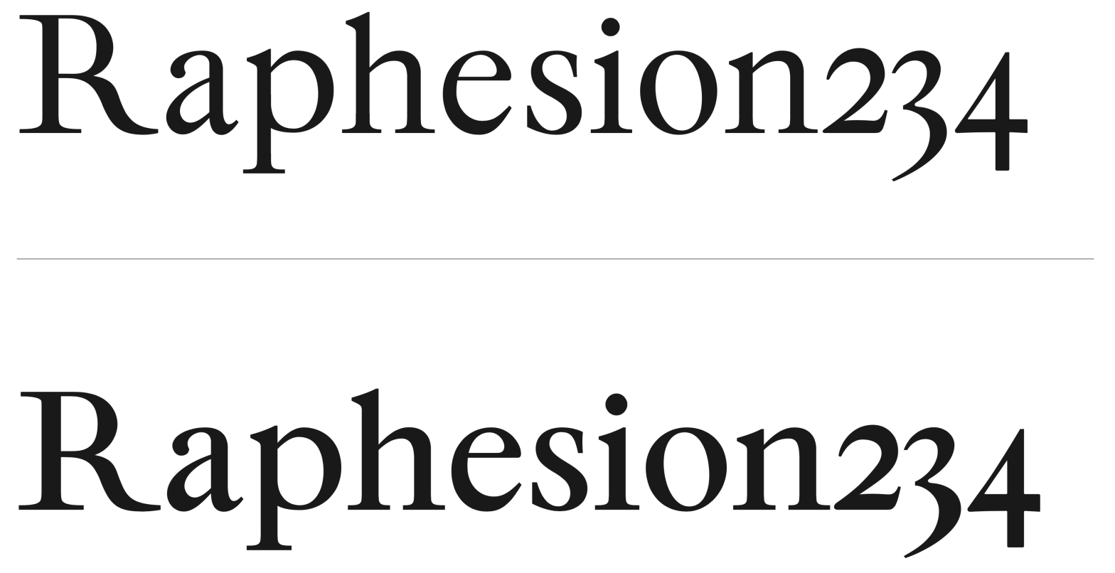
Villeneuf is a Transitional display typeface with Garalde influences, developed by a student in the 2024–25 Typeface Design course at FBAUP. The project reinterprets the historical JVilleneuve typeface (2006) by Portuguese sculptor and typographer Manuel Pereira da Silva, blending its heritage with formal experimentation grounded in the Foundational Hand.
The design features high stroke contrast (~68%), oblique stress in curved characters (with notable inclination in the ‘e’ and ‘c’), and drop terminals. Serif construction is inspired by Transitional models like Times New Roman and Baskerville PT, with asymmetrical wedge-shaped feet on letters like ‘n’, ‘m’, and ‘h’. While the x-height is relatively tall, the uppercase characters rise above the ascenders — a deliberate inversion of Transitional conventions that adds formal distinctiveness.
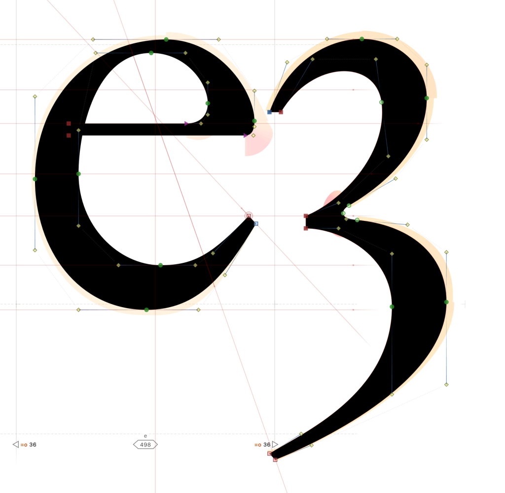
The numeral system draws from Garalde Old Style references, with varying heights across figures: the ‘3’ and ‘4’ descend, while the ‘2’ aligns with the x-height. These detailed calibrations enrich the typographic voice of Villeneuf, resulting in a typeface both historically rooted and contemporary in tone — particularly well suited for editorial display use.