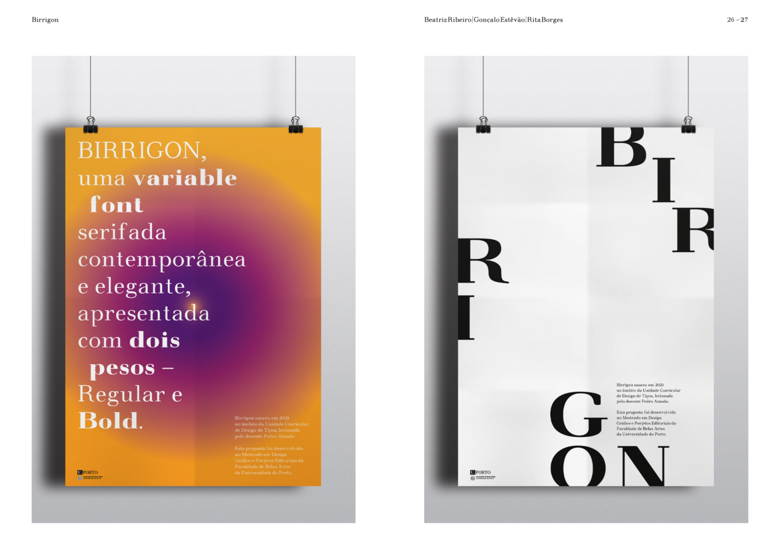
Birrigon is a quirky, old-style inspired, soft-corner text typeface revival. Designed and produced by Beatriz Ribeiro, Gonçalo Estevão, and Rita Borges during 2021.
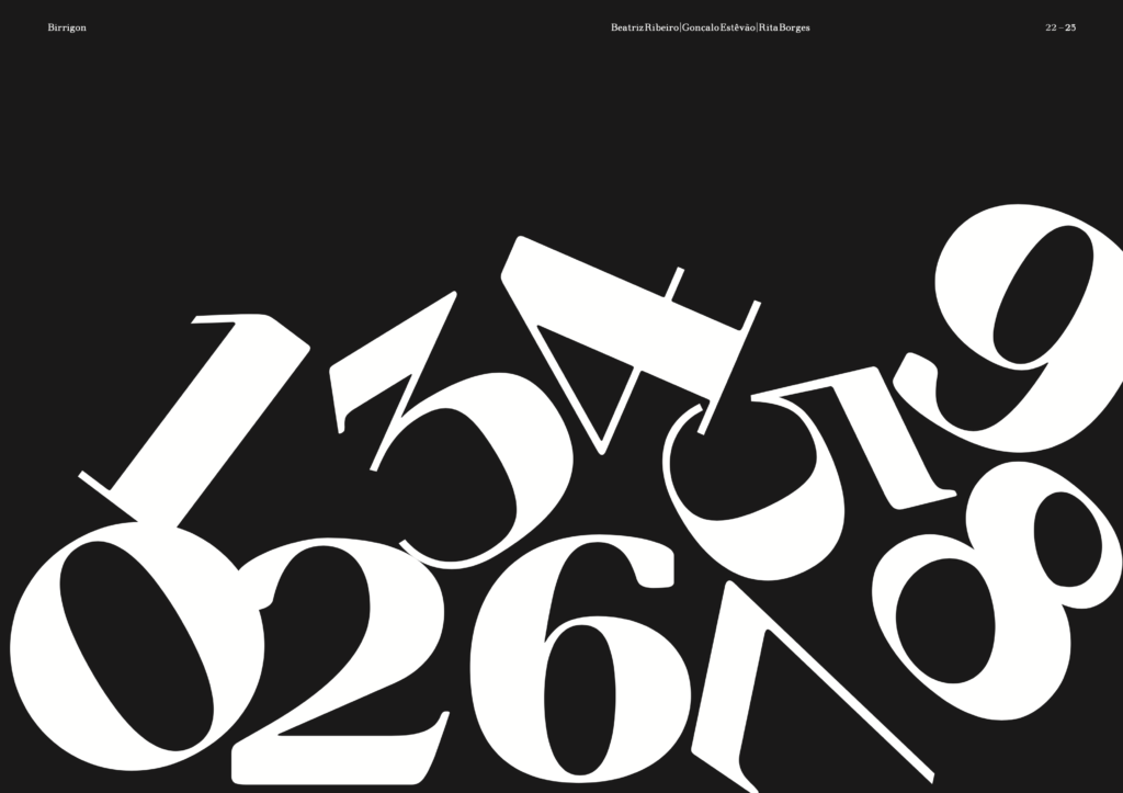
Birrigon merges 5 different typefaces and feature influences: Walbaum, Normande, Goudy Old Style, Verona, and Bembo. From these, special attention was dedicated to preserving the proportions and spacing, especially from Walbaum.
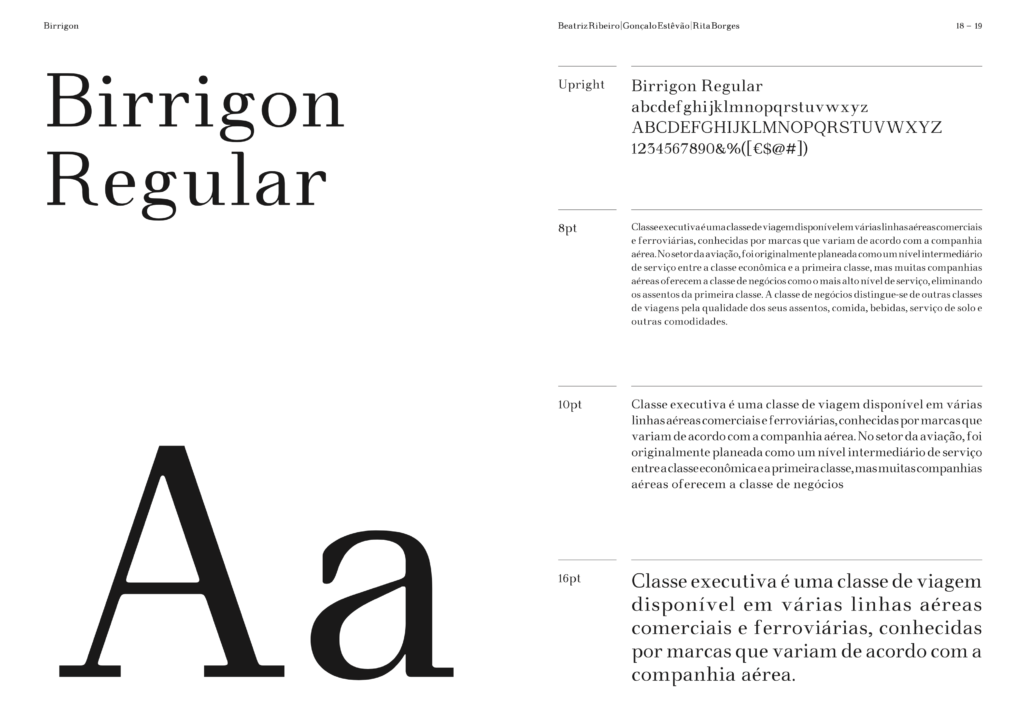
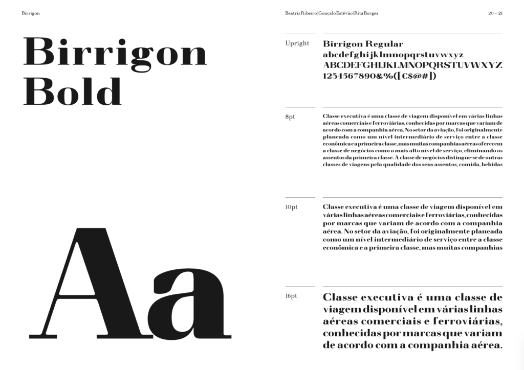
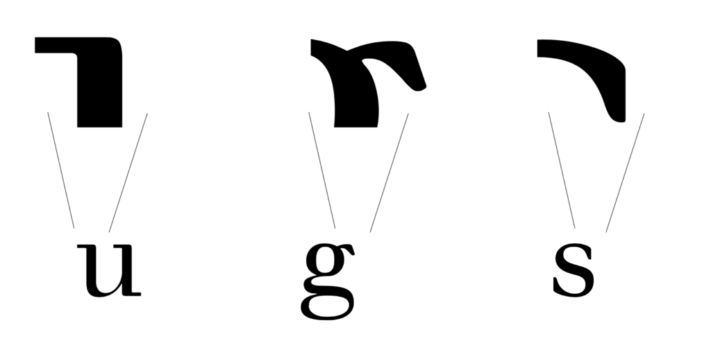
Designed and implemented in a one-axis Variable Font, Birrigon is well suited for small(ish) text and large headings. Mainly when it is possible to appreciate its soft details
See the full booklet specimen here.