Student: João Tomás
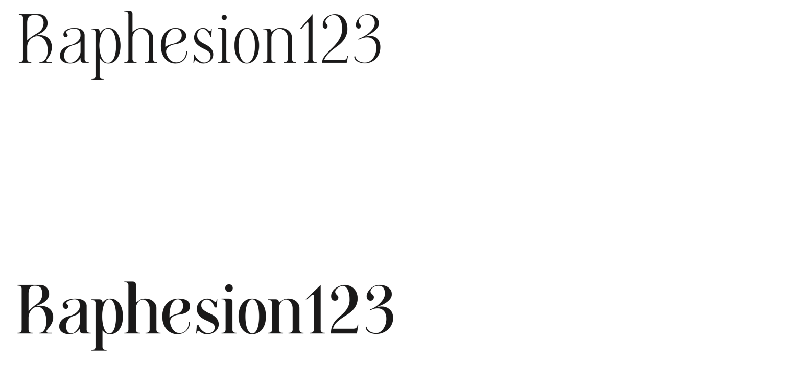
Classification: Modern Serif (Didone, Vox-Atypi)
Variation Axis: Weight (Regular–Bold)
Cunty is a modern serif display typeface that draws inspiration from Bodoni and PP Editorial New, embracing the high contrast and vertical stress typical of Didone models. Designed by a student in the 2024–25 Typeface Design course at FBAUP, the typeface introduces a more fluid and contemporary take on the genre, softening the rigidity of its references through subtly curved forms.
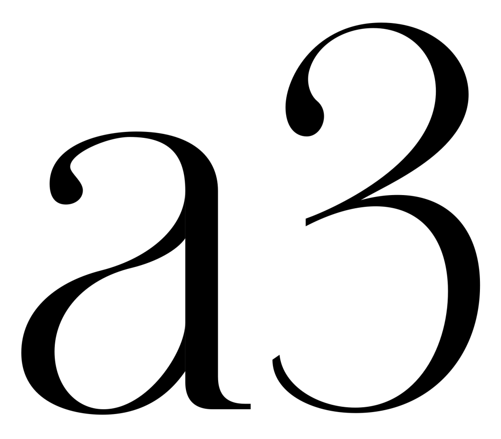
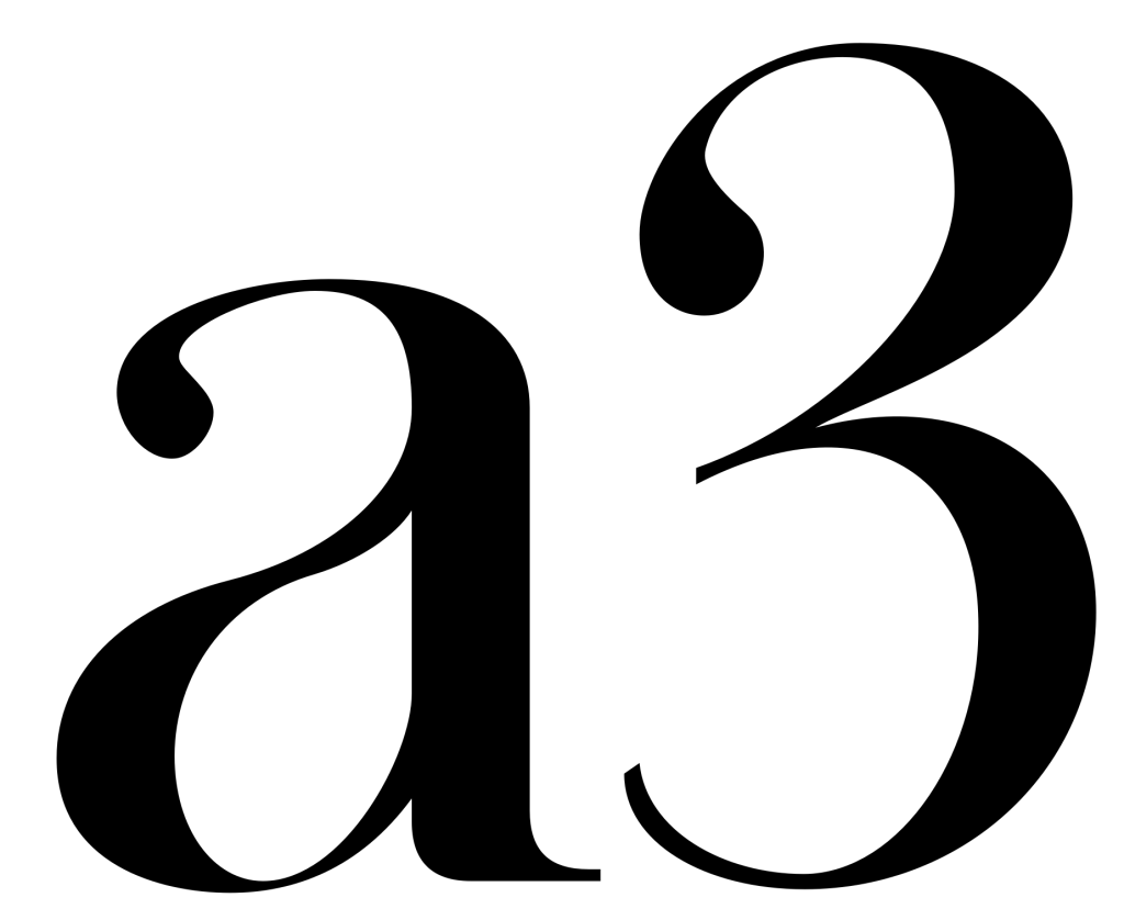
Notable features include teardrop-shaped counters and terminals, particularly evident in characters like “a,” “e,” “3,” and “2”, and the curved top terminals of letters like “p,” “h,” “i,” and “n”, which replace traditional right angles. These details create a youthful, expressive tone while maintaining the elegance and classicism of its Bodoni roots.
Designed for large-scale applications such as posters and visual communication, Cunty is not optimized for small sizes, where a dedicated text version with lower contrast and increased spacing would be more appropriate. The typeface interpolates between Regular (400) and Bold (700), with the Bold weight emphasizing contrast and optical impact.