
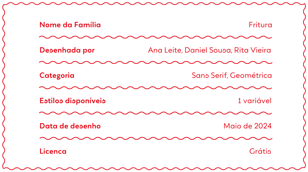
Fritura is a geometric sans serif typeface, designed by Ana Leite, Daniel Sousa, and Rita Vieira in 2024.
Fritura is a playful reinterpretation of two influential typefaces: Futura by Paul Renner (1927) and Tia Lira by Manuel Pereira da Silva (2004). It merges the clean, rational forms of Futura with the expressive, localized charm of Tia Lira, adding a flavorful twist that reflects both its typographic and cultural heritage.
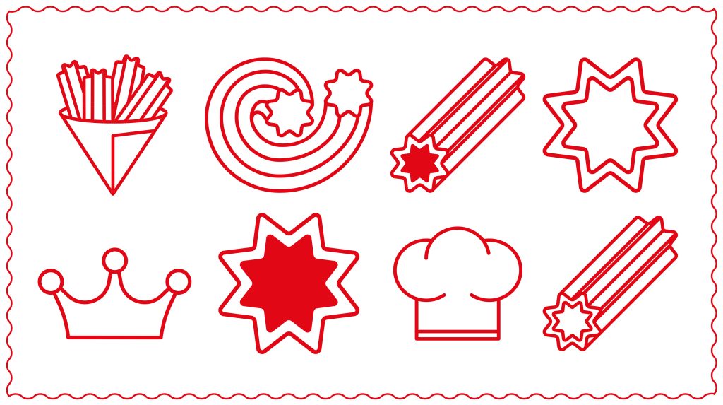
The name “Fritura” is a tongue-in-cheek play on “Futura” — rebranding the modernist classic with a dose of Portuguese spirit. Much like the deep-fried treat it references (fartura), Fritura is festive, warm, and unmistakably local.
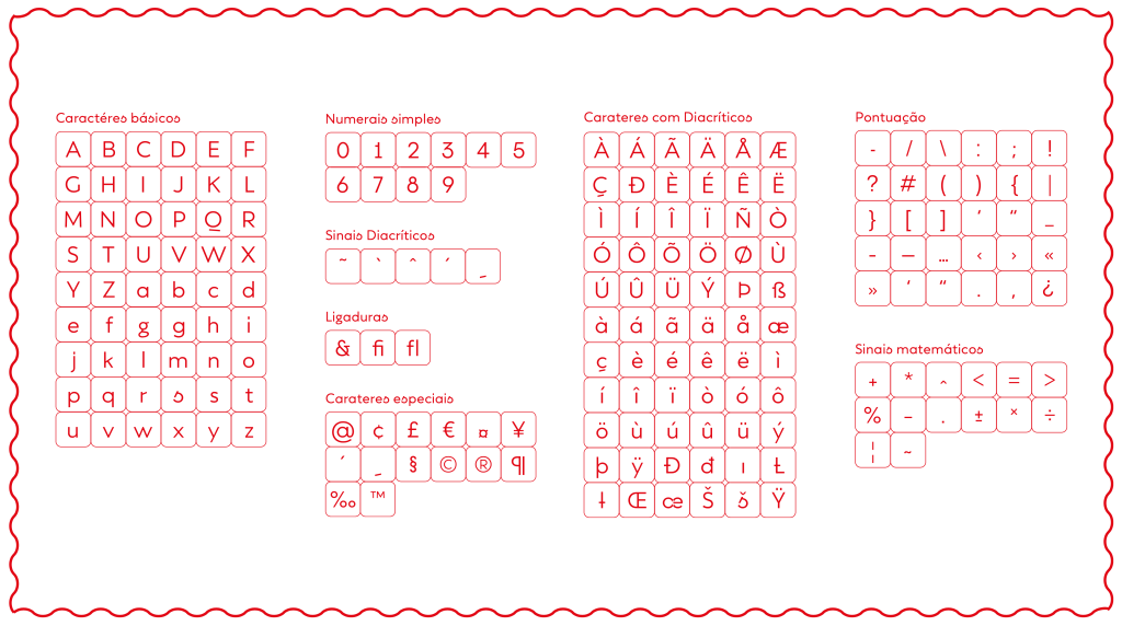
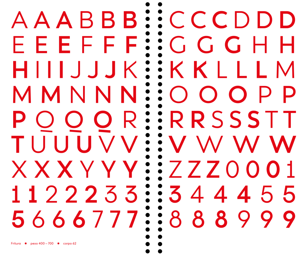
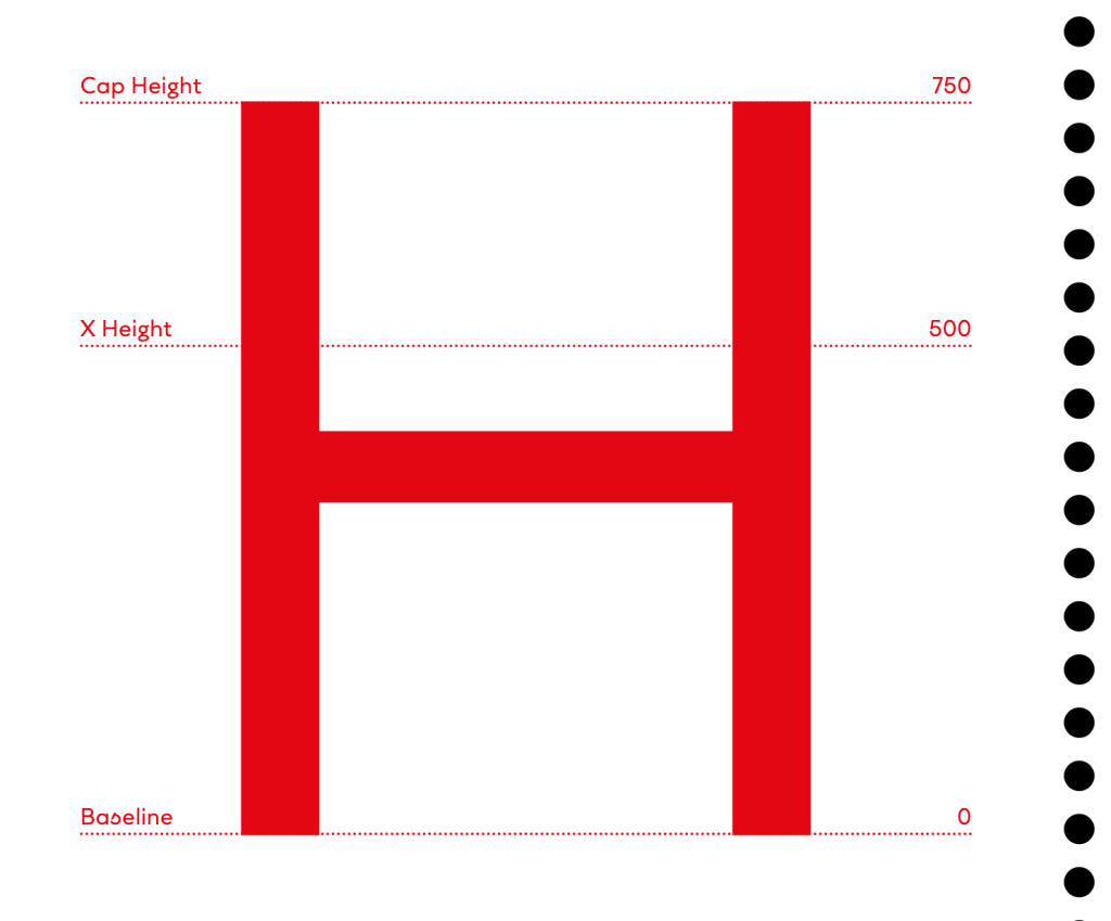
Technically, the typeface is a monolinear geometric sans serif, with upright, modular forms and a moderate x-height. The variable font includes weights ranging from Regular (400) to Bold (700). While the structure is minimal and legible, Fritura integrates quirky, human touches through alternate glyphs and subtle Art Nouveau-inspired curves.

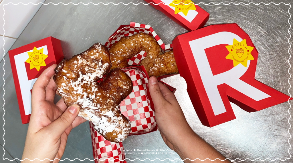
Designed for versatility, Fritura works well in both text and display settings, but truly shines in branding, posters, and editorial contexts where its personality can be celebrated. This typeface offers a contemporary, accessible voice with a celebratory character — a typographic snack that’s always served hot.
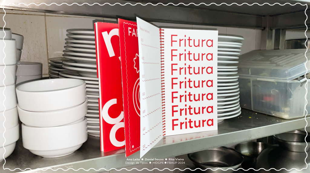
See the full specimen booklet here: