This year’s edition of the Fontstand Conference was an amazing one-day event! The culture, design, and typefaces presented by internationally acclaimed type designers were mind-blowing.
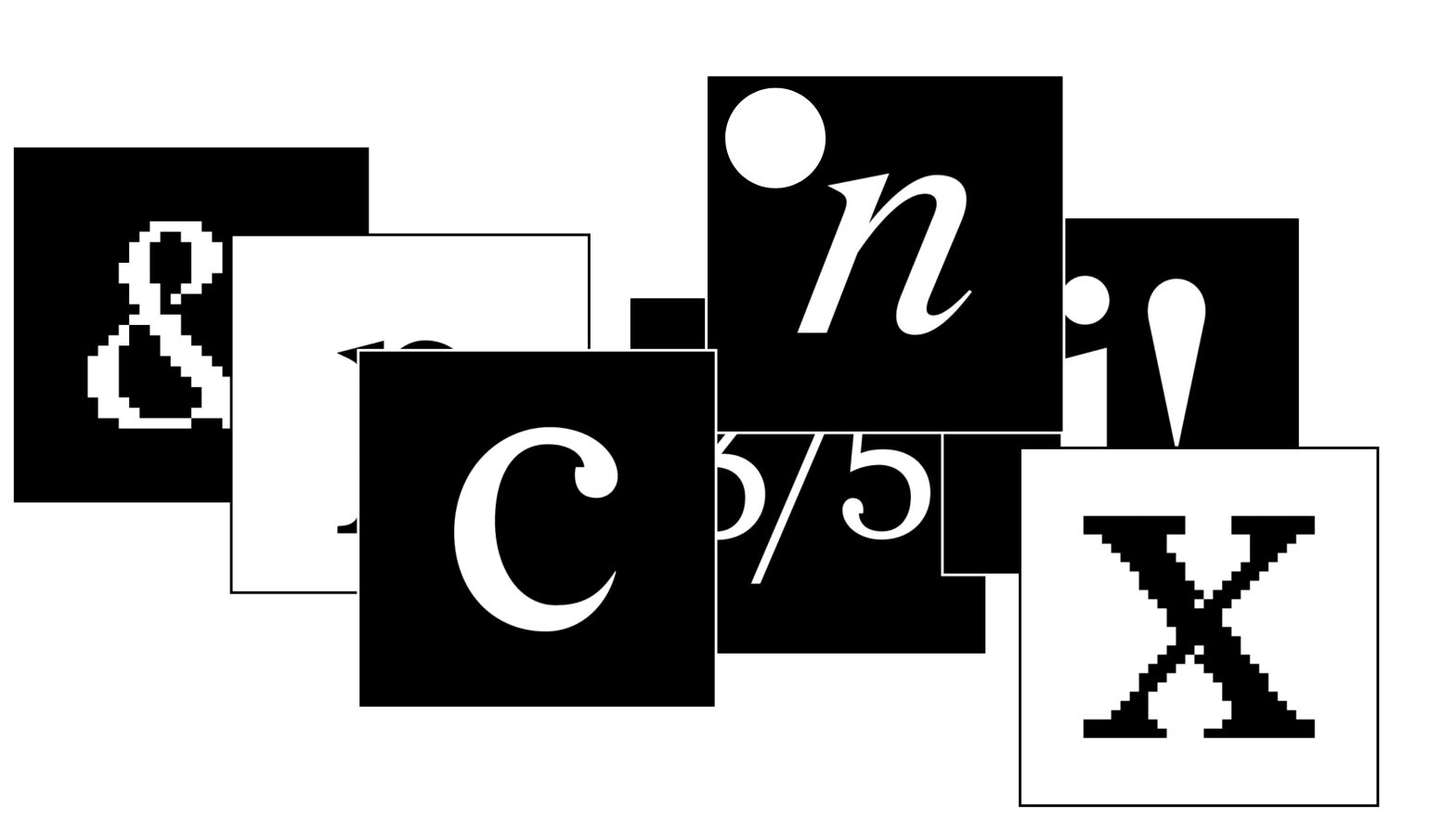
One such presentation was Jeremy Mickel’s. He presented us with this fantastic typeface. As a hybrid revival of Times and Century, it is an excellent Case Study to be further studied within the master’s course.
If the design wasn’t enough, they even distributed it in an OFL license, free to use. Check out more on the micro-site.
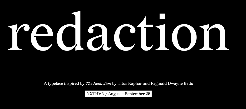
Redaction —
a multiplicity of typographic,
legal, and human historiesRedaction is a bespoke typeface commissioned by Titus Kaphar and Reginald Dwayne Betts’ The Redaction exhibition at MoMA PS1. As part of a timely conversation at the intersection of history, the legal system and social justice, the fonts will be free for personal use. In a spirit of generosity, the artists invite everyone to broaden the ethos of the exhibition by making these tools accessible to a global and engaged audience.
Excerpt from the microsite synopsis