Student: Luís LopesClassification: Geometric Serif (Modern/Didone with Art Nouveau influences)Variation Axis: Weight (Regular–Bold) Pena is a geometric serif display typeface designed by a student in the 2024–25 Typeface Design course at FBAUP. The project explores revivalism through juxtaposition, blending 1920s Portuguese typographic aesthetics with the clarity and precision of contemporary digital design. Rooted in the… Continue reading Pena
Tag: Didone
Cunty
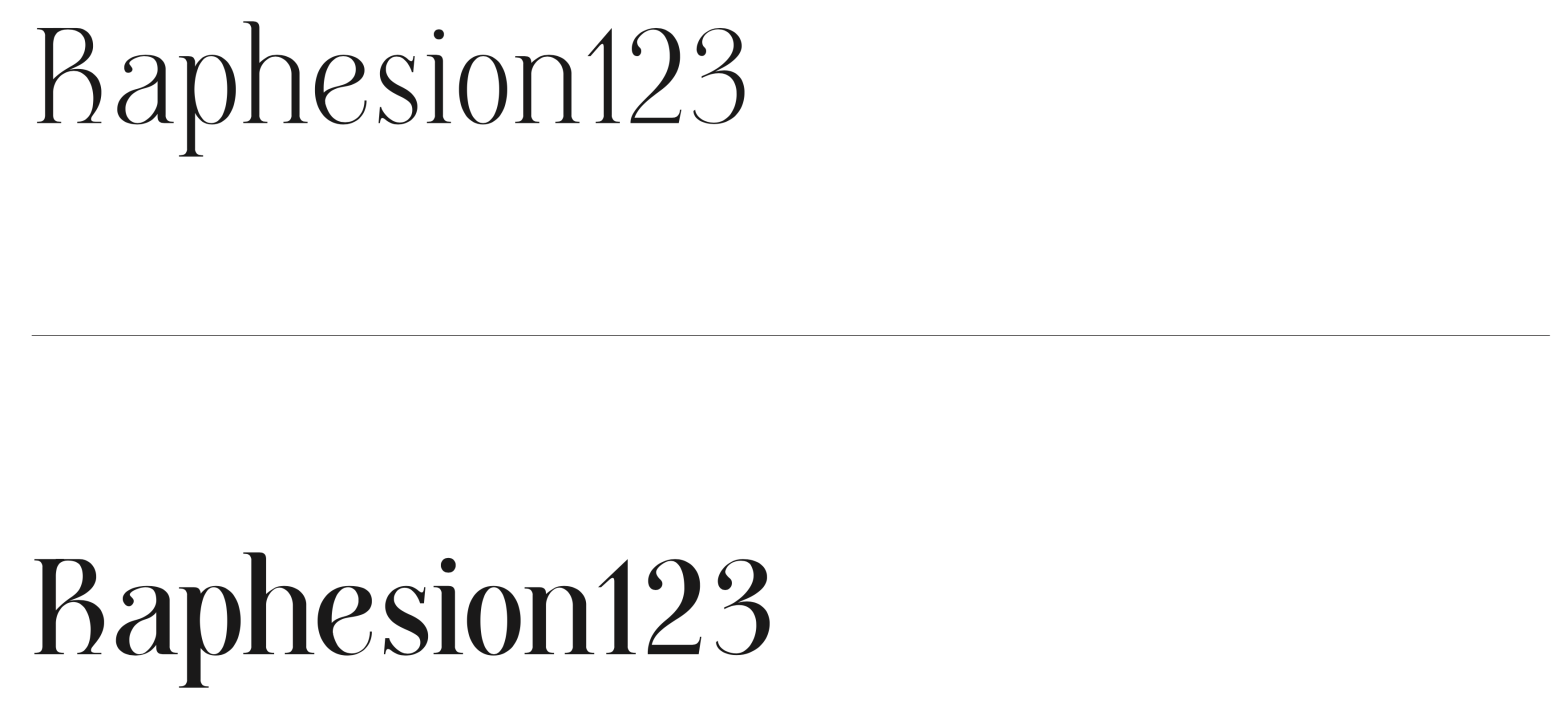
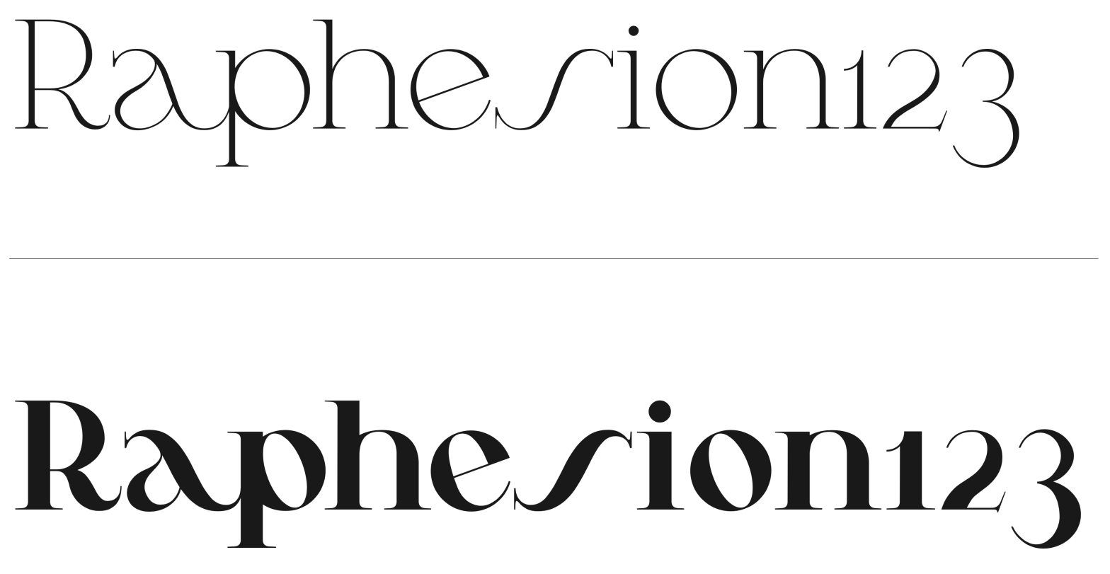
Student: João TomásClassification: Modern Serif (Didone, Vox-Atypi)Variation Axis: Weight (Regular–Bold) Cunty is a modern serif display typeface that draws inspiration from Bodoni and PP Editorial New, embracing the high contrast and vertical stress typical of Didone models. Designed by a student in the 2024–25 Typeface Design course at FBAUP, the typeface introduces a more fluid… Continue reading Cunty
JVC Bodoni
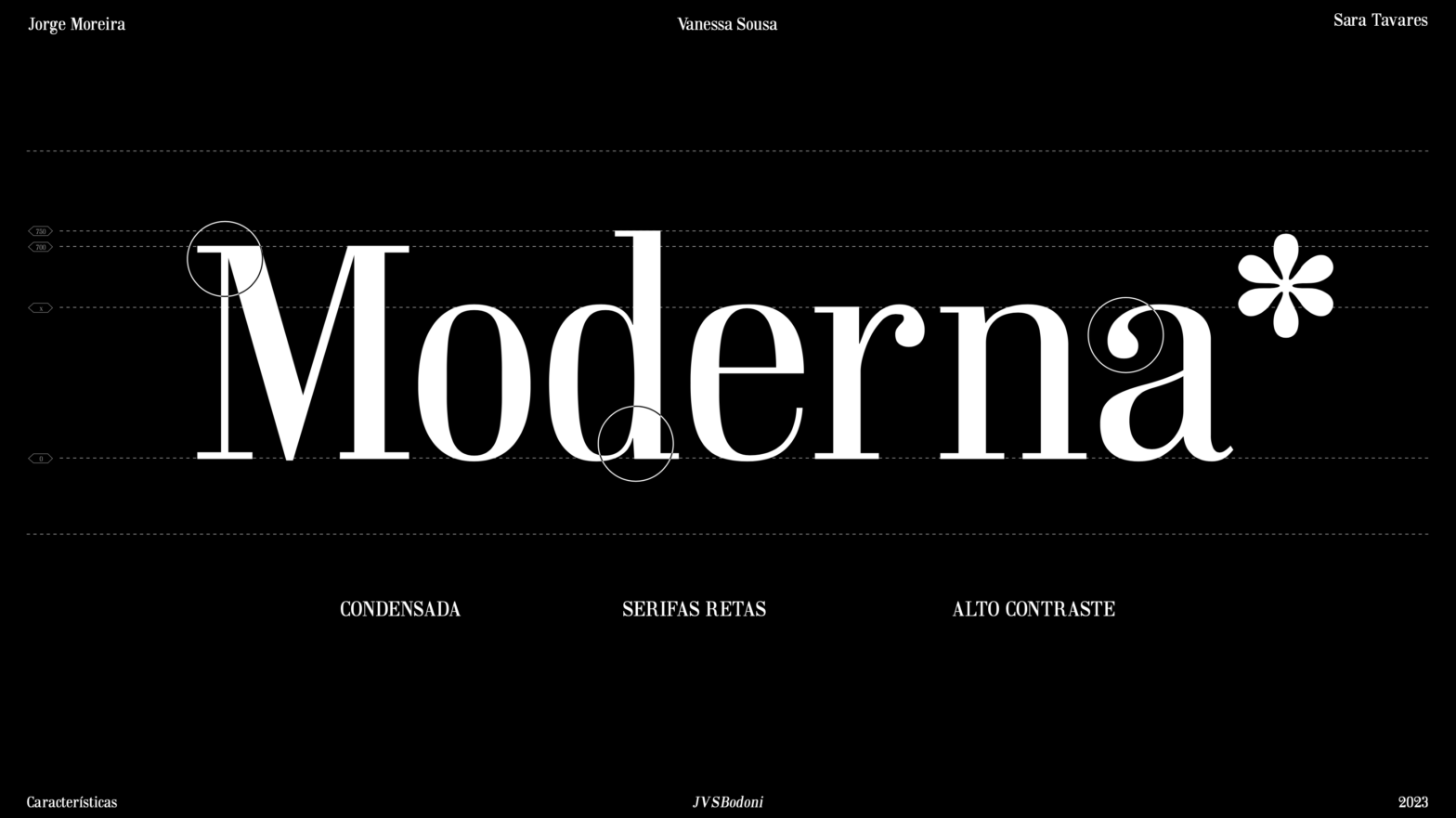
JVC Bodoni is a “Didone” typeface revival, designed by in 2023 by Jorge Moreira, Vanessa Sousa and Sara Tavares. The purpose of this work was to design a font for text inspired by a typography of books prior to 1980, with the intention of updating it to the contemporary [local] culture and, thus, producing a… Continue reading JVC Bodoni