
Kathow Sans is a geometric sans-serif typeface, designed by Filipa Moreira, João Cardoso, and Pedro Gil in 2024. Kathow Sans began as a revival project inspired by Manuel Pereira da Silva’s “Tia Lira,” but evolved into a distinctly original typeface influenced by classic geometric sans-serifs such as Adrian Frutiger’s Avenir and Journal Sans New from… Continue reading Kathow Sans
Tag: Geometric
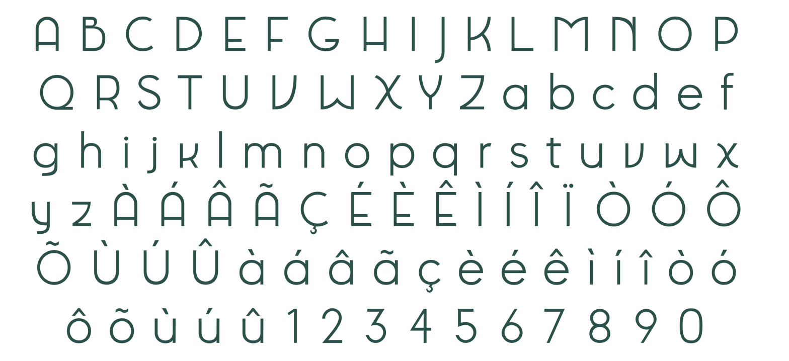
Tia Viola

Tia Viola is a geometric sans serif typeface, designed by Christine Andres, Mafalda Ribeiro, and Sofia Silva in 2024. Tia Viola is a revival of Tia Lira (Bold), a typeface designed in 2004 by Portuguese sculptor and designer Manuel Pereira da Silva. With roots in geometric structure and typographic modernism, the original Tia Lira Bold… Continue reading Tia Viola
Fritura

Fritura is a geometric sans serif typeface, designed by Ana Leite, Daniel Sousa, and Rita Vieira in 2024. Fritura is a playful reinterpretation of two influential typefaces: Futura by Paul Renner (1927) and Tia Lira by Manuel Pereira da Silva (2004). It merges the clean, rational forms of Futura with the expressive, localized charm of… Continue reading Fritura
Tia Déco
Tia Déco is a geometric sans serif typeface with strong Art Deco influences, designed by Alexandra Aidos, Fátima Ribeiro, and Francisca Paixão in 2024. Tia Déco is a modern reinterpretation of Tia Lira, an experimental geometric typeface originally designed by Manuel Pereira da Silva in 2003. Drawing inspiration from the visual language of the Art… Continue reading Tia Déco
Pena
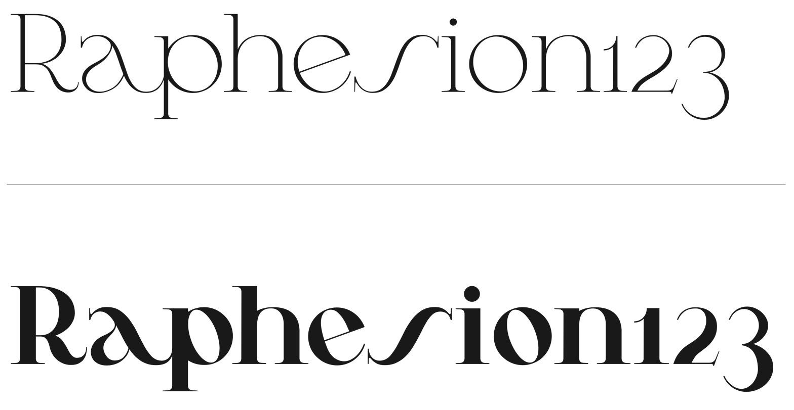
Student: Luís LopesClassification: Geometric Serif (Modern/Didone with Art Nouveau influences)Variation Axis: Weight (Regular–Bold) Pena is a geometric serif display typeface designed by a student in the 2024–25 Typeface Design course at FBAUP. The project explores revivalism through juxtaposition, blending 1920s Portuguese typographic aesthetics with the clarity and precision of contemporary digital design. Rooted in the… Continue reading Pena
Bili
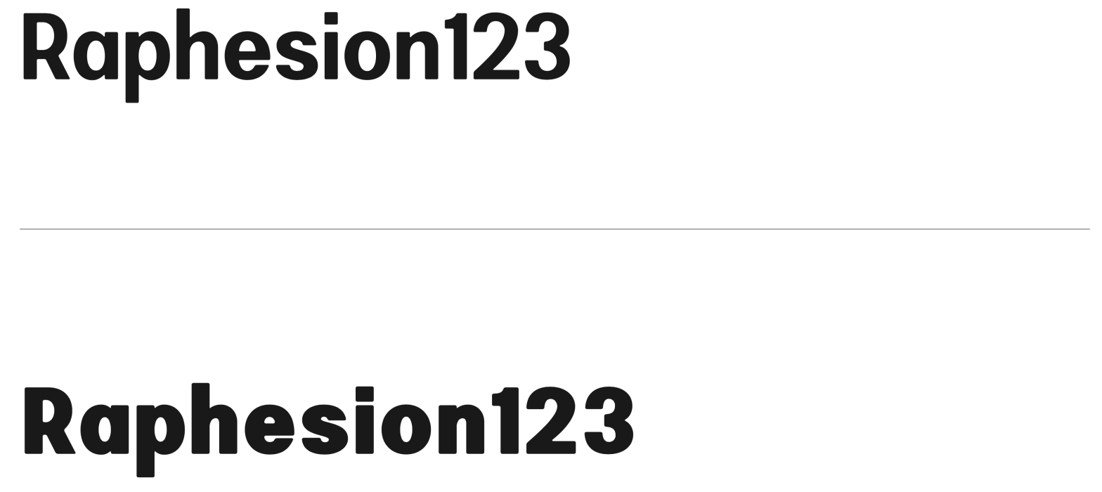
Student: Lília AmaroClassification: Hybrid Sans Serif — Geometric, Neo-Grotesque, and Neo-HumanistVariation Axis: Weight (emphasis on bold interpolation) Bili is a hybrid sans serif display typeface designed by a student in the 2024–25 Typeface Design course at FBAUP. It merges characteristics from three typographic traditions — geometric sans, neo-grotesque, and neo-humanist — resulting in a visually… Continue reading Bili
Cafuné

Student: Katharina Veronika FeddeClassification: Geometric Sans Serif (Vox-Atypi: Lineal – Geometric; DIN 16518: Constructed Grotesque)Variation Axis: Weight (Regular–ExtraBold) Cafuné is a geometric sans serif display typeface designed by a student in the 2024–25 Typeface Design course at FBAUP. Inspired by the uniform-line signage on a wrought iron gate near Porto’s Palácio de Cristal, the project… Continue reading Cafuné
Orbis

Student: Bruna SilvaClassification: Geometric Sans Serif (Modern)Variation Axis: Weight (Regular–Bold) Orbis is a geometric sans serif display typeface designed by Bruna Silva, blending legibility and modularity in both print and digital contexts. Inspired by typefaces such as Futura and SK Nomerok, it draws from the Constructivist and Modernist visual traditions to convey a strong, expressive… Continue reading Orbis
Moderna
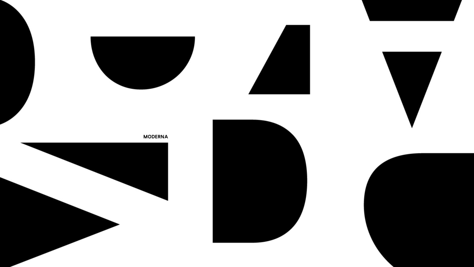
Moderna is a geometric, linear, sans-serif, one-axis Variable Font. Heavily influenced by the geometric typefaces from the early twentieth century it provides an even color to text compositions. Designed by Beatriz Almeida, Diana Ferreira and Gabriela Moreira in 2021. Its main influences are fonts such as Futura (1927) by Paul Renner, Kabel by Rudolf Koch… Continue reading Moderna