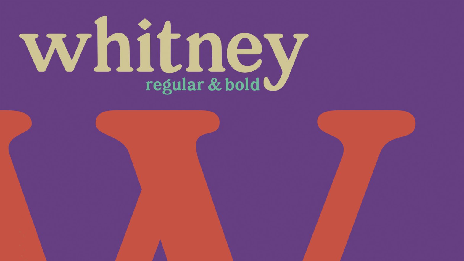
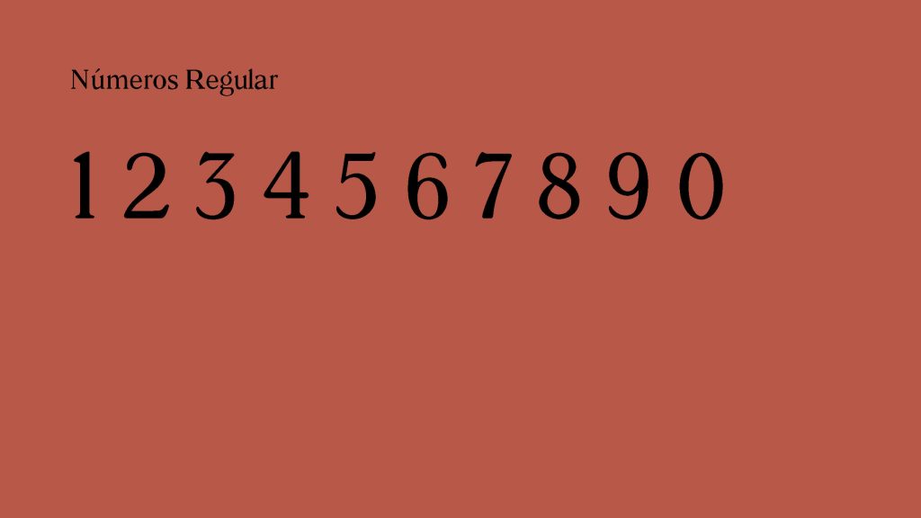
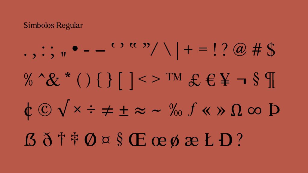
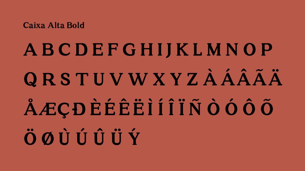
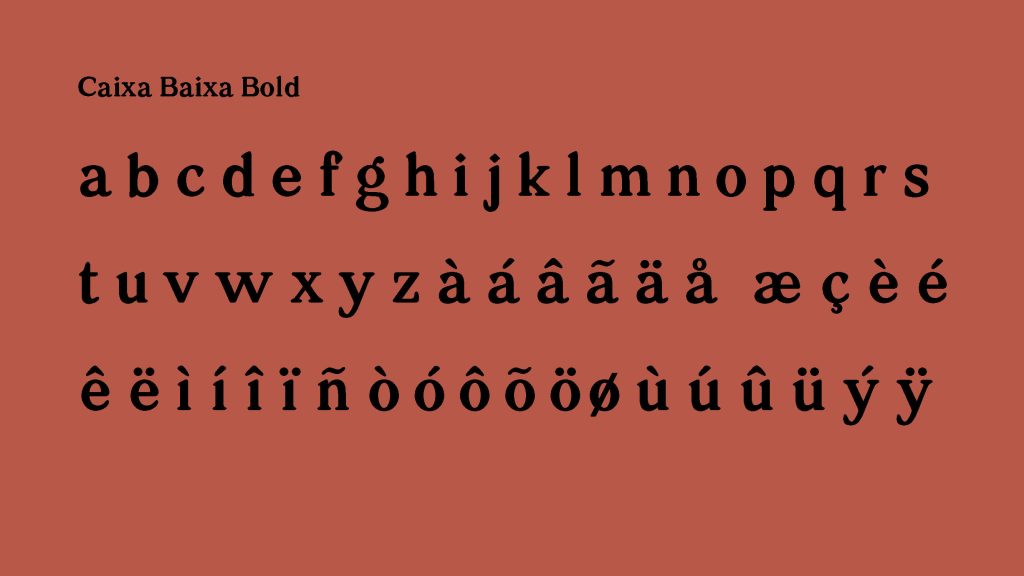
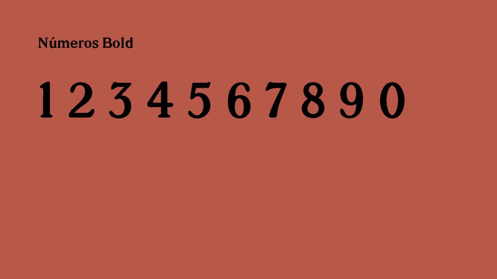
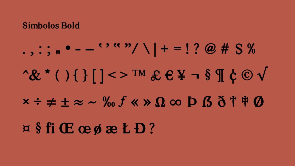
Whitney is a Classical (soft nineteenth-century) Serif typeface revival designed by Ana Paula Hentges, Margarida Almeida, and Vitória Santos in 2022.
The project had as its premise of developing a complete text typeface, from a printed copy before the 1980s.
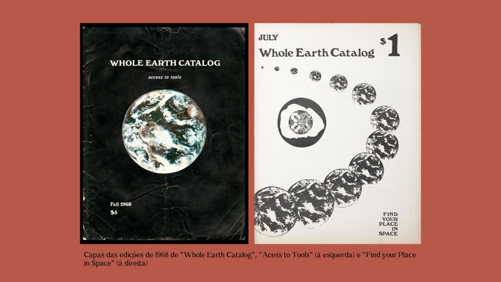
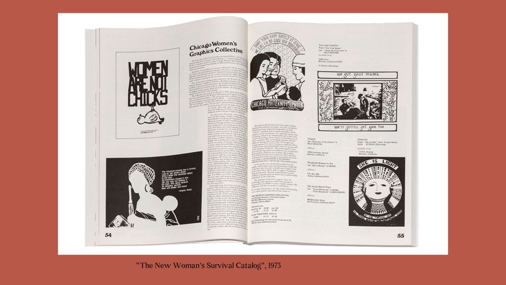
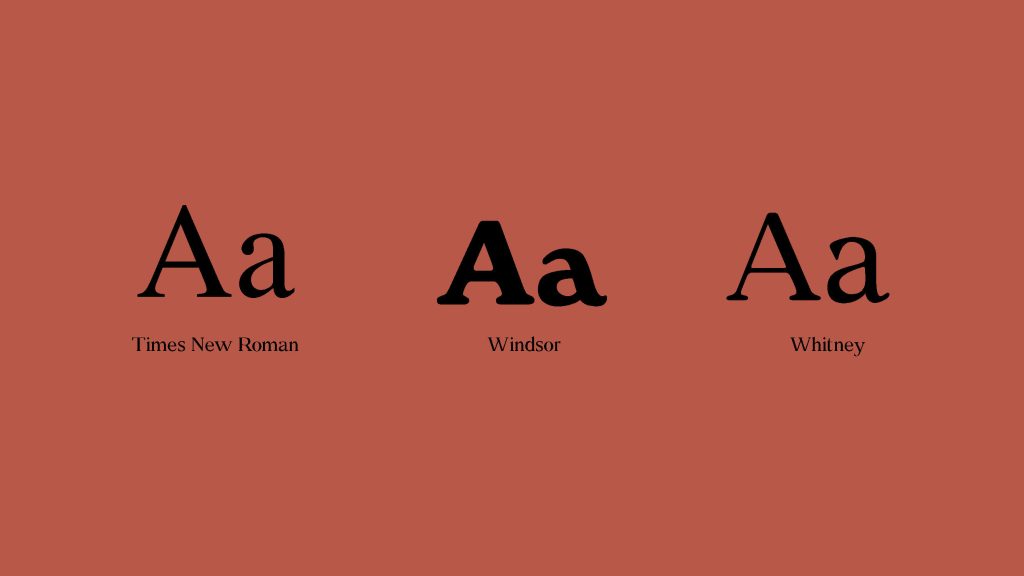
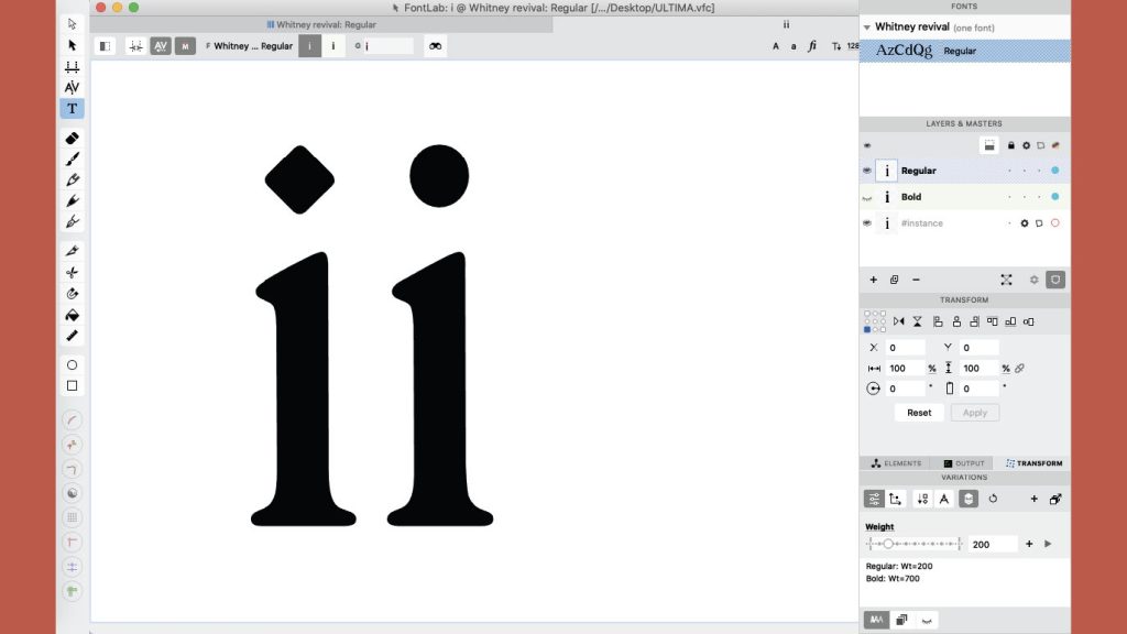
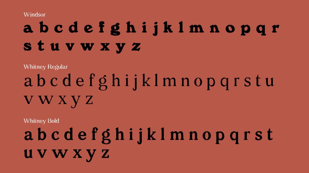
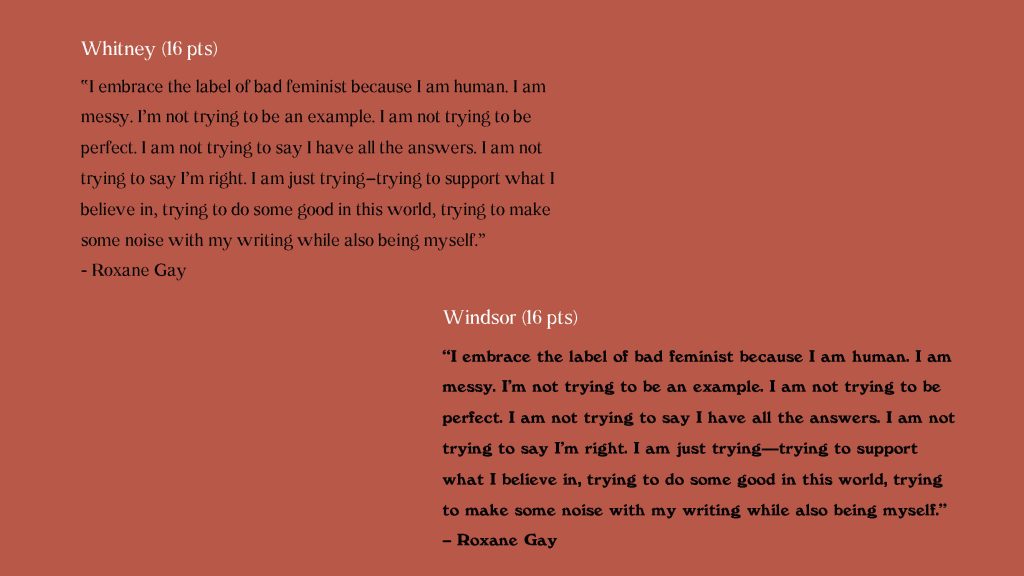
The chosen font was Windsor, launched in 1905 and created by Eleisha Pechey. Due to her implications for the feminist movements of the 1970s, through her appearance in zines and other publications of the time, it was decided to use a female name – Whitney – to designate the Windsor revival. Since Windsor was created for display, some changes were made to the inclination and axis of some letters, as well as their x-height, in order to increase their readability. The contrasts were also accentuated, and the serifs changed.
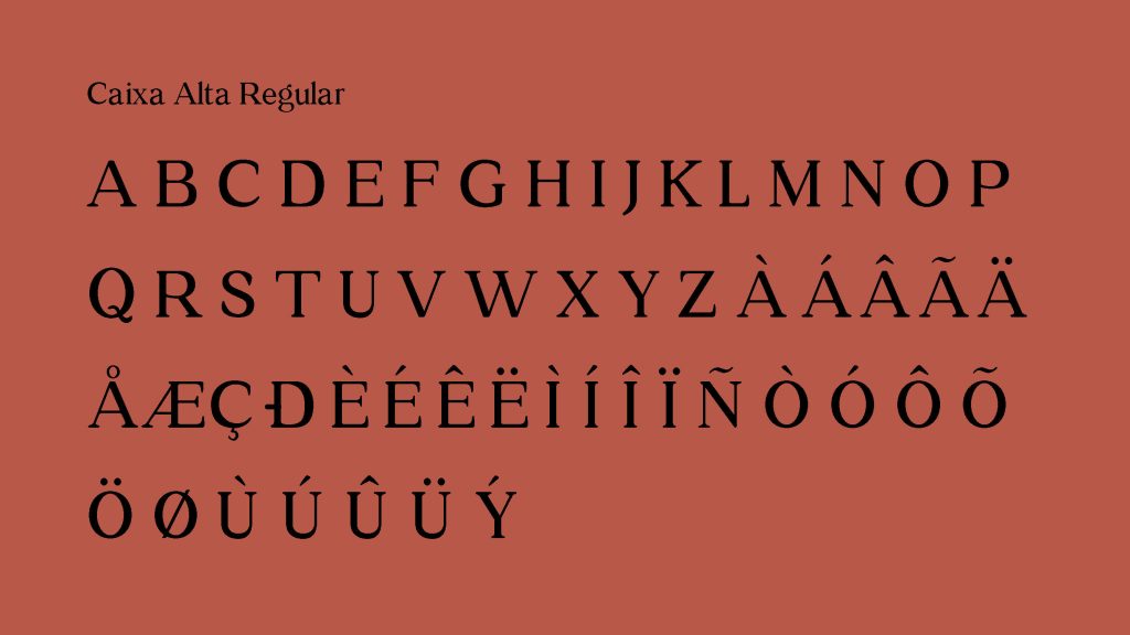
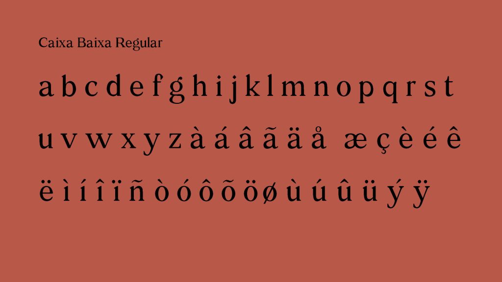
Whitney is within the Vox-ATypl classification of classical serif (Reales), having characteristics of the humanist and Garalde classification.
Adapted excerpt from the project presentation
This is yet another project that started with an interesting but very difficult premise, due to the “display nature” of Winsor. It is a space-consuming face originally, so the revival in itself was difficult from the onset. Despite the lack of proper width and weight consistency, a very interesting result was achieved.
In order to make the source more suitable for text, we decided to use Times New Roman as initial reference. Regular weight was used as inspiration for the development of the Whitney, for having a height of higher x, for the high readability and for the serifs of transition.
The development of a complete font has given us a new understanding regarding the work of the type designer, showing us that the time we had for the project was actually quite small.
Adapted excerpt from the project presentation
See the full specimen booklet here.
