
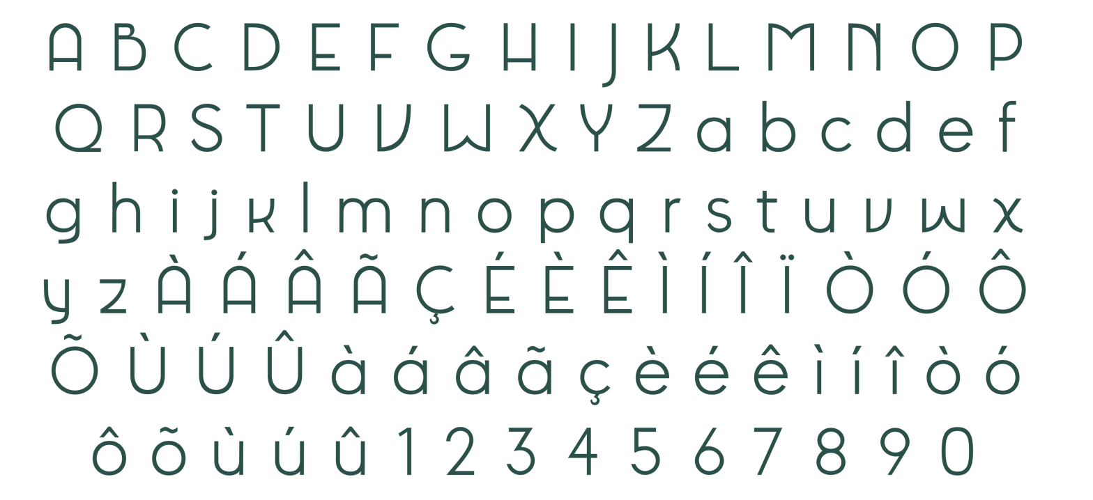
Kathow Sans is a geometric sans-serif typeface, designed by Filipa Moreira, João Cardoso, and Pedro Gil in 2024. Kathow Sans began as a revival project inspired by Manuel Pereira da Silva’s “Tia Lira,” but evolved into a distinctly original typeface influenced by classic geometric sans-serifs such as Adrian Frutiger’s Avenir and Journal Sans New from… Continue reading Kathow Sans
Author: Pedro Amado
Pedro Amado. Associate Professor at FBAUP. Integrated researcher of the i2ADS research institute.
ManuEla
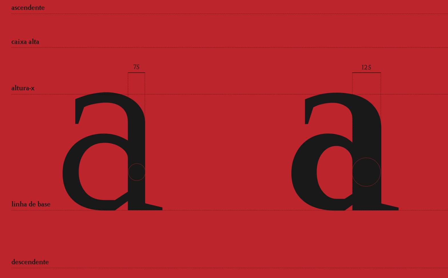
ManuEla is a modern sans-serif typeface, designed by Aurélia Ferreira, Maria Carlos, and Melissa Gaviria in 2024. ManuEla is more than a typeface—it’s a love letter. Named in tribute to Manuela, the wife of the late Portuguese typographer Manuel Pereira da Silva, the typeface honors her unseen but vital role in preserving Silva’s typographic legacy.… Continue reading ManuEla
Tia Viola

Tia Viola is a geometric sans serif typeface, designed by Christine Andres, Mafalda Ribeiro, and Sofia Silva in 2024. Tia Viola is a revival of Tia Lira (Bold), a typeface designed in 2004 by Portuguese sculptor and designer Manuel Pereira da Silva. With roots in geometric structure and typographic modernism, the original Tia Lira Bold… Continue reading Tia Viola
Fritura

Fritura is a geometric sans serif typeface, designed by Ana Leite, Daniel Sousa, and Rita Vieira in 2024. Fritura is a playful reinterpretation of two influential typefaces: Futura by Paul Renner (1927) and Tia Lira by Manuel Pereira da Silva (2004). It merges the clean, rational forms of Futura with the expressive, localized charm of… Continue reading Fritura
Tia Déco
Tia Déco is a geometric sans serif typeface with strong Art Deco influences, designed by Alexandra Aidos, Fátima Ribeiro, and Francisca Paixão in 2024. Tia Déco is a modern reinterpretation of Tia Lira, an experimental geometric typeface originally designed by Manuel Pereira da Silva in 2003. Drawing inspiration from the visual language of the Art… Continue reading Tia Déco
Friedlander Neue
Friedlander Neue is a Transitional Roman typeface, designed by Eunice Bastos, Francisca Rebelo, and Rita Melo in 2024. Friedlander Neue is a revival and reinterpretation of Elizabeth Antiqua, a typeface originally commissioned in 1927 by the Bauer Type Foundry and completed in 1939 by one of the first recognized women in type design — Elizabeth… Continue reading Friedlander Neue
Prova
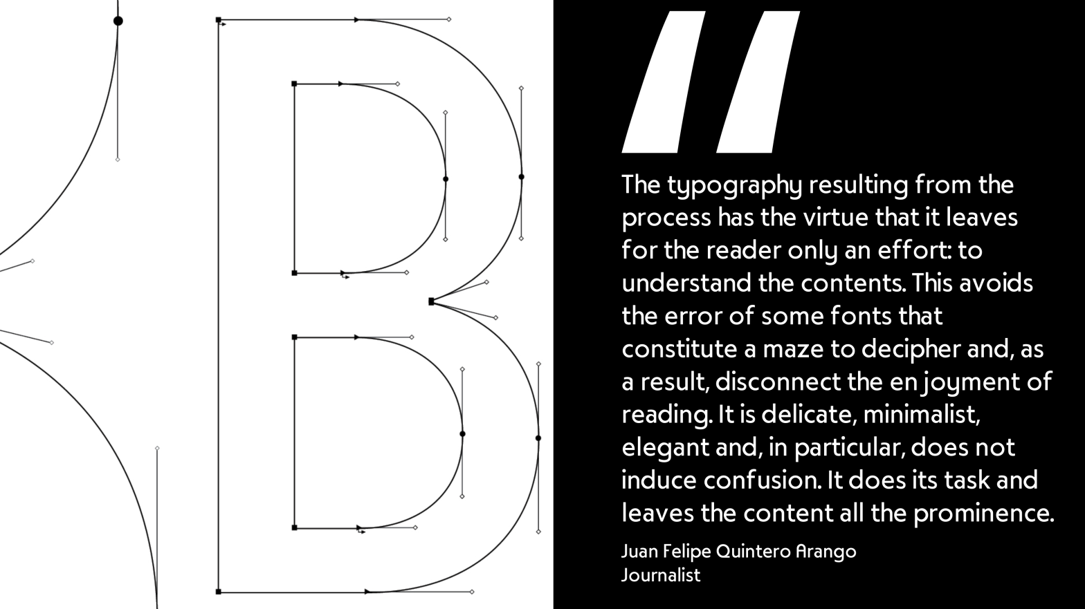
Prova is a geometric sans serif typeface, designed by Bruna Valoura, Bruno Barros, Cristiana Braz, and Inês Loureiro in 2024. Prova is a revival of Tia Lira, one of the “first geometric typeface developed in Portugal” [please take this information with a slight grain of salt — see more infor about its origin in his… Continue reading Prova
Liranela
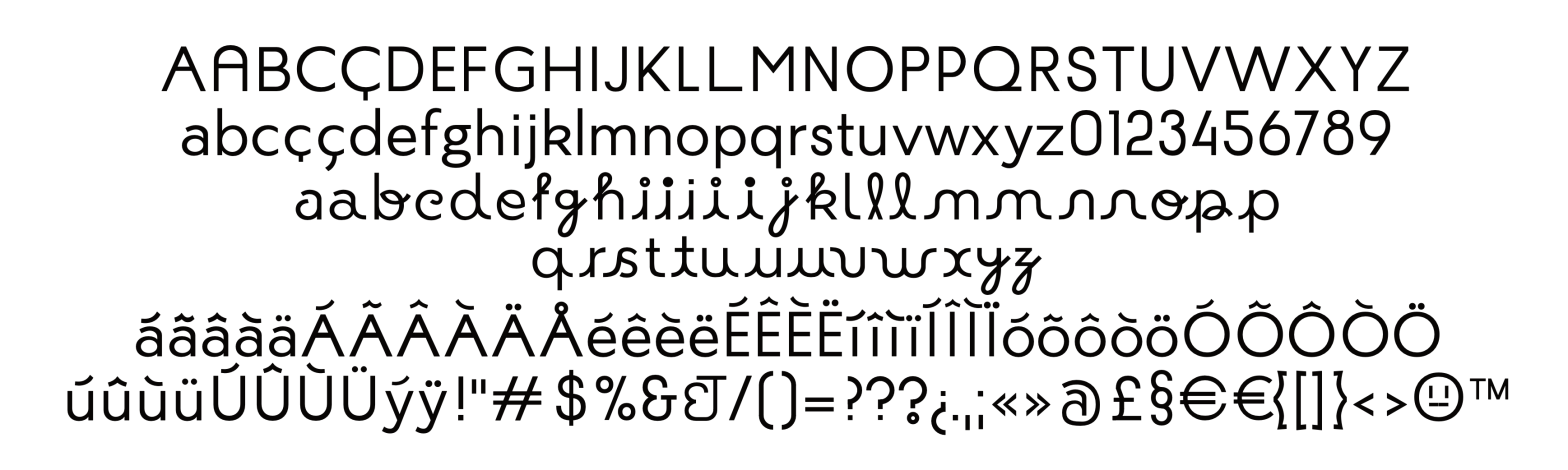
Liranela is a “Hibrid” Sans serif and script(ty) typeface revival, designed by in 2024 by Bernardo Xavier, João Janeiro, José Pelaio and Pedro Oliveira. A “TIALIRA” FOI FEITA APENAS PARA CURTAS FRASES, DE SIMPLICIDADE SÓ APARENTE E TEM QUASE NADA A VER COM LETRA DE VERDADE. Liranela is a revival of TiaLira, a typeface originally… Continue reading Liranela
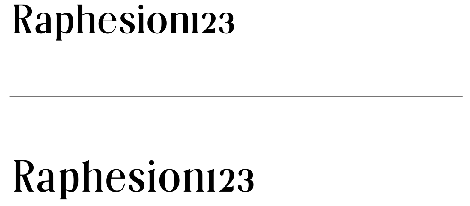
2025 Display Type Explorations
A Typographic Showcase from the first assignment of the 2025 edition of the Masters’ in Graphic Design & Editorial Projects Type Design course. In the first major assignment of the Typeface Design course, students are challenged to design a display typeface beginning with a test word — typically “Raphesion123” — and develop a Variable Font… Continue reading 2025 Display Type Explorations
Butique
Student: Roberta MirandaClassification: Hybrid Display Serif – Modern/Rational with Transitional & Flare-Slab InfluencesVariation Axis: Serif Shapes (and optical Size) Butique is a hybrid serif display typeface created by a student in the 2024–25 Typeface Design course at FBAUP. Developed from the Foundational Hand and drawing from Gerrit Noordzij’s stroke theory, the project introduces students to… Continue reading Butique