Author: Pedro Amado
-
Writing systems of the World
[This post is still a rough draft mainly citing Robinson’s book. Lacks additional sources such as Bright, Nakanishi and a few others. Also, examples of scripts!] Cuneiform Evolves from pictograms to wedge-shaped cuneiform signs in Sumer around 2500 BC. Evolved into Babylonian, Assyrian, Hitite. Used by the Akkadian and Elamites also. It evolved over the…
-
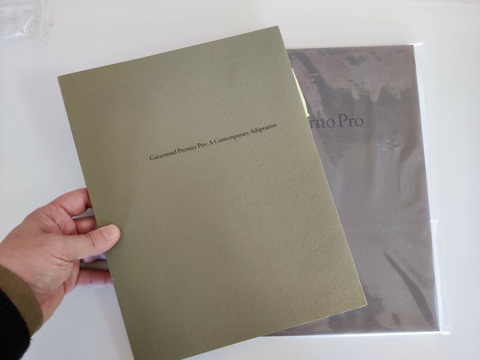
Adobe Garamond Pro
A medium-sized perfect binding booklet, with a heavy-sized colored paper warping the white cover. Nicely executed, no-nonsense specimen. Dust-cover Cover Hlaf-title and Title pages Historical information about Garamond Font development information Character sets and features Mockups Very complete and exemplar reference for anyone designing a specimen. “Just” missing a “Fonts in Use” section and maybe…
-
Communication Arts award for Loretta Type Familly
The Loretta typeface family, designed by Joana Correia and Abel Martins — a former award-winning student from the MDGPE master program—, now working with Joana Correia at Nova Type Foundry, was awarded a Communication Arts (CA) prize in the 2022 Typography competition. A heartfelt congratulations to both, and a special thank you for promoting the…
-

Results from the calligraphy workshop
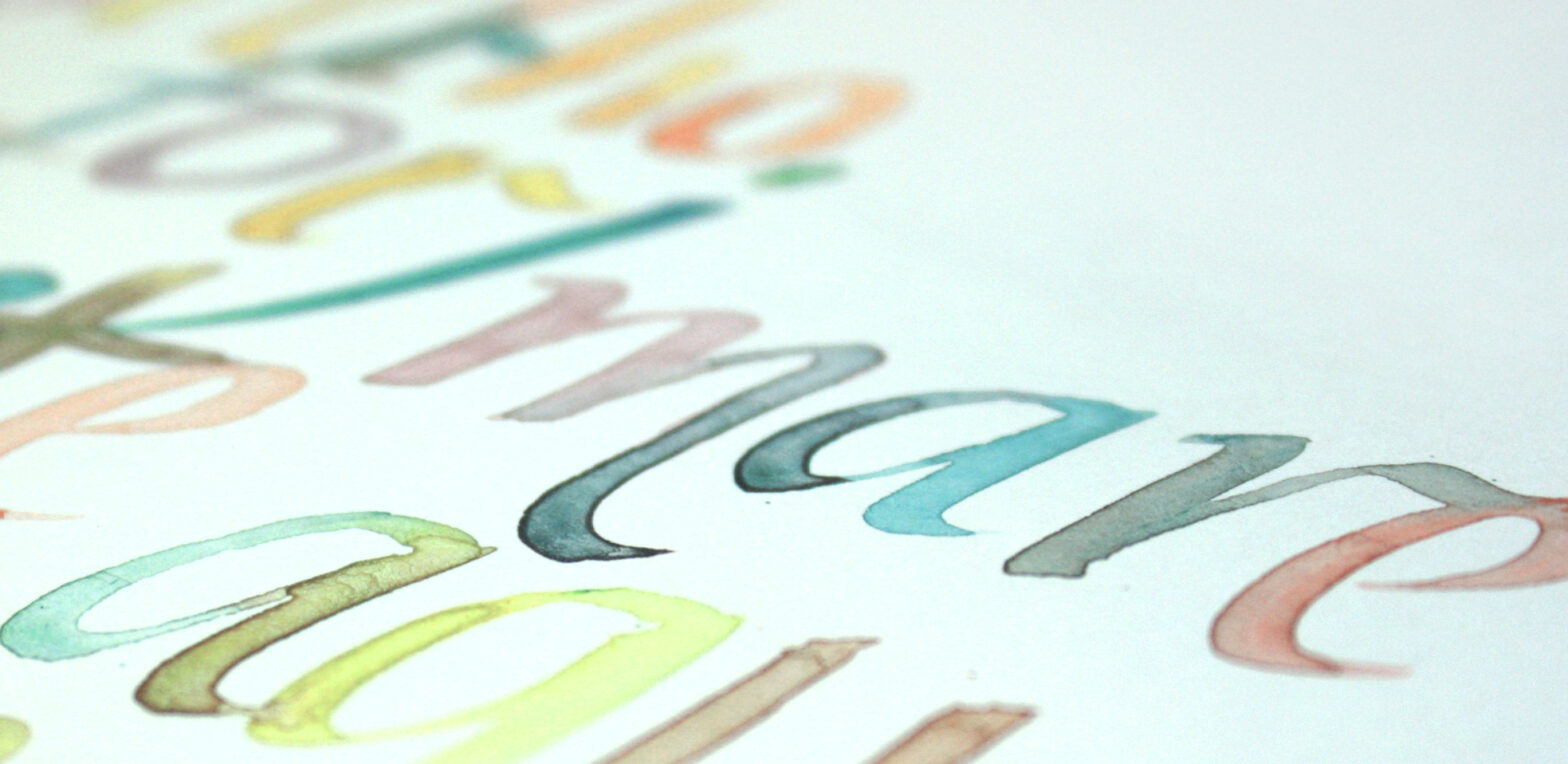
In the past week, we hosted a calligraphy workshop, lectured by the visiting Design teacher and Ph.D. researcher Maíra Woloszyn. It was a one-day workshop, divided into two morning and afternoon sessions, where participants created their own tools —in order to better understand the relation between the stroke mark and its tool marker—, and were…
-
Calligraphy Workshop
On Wednesday, January 19, we’ll host and conduct a calligraphy workshop with our guest teacher and Ph.D. researcher Maíra Woloszyn. The workshop is geared towards beginner and intermediate practitioners, from all fields of art and design. But it is especially focused on the type design and designers as it aims to provide specific knowledge on…
-
Em Dash
The Em Dash is a long horizontal stroke or rule[r] that follows the same typographic expression of the typeface: weight, contrast, stress, and terminals. This means that in specific cases (eg. Humanist, Monospace, Script of Graphic) its terminals might be angled. It is vertically centered on the lowercase characters and has the width of the…
-
Origins of Writing
Writing seems to have its origins in around 4000 BC. Several authors claim as writing signs dating from as early as 20 000 BC. But, for this context, we consider everything we are not sure of being a full writing system as proto-writing (Robinson, 2009). Writing is a “system of graphic symbols that can be…
-
Chiswell
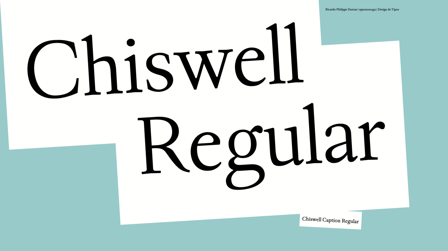
Chiswell is a Garalde typeface optimized for text and captions, designed by Ricardo Dantas in 2021. Its concept derives from the intersectional design space of two famous typographers – Caslon and Fournier. It aims for a sharp x-height and classic features providing an optical variation axis for small text size compositions, such as captions and…
-
Claredon*t
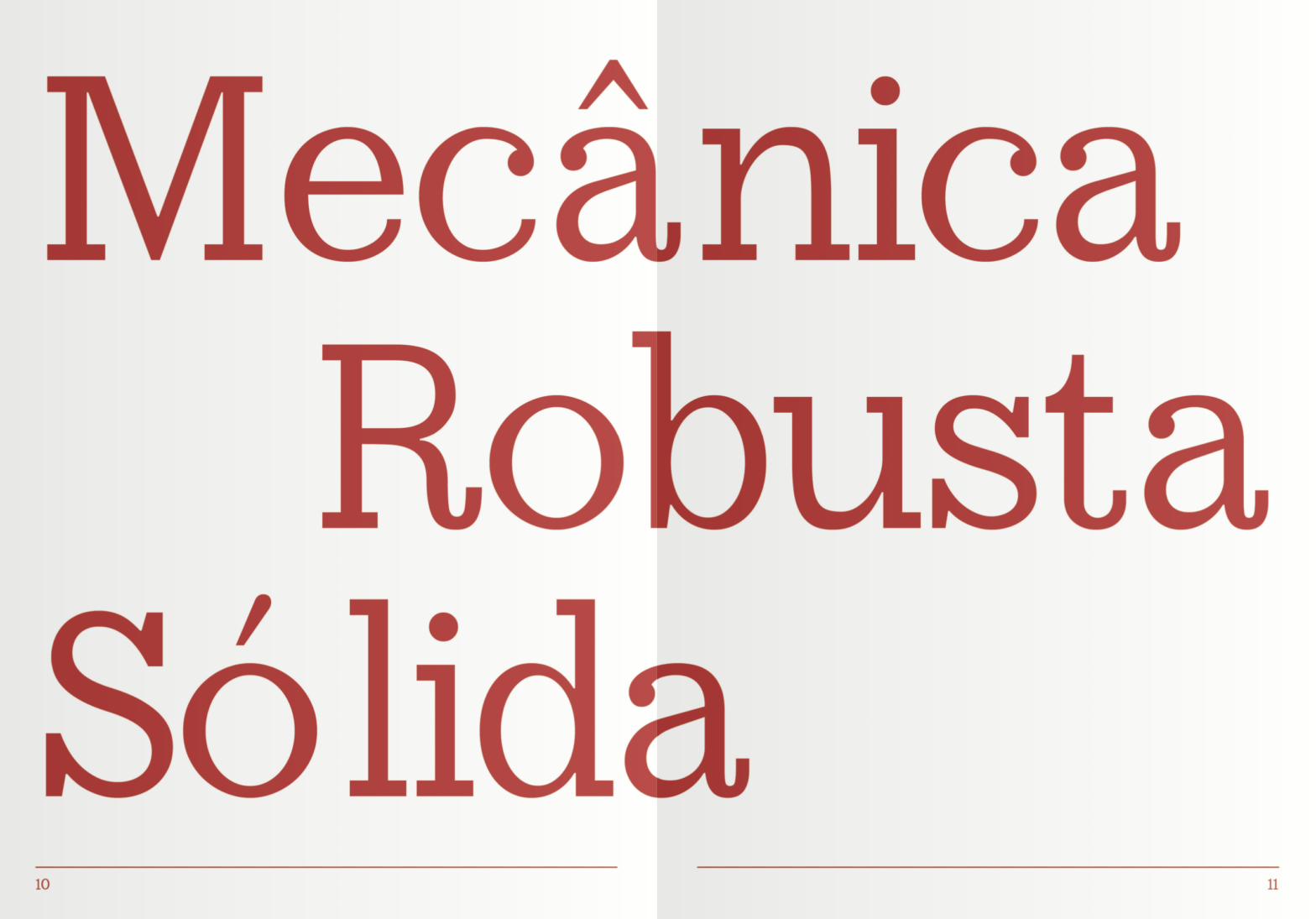
Claredon*t is an Egyptian [clarendon] typeface designed by Ana Rita Antunes, Beatriz Gomes, Diana Pereira in 2021. The final module of the course program is usually distributed over a period of six to eight weeks. During this module, students are encouraged to work in groups. They are required to design a text typeface based on…
-
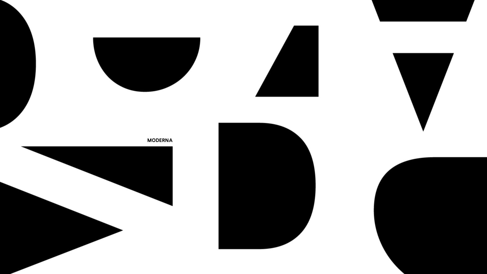
Moderna
Moderna is a geometric, linear, sans-serif, one-axis Variable Font. Heavily influenced by the geometric typefaces from the early twentieth century it provides an even color to text compositions. Designed by Beatriz Almeida, Diana Ferreira and Gabriela Moreira in 2021. Its main influences are fonts such as Futura (1927) by Paul Renner, Kabel by Rudolf Koch…