
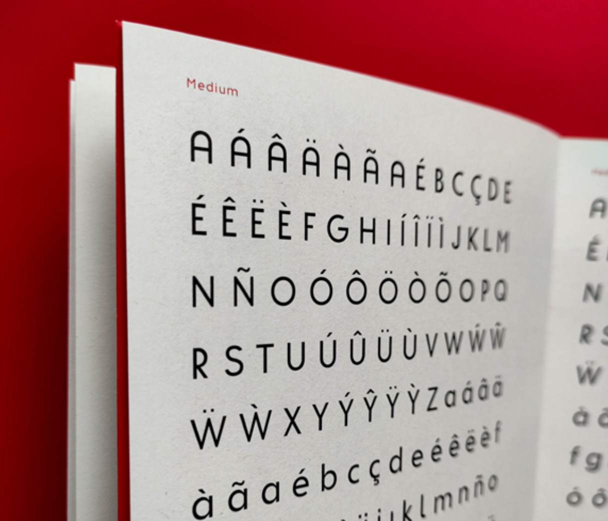
Fritura is a geometric sans serif typeface, designed by Ana Leite, Daniel Sousa, and Rita Vieira in 2024. Fritura is a playful reinterpretation of two influential typefaces: Futura by Paul Renner (1927) and Tia Lira by Manuel Pereira da Silva (2004). It merges the clean, rational forms of Futura with the expressive, localized charm of… Continue reading Fritura
Category: Top
Prova
Prova is a geometric sans serif typeface, designed by Bruna Valoura, Bruno Barros, Cristiana Braz, and Inês Loureiro in 2024. Prova is a revival of Tia Lira, one of the “first geometric typeface developed in Portugal” [please take this information with a slight grain of salt — see more infor about its origin in his… Continue reading Prova
Butique
Student: Roberta MirandaClassification: Hybrid Display Serif – Modern/Rational with Transitional & Flare-Slab InfluencesVariation Axis: Serif Shapes (and optical Size) Butique is a hybrid serif display typeface created by a student in the 2024–25 Typeface Design course at FBAUP. Developed from the Foundational Hand and drawing from Gerrit Noordzij’s stroke theory, the project introduces students to… Continue reading Butique
Pena
Student: Luís LopesClassification: Geometric Serif (Modern/Didone with Art Nouveau influences)Variation Axis: Weight (Regular–Bold) Pena is a geometric serif display typeface designed by a student in the 2024–25 Typeface Design course at FBAUP. The project explores revivalism through juxtaposition, blending 1920s Portuguese typographic aesthetics with the clarity and precision of contemporary digital design. Rooted in the… Continue reading Pena
Bili
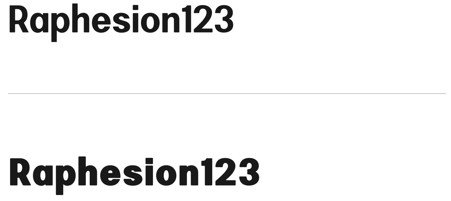
Student: Lília AmaroClassification: Hybrid Sans Serif — Geometric, Neo-Grotesque, and Neo-HumanistVariation Axis: Weight (emphasis on bold interpolation) Bili is a hybrid sans serif display typeface designed by a student in the 2024–25 Typeface Design course at FBAUP. It merges characteristics from three typographic traditions — geometric sans, neo-grotesque, and neo-humanist — resulting in a visually… Continue reading Bili
Unnamed
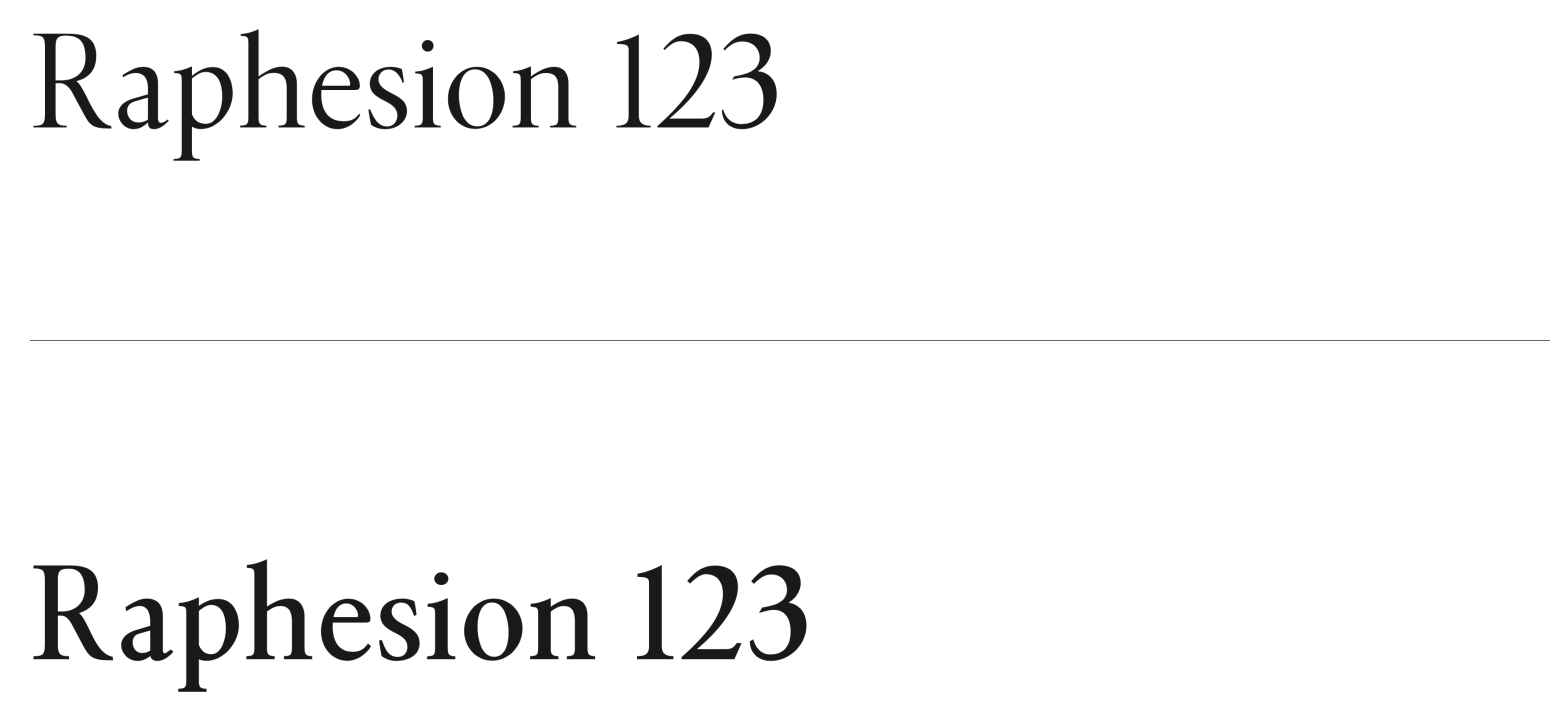
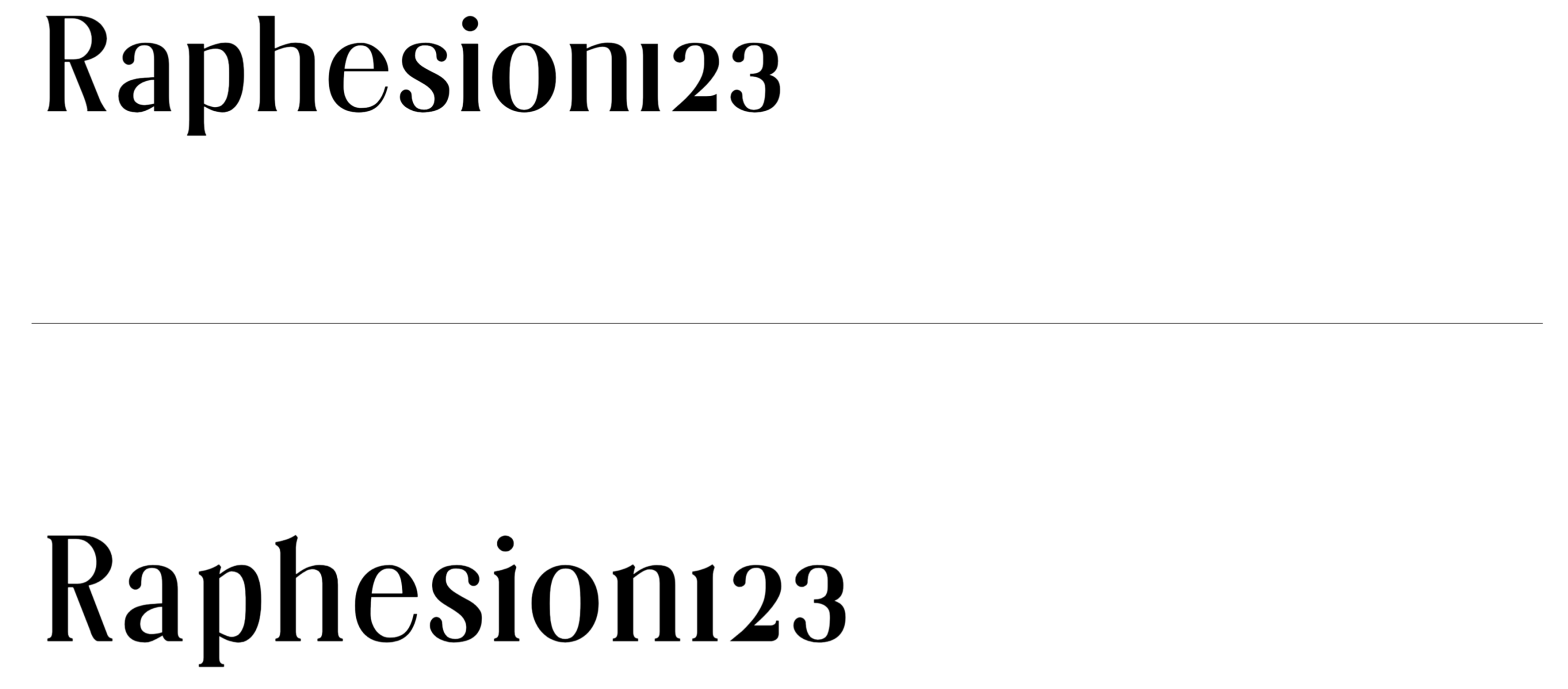
Student: Julien LimaClassification: Transitional Serif (Vox-Atypi)Variation Axis: Weight (Regular–SemiBold) Unnamed is a transitional serif typeface designed by a student in the 2024–25 Typeface Design course at FBAUP. Inspired by Minion Pro, it pays homage to late 18th-century Neoclassical serif types while aiming for balance, legibility, and editorial versatility. Conceived initially in Regular (400) and interpolated… Continue reading Unnamed
Cunty
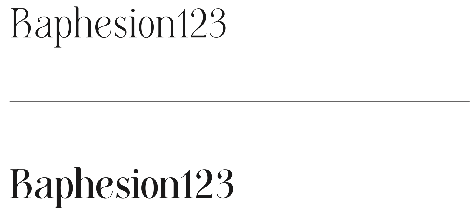
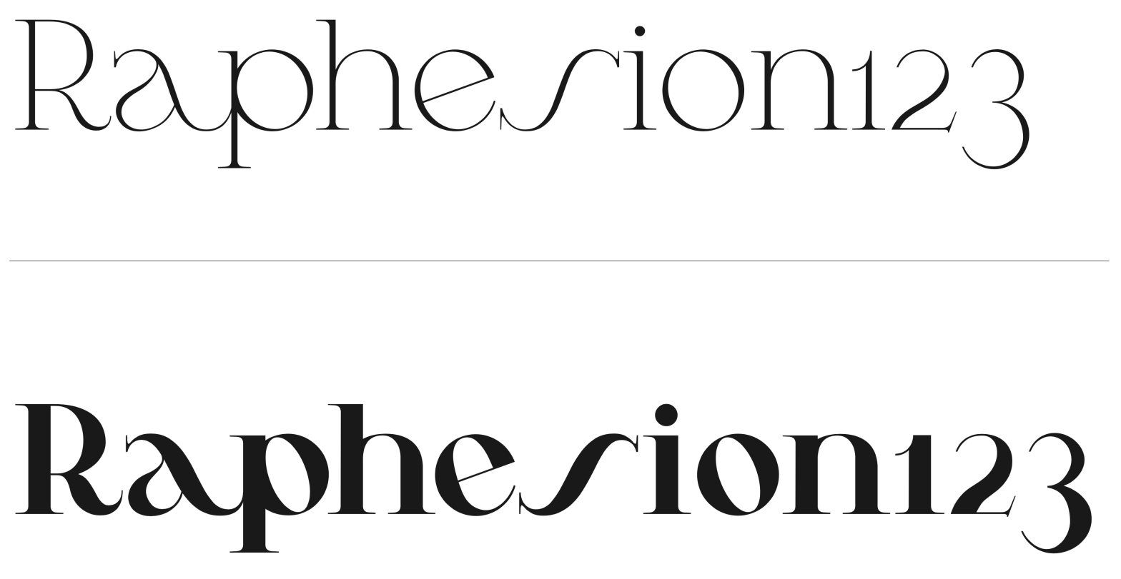
Student: João TomásClassification: Modern Serif (Didone, Vox-Atypi)Variation Axis: Weight (Regular–Bold) Cunty is a modern serif display typeface that draws inspiration from Bodoni and PP Editorial New, embracing the high contrast and vertical stress typical of Didone models. Designed by a student in the 2024–25 Typeface Design course at FBAUP, the typeface introduces a more fluid… Continue reading Cunty
Off Serif
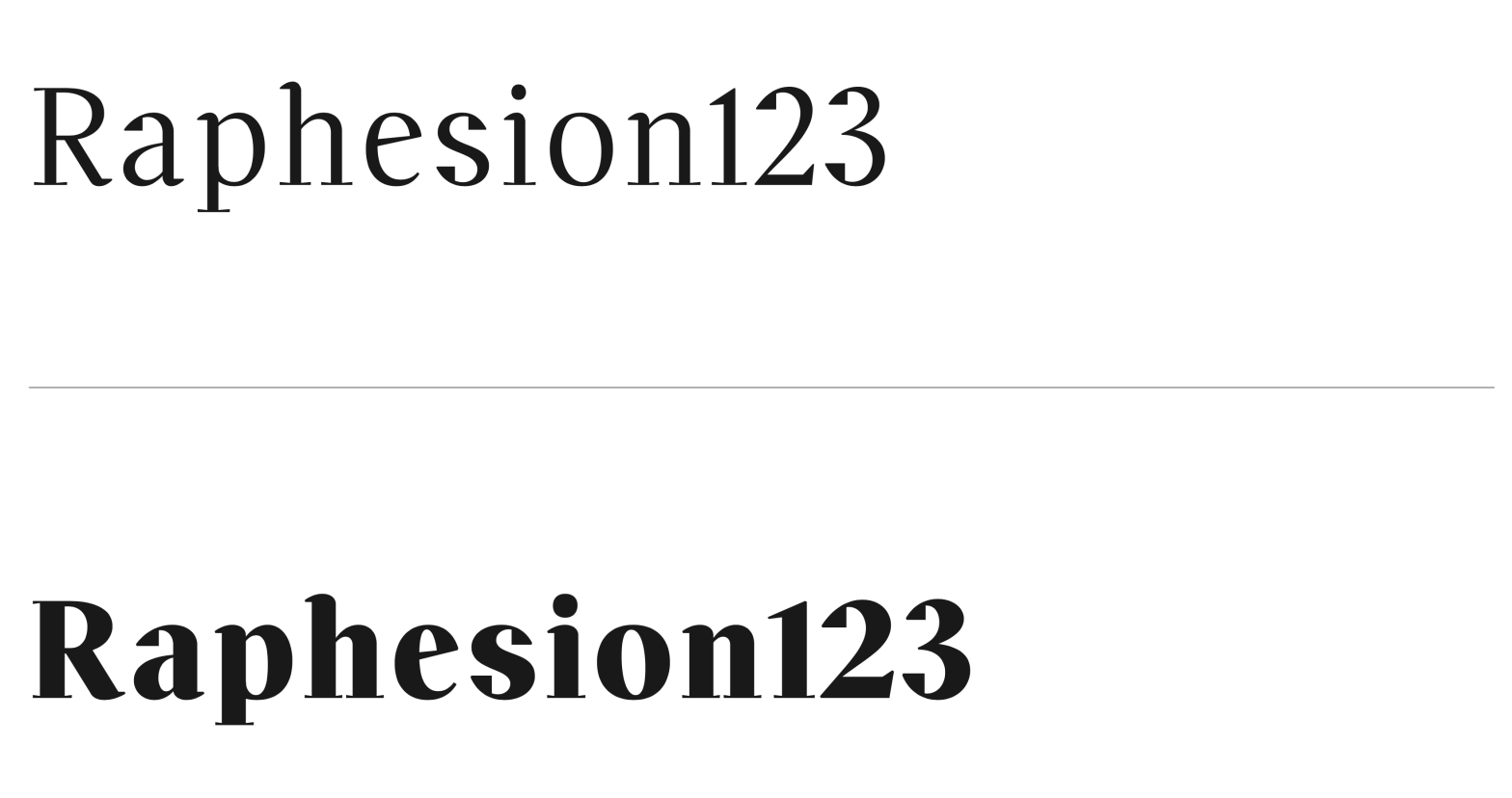
Student: André do Carmo GonçalvesClassification: Didone (Modern Serif – R-Vox)Variation Axis: Weight (5 instances: Regular to ExtraBold) Off Serif is a high-contrast, modern serif display typeface developed as part of an assignment exploring the stroke theory of Gerrit Noordzij. While rooted in the foundational hand, it deliberately deviates from tradition to evoke a delicate balance… Continue reading Off Serif
JVC Bodoni
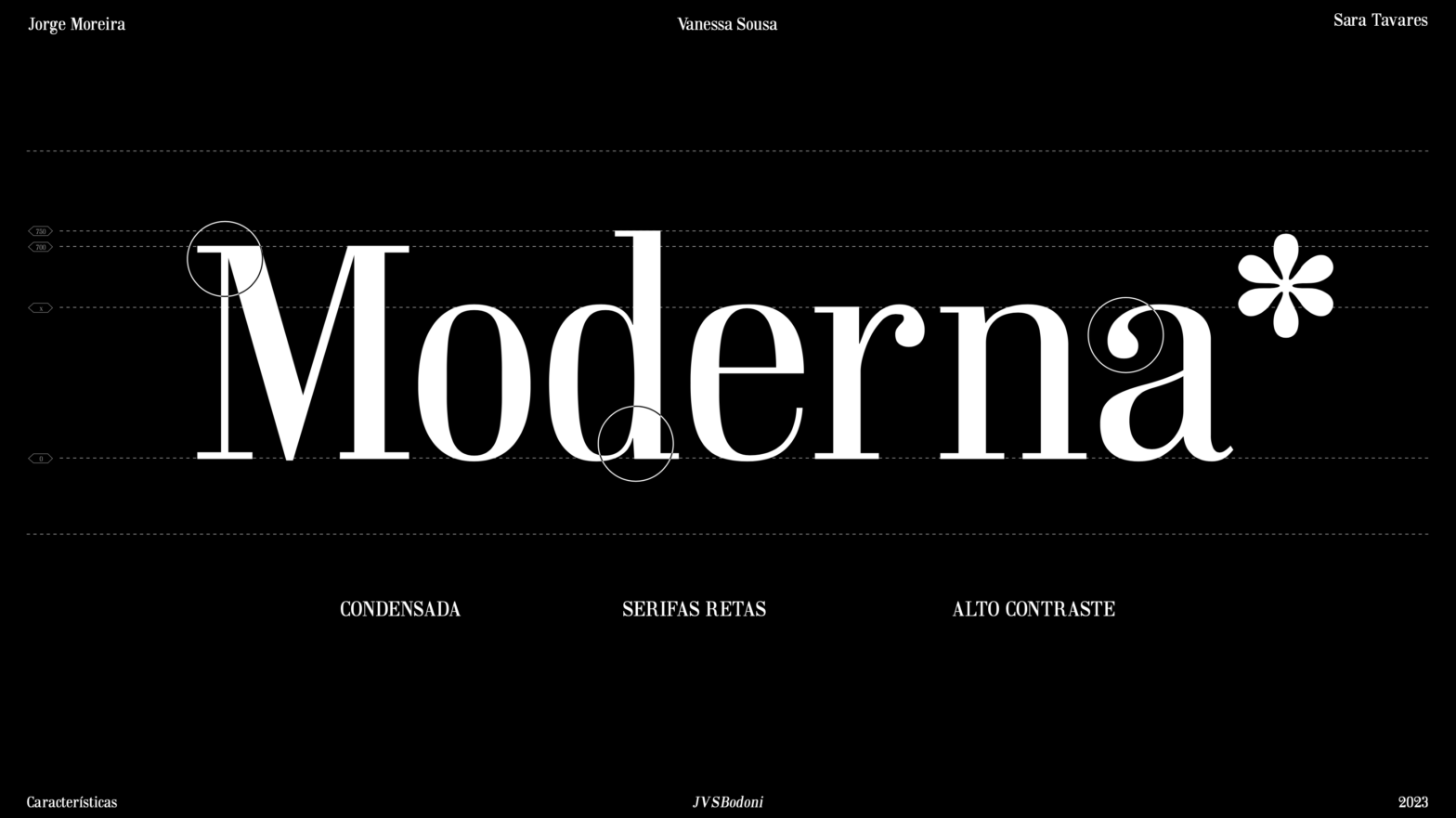
JVC Bodoni is a “Didone” typeface revival, designed by in 2023 by Jorge Moreira, Vanessa Sousa and Sara Tavares. The purpose of this work was to design a font for text inspired by a typography of books prior to 1980, with the intention of updating it to the contemporary [local] culture and, thus, producing a… Continue reading JVC Bodoni
U2

U2 is a neo-grotesque, sans serif font, available in two “flavors” — regular and oblique — designed by Duarte Antão, Joana Tavares, & Maria Figueiredo in 2023. It claims its shape as an Univers Revival. The font’s name/logogram evokes a well-known graphic representation of the original source – the periodic table. It translates all the… Continue reading U2