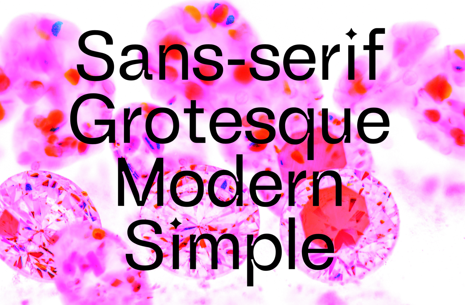
Diamond Grotesk was a typeface designed by Mariana Braga, Marco Antunes, Beatriz Lima during the hybrid sessions of 2021. Heavily inspired by Akzidenz Grotesk, this typeface explores the aesthetic quality of the ink traps and diamond shapes (dots & cuts).
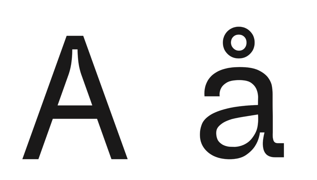
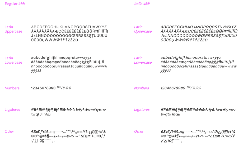
(…) The aim of this project was to develop a font based on the existing grotesques, but with a more contemporary feel, being appropriate mainly for use in text sizes (-10 pt). Due to the editorial design needs of common text composition, with different variants, the font was designed in two masters in an italic variation axis. This ranges from 0 to 14 degrees and can therefore also be used in its slanted version, allowing a variety of dynamic solutions. Starting from the essential characteristics of the base font, the contrasts were slightly increased in some ways, adding ink traps in their joins for reasons of visual weight ba-lance, mainly in a print context. On an aesthetic level, these ink traps were also introduced to reinforce the contemporary character corresponding to current type design aesthetics. The name of this font comes from the particularity of the diamond shape, characteristic of all the dots found in the character set, which turns out to be one of the characteristics that best distinguishes it from other fonts…
This typeface was also presented during the last Typography Meeting and is scheduled to be released commercially soon.
See the specimen or read or see more about this typeface at: https://www.behance.net/gallery/121739099/Diamond-Grotesk-Typeface-Type-Editorial-Specimen