
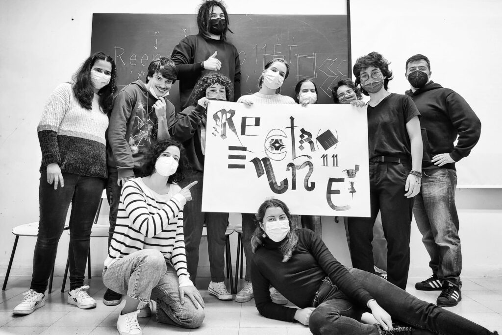
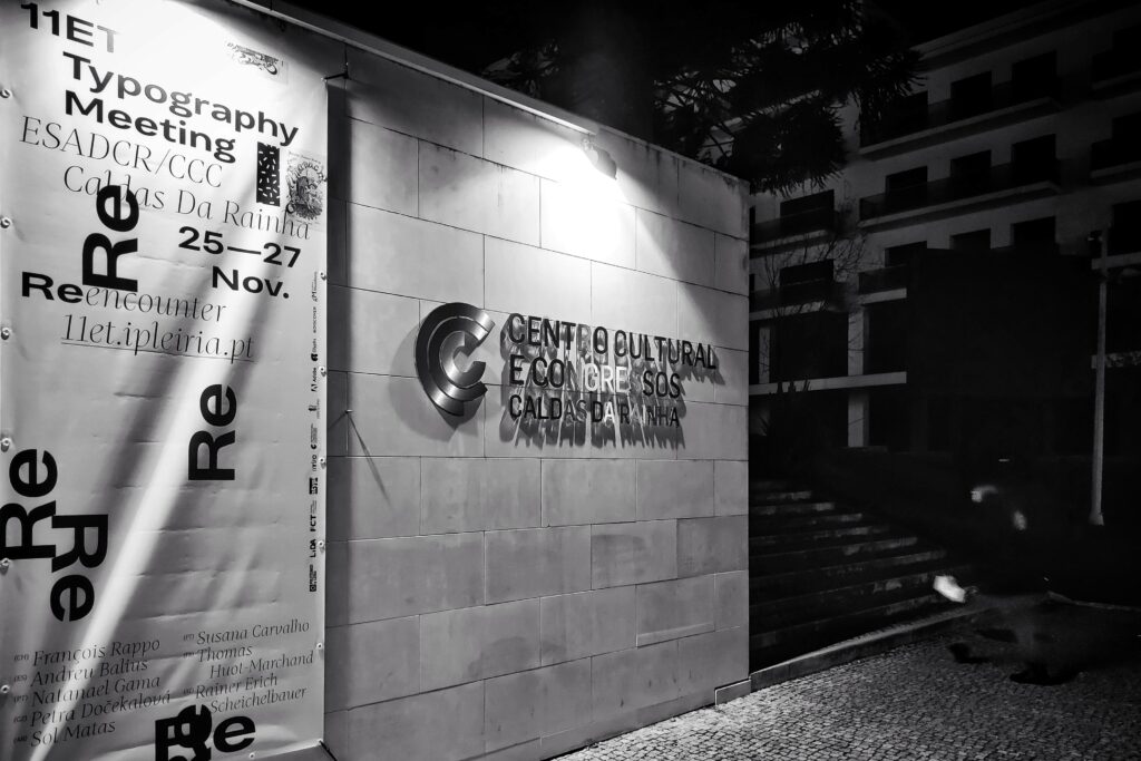
The 11th edition of the Typography Meeting (@encontrodetipografia) took place at Caldas da Rainha, from November 25 to 27. The program included very expressive participation from the FBAUP’s students (mainly the MDGPE’s students) and a Ph.D. researcher. In total, we conducted two workshops, presented three papers, and exhibited four posters.
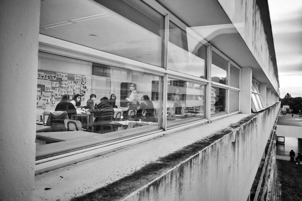
As usual, the conference started with a first workshops-exclusive day. These took place at the amazing Bauhaus-like ESAD.CR school of the arts. We organized and conducted a couple of workshops on type design and font production.
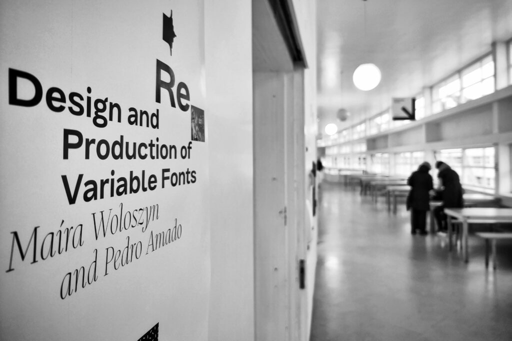
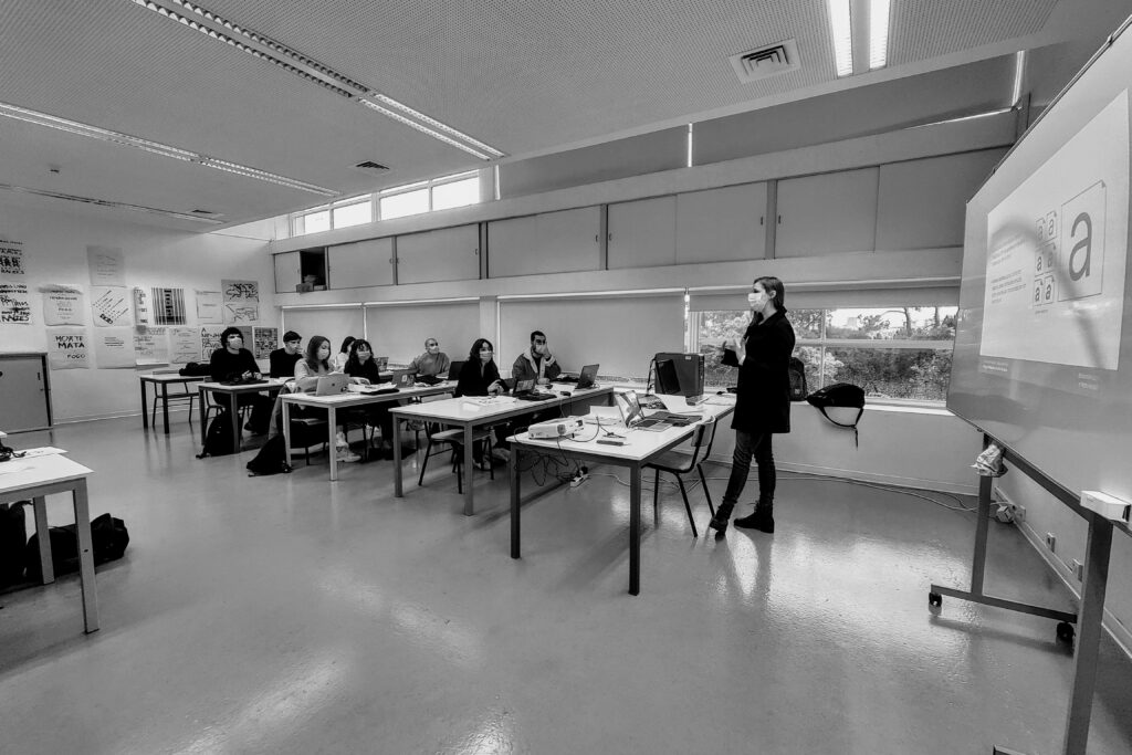
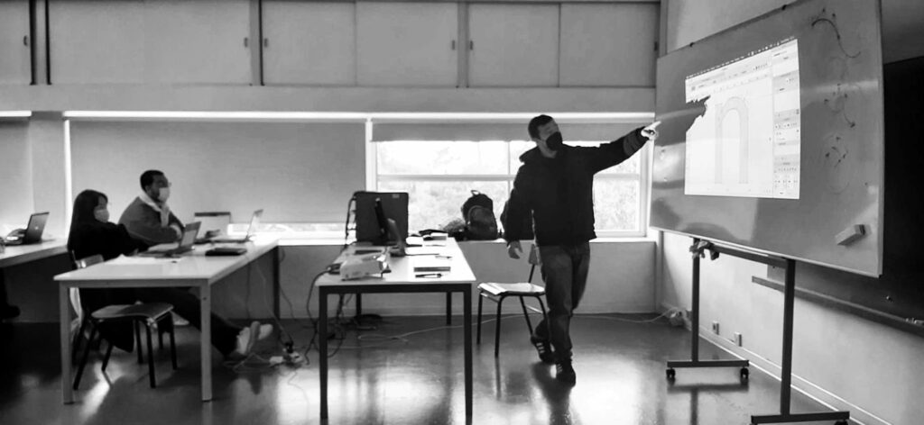
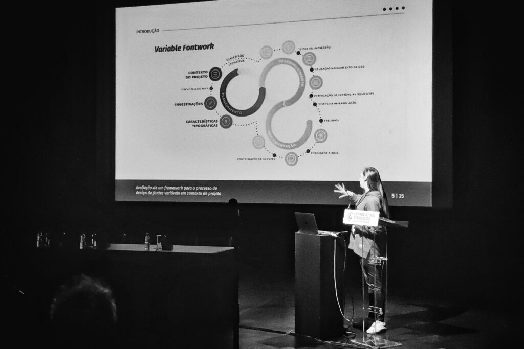
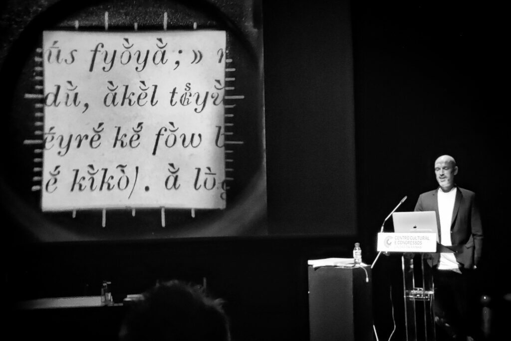
The first, which ran throughout the first full day, was the Design and Production of Variable Fonts with the Ph.D. researcher Maíra Woloszyn (@mairawoloszyn). She presented a quick introduction to the current state-of-the-art development and use of Variable Font technology. Later, Pedro Amado (@pedamado) introduced the participants to the development process of Variable Fonts using Fontlab. The rest of the day was dedicated to the exploration of possibilities guided by Maíra’s custom-designed framework.
Variable Font Design and Production
Maíra Woloszyn & Pedro AmadoVariable fonts have been on the rise due to their digital versatility, impacting editorial and type design practices. This workshop aims to provide a global comprehension of the variable font design process, using a custom-designed framework.
We will start the workshop with a short presentation and focus on hands-on drawing, lettering, and type design activities in order to develop a working variable font prototype. Participants will learn how to approach the font design space, work with axes, instances, and extremes in a professional font production environment. The instructors will provide the support materials and promote an active discussion of the results achieved
With this workshop, we hope to promote the participant’s overall design research and development process as well as stimulate new ways to identify and solve problems in type design-oriented projects.
Duração: 6 horas
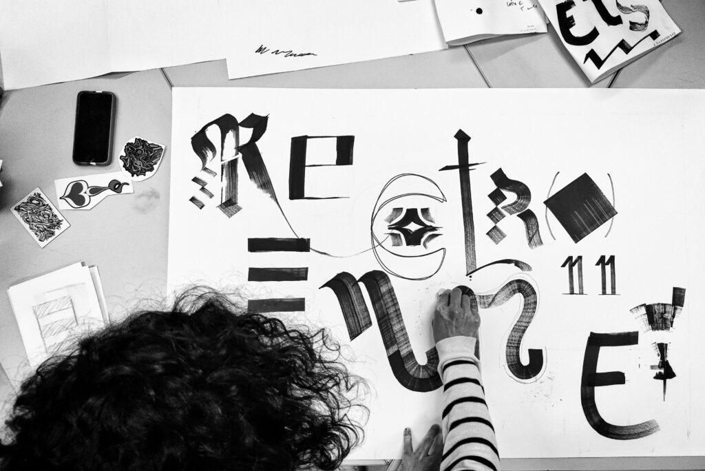
The second workshop was dedicated to type sketching in search of novel ideas worth exploring in type design. This was yet another (slightly modified and ever improved) SLOType workshop we have been exploring in this course, with the IPCA professor Ana Catarina Silva (@anacatarinasilva_). We had the honor and privilege to work with a great group of students from ESAD.CR. The drawing was amazingly fast, and the results were ever so surprising! We have run this workshop for more than 6 editions now, and we keep getting surprised with all the enthusiasm and different designs participants come up with.
SLOType: Take a spin in agile Type Design
Ana Catarina Silva & Pedro AmadoDigital technologies allow the unconstrained exploration of unlimited type design spaces, techniques, and applications with unprecedented access to history and openness to speculative approaches.
Grounded on Gerrit Noordzij’s “The stroke” theory, and harnessing agile development methodologies, this workshop will present a creative and educational process. Using simple drawing tools, participants will be introduced to the translation and rotation writing dimensions. During the three stages of the workshop, a digital tool will provide progressively challenging prompts to design an “adhesion” keyword. Participants will have to question their assumptions, bend the rules, and generate original design sketches. Who will win the jackpot?
Duration: 4 horas
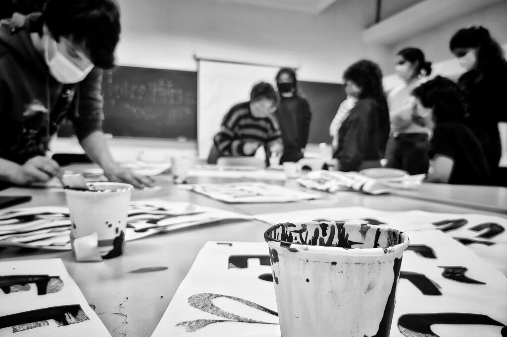
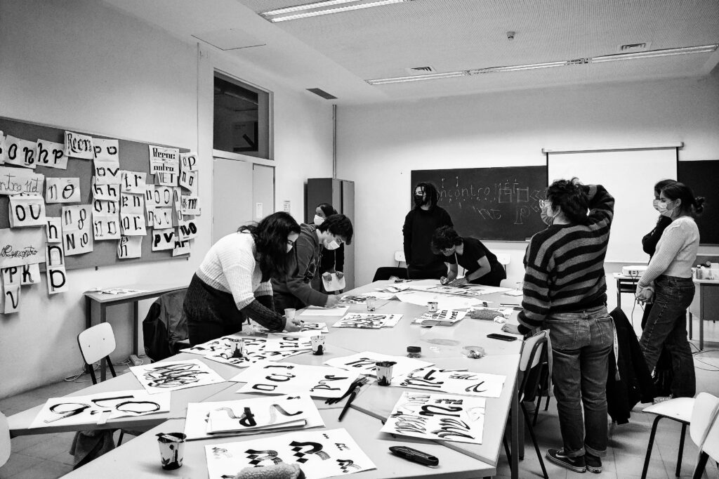
These were just a couple of workshops available throughout the day. There were other amazing workshops ranging themes from calligraphy and lettering to font design and production. And a special one that covered printing with modular, digitally-fabricated letterpress modules with a provisional press. We hope to have Ângelo and Vítor Quelhas soon at FBAUP to explore conduct this workshop. And also, soon we hope to be conducting a similar activity in the XTND Lab, as the work of Ana Rita Antunes and the Provisional Vandercook is coming along in timely progress.
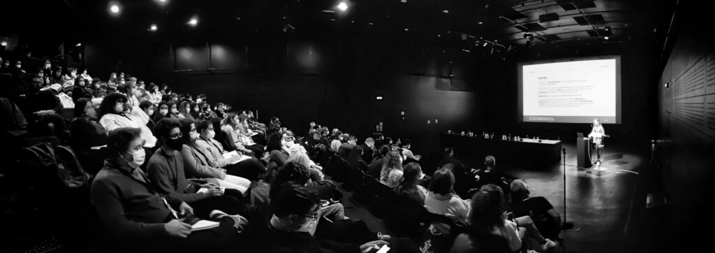
The following two days were dedicated to the conference. After a one-year hiatus, it was great to have this event is back on track.
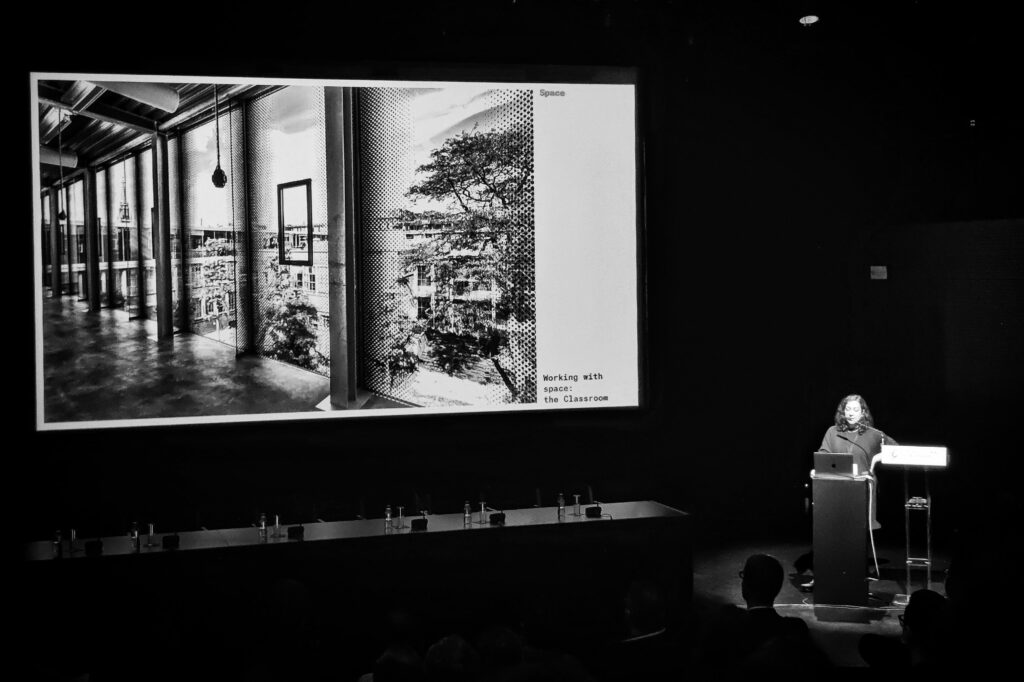
The conference started with an awe-inspiring, practice-challenging keynote address from Susan Carvalho. Susana challenged us to rethink the cultural, hierarchical, gender assumptions and common practices in education through the lens of the [type] spacing. A great theme, presented with a totally relevant metaphor.
Then, the program of the plenary session continued where we had the most significant representation from the “FBAUP committee”.
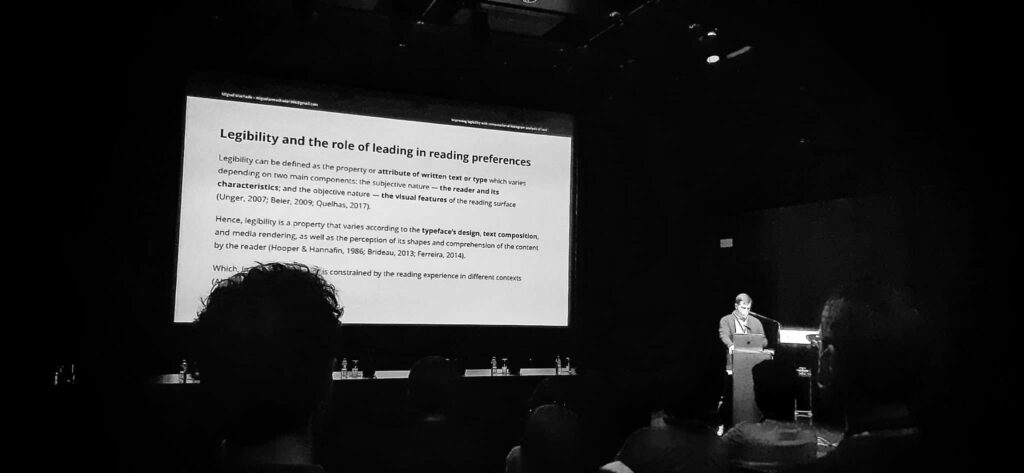
First, Miguel Machado’s master project was presented. Here, the main highlights from his work on the importance of leading to tweak legibility through fine-tuning the “color” of the text were covered, as well as the methodology of analysis and the proposal of the soon-to-be-developed prototype.
Improving legibility with computational histogram analysis of text. Miguel Machado, Pedro Amado and Eduardo Aires
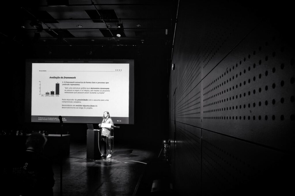
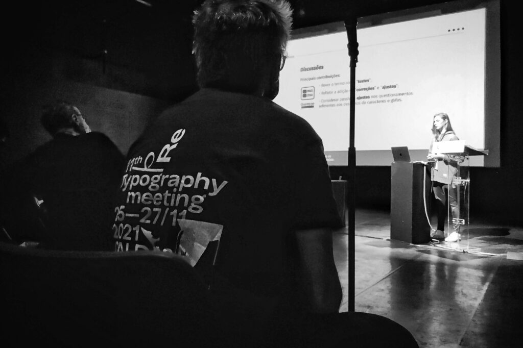
Then Maíra Woloszyn presented us with a couple of communications. The first was on a different approach to doing a QA assessment to the font production process (mainly geared to students and newbie type designers).
Evaluation of a framework for variable fonts design process in a project context. Maíra Woloszyn, Pedro Amado and Berenice Santos Gonçalves
And a second one was a very insightful paper on the current state of affairs of type and typography research being done in Portugal and Brasil. This paper describes the trends and revealed the weaknesses and opportunities for current and future research on typography and type design — mainly, for us, here in Portugal, about the vernacular artifacts.
Panorama of research in typography in the principal thesis and dissertation repositories: a comparative study between Brazil and Portugal. Maíra Woloszyn, Pedro Amado and Berenice Santos Gonçalves
The rest of the conference program continued, presenting work from national and international designers, professors, researchers, and students. It was a very healthy mix of themes and expertise levels, including Professional Type Design Studios and Research Laboratories such as the Atelier National de Recherche Typographique – ANRT.
And it was a great way to actually see and hear what the Portuguese Colleges and Polytechnics are investing in. This year, it was noticeable very healthy participation from ESAD.CR, ESAD (Matosinhos), ESMAD-IPP, FAUL, FBAUP, IPCA, and UFSP just to mention the few that were visibly affiliated.
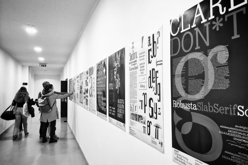
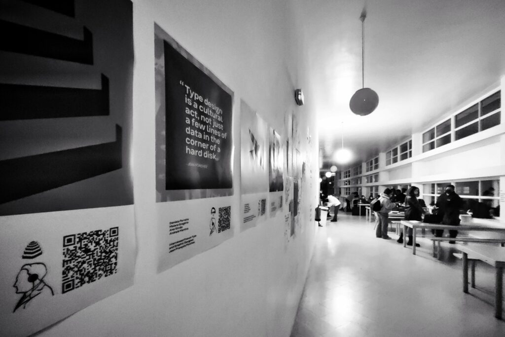
Last, but not least, the posters and the student’s participation in the exhibition. In total, we had four posters accepted and exhibited during the conference. One from the master dissertation project of Tereza Zagalo.
A Influência do Modernismo no Design de Tipos para Sinalética: Desenvolvimento da Kobalt (tipo de letra) e a Sinalética para a Oficina CobaltoTM
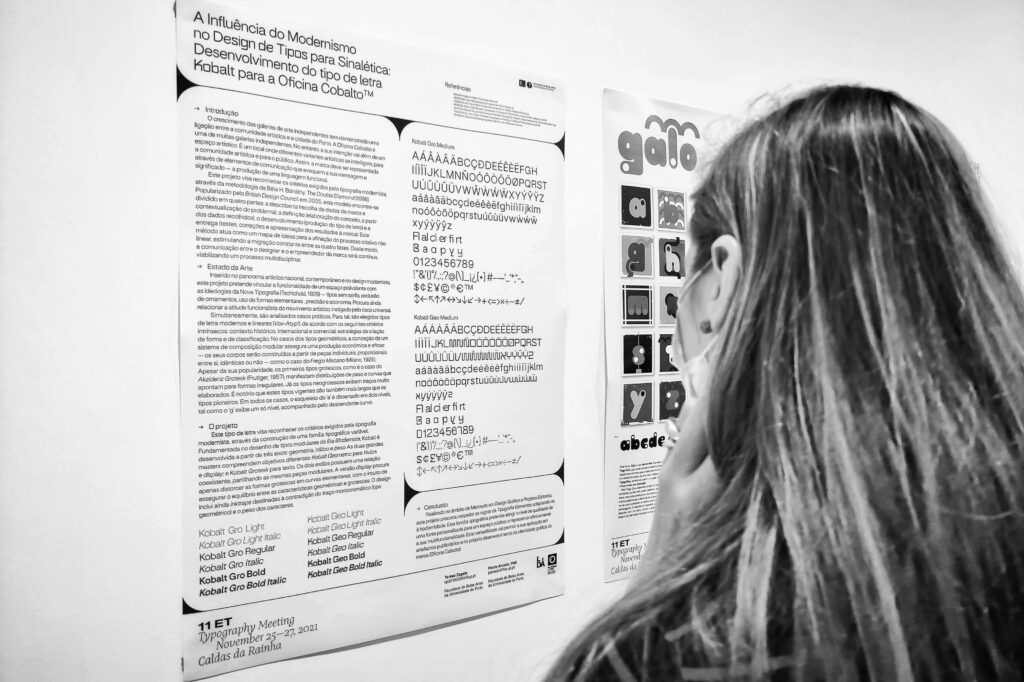
Teresa will soon be doing her final presentation, but this was yet another important milestone, after the Type Crit with John Downer and the best art & design presentation award at the IJUP online conference.
The additional posters were also very important for this course and the master program as they resulted from the work done in the final Type Design course assignment — research, design, and produce a variable font for text compositions. This means the students dive into the topic of Typeface revivals and the issues of designing text-size specific features that deal with legibility. Not only do they have to create an original design, but also they have to implement it in a full Latin STD character set, one axis/two masters minimum Variable Font.
One of the most impressive designs — as it presents comprehensive research as well as a full response to the project briefing — we’ve had in the course was
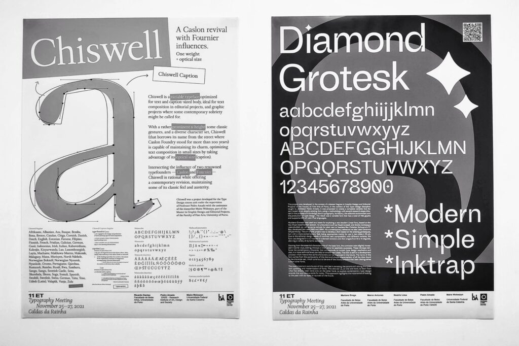
Chiswell: A Caslon and Fournier influenced mashup
Ricardo DantasChiswell is a Garalde (Vox-ATypI) variable typeface optimized for text and caption-sized body, ideal for text composition in editorial projects, branding and any other graphic project where some contemporary sobriety might be called. With a rather prominent x-height, some classic gestures, and a diverse character set, Chiswell — that borrows its name from the street where Caslon Foundry stood for more than 200 years — is capable of maintaining its charm, optimizing text composition in small sizes by taking advantage of its optical size (caption). Intersecting the influence of two renowned typefounders — Caslon and Fournier — Chiswell is timeless and rational while offering a contemporary revision, maintaining some of its classic feel and austerity…
The other two posters are also excellent examples of the Type Design Course. All projects are different and it is always difficult to have chosen between them. Despite having “teased” all the students from the course, it was an absolute pleasure and privilege to have
Diamond Grotesk
Mariana Braga, Marco Antunes, Beatriz Lima(…) The aim of this project was to develop a font based on the existing grotesques, but with a more contemporary feel, being appropriate mainly for use in text sizes (-10 pt). Due to the editorial design needs of common text composition, with different variants, the font was designed in two masters in an italic variation axis. This ranges from 0 to 14 degrees and can therefore also be used in its slanted version, allowing a variety of dynamic solutions. Starting from the essential characteristics of the base font, the contrasts were slightly increased in some ways, adding ink traps in their joins for reasons of visual weight ba-lance, mainly in a print context. On an aesthetic level, these ink traps were also introduced to reinforce the contemporary character corresponding to current type design aesthetics. The name of this font comes from the particularity of the diamond shape, characteristic of all the dots found in the character set, which turns out to be one of the characteristics that best distinguishes it from other fonts…
See the specimen or read or see more about this typeface at: https://www.behance.net/gallery/121739099/Diamond-Grotesk-Typeface-Type-Editorial-Specimen
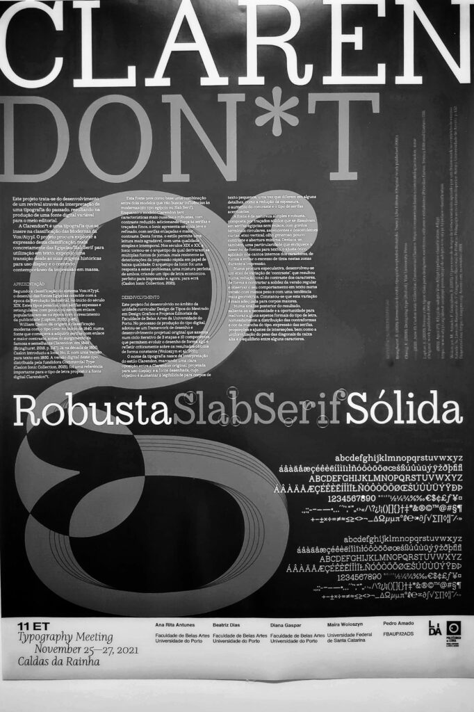
And also to have the participation of this final poster. Worth mentioning is that the Type Design course focuses on the design and development of the fonts and the production of a booklet specimen. Hence all these posters were developed after the course ended. Especially this final one — with the participation of two of the students we are currently working with within the XTND Lab —, had several optimizations done to the typeface and a very worthwhile investment from all the team members.
Claredon*t
Ana Rita Antunes, Beatriz Gomes, Diana Pereira(…) Clarendon*t is a typeface that falls under the Egyptian classification of VoxAtypI. The project seeks to explore the use of Slab Serif fonts for textual use, exposing a transition from their historical origins to display use and the contemporary context of mass printing. (…) The name of the typeface comes from the interpretation of the Clarendon style, marking a clear opposition between the original Clarendon, designed for display use, and the designed font, whose purpose is to increase readability for small bodies of text, since they differ in some details, such as thickness, contrast and type of serifs (…) fat circular terminals, short ascenders and descenders, a vertical axis, a generous eye, little contrast, and minimal aperture. There is also a particularity that enriches the design of fonts for text, the optical adjustment, a kind of italic, applied to the inner corners of the characters. The variation axis developed resulted in a total reduction of character contrast, in order to counteract the solidity of the regular version and observe its behavior in text in a version with less weight and a more geometric trend…
These typefaces (and some additional ones) can be viewed in the course portfolio.