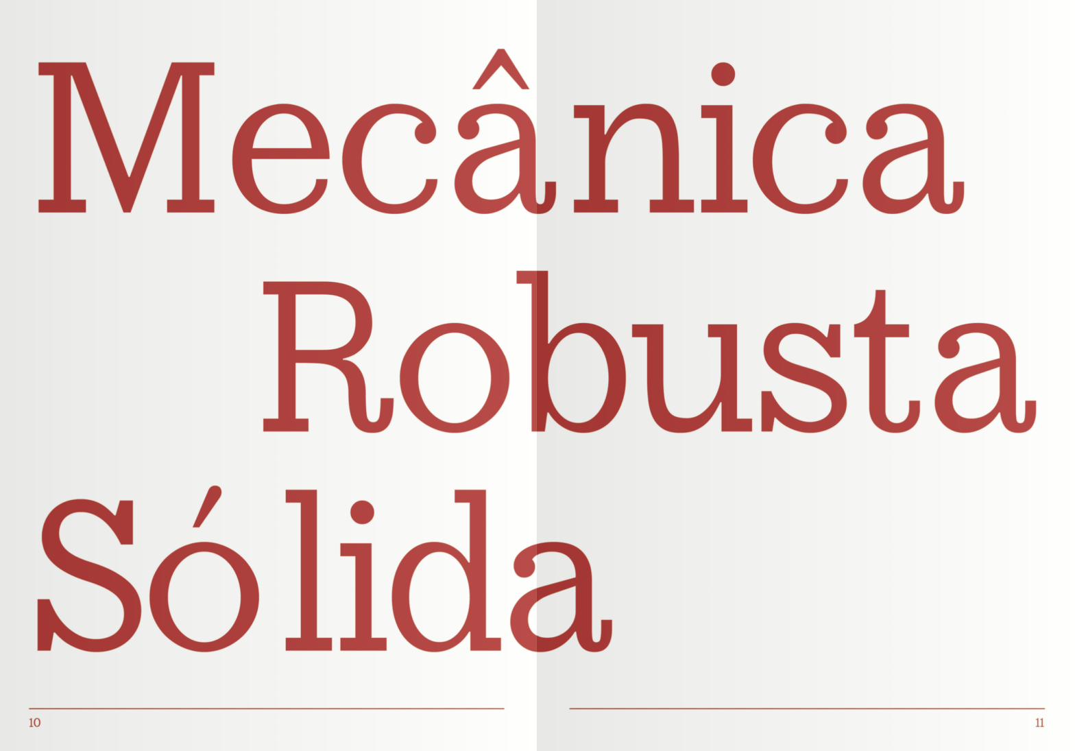
Claredon*t is an Egyptian [clarendon] typeface designed by Ana Rita Antunes, Beatriz Gomes, Diana Pereira in 2021.
The final module of the course program is usually distributed over a period of six to eight weeks. During this module, students are encouraged to work in groups.
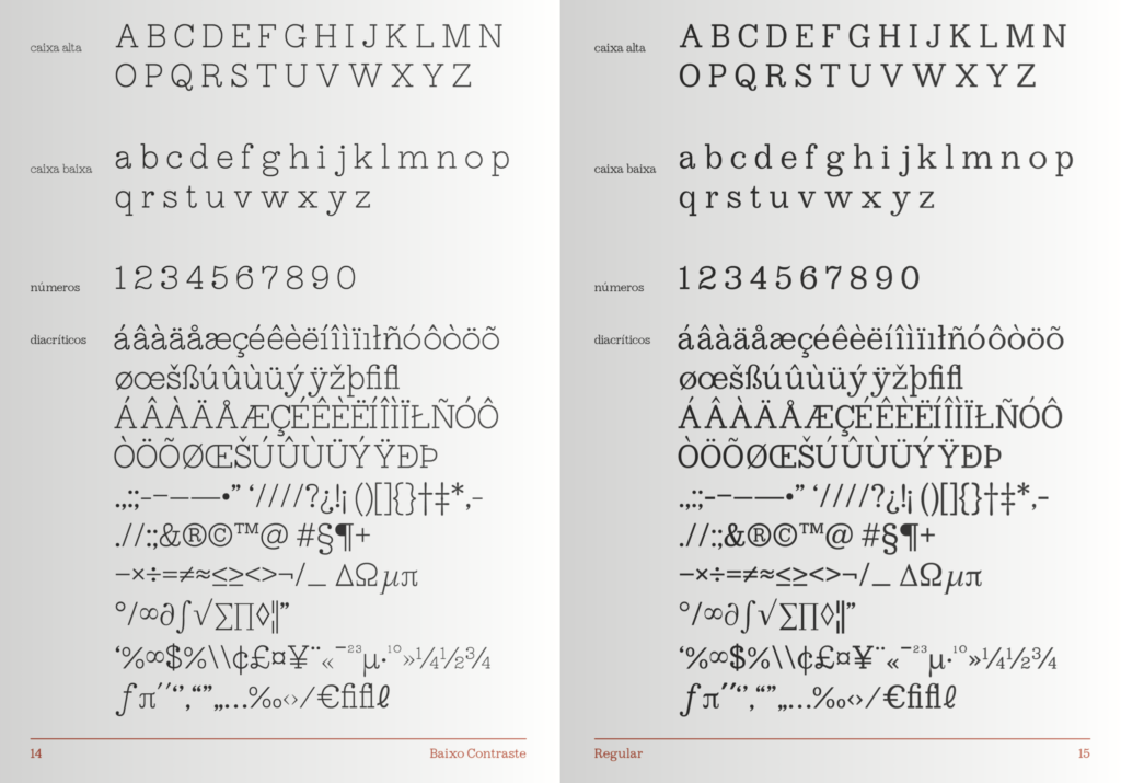
They are required to design a text typeface based on a revival of their choice. But they are required to produce a full Opentype Std Character set and implement it in a functional variable font (with a minimum of two masters required).
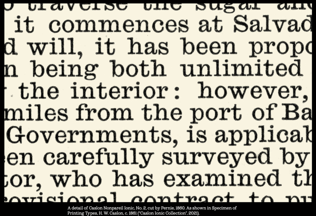
The name of the typeface comes from the interpretation of the Clarendon style, marking a clear opposition between
the original Clarendon, designed for display use, and the designed font, whose purpose is to increase readability for small bodies of text, since they differ in some details, including thickness, contrast, and serif type. Despite some issues, it is surprisingly robust and evenly colored.
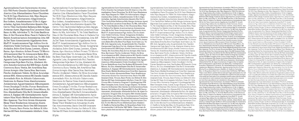
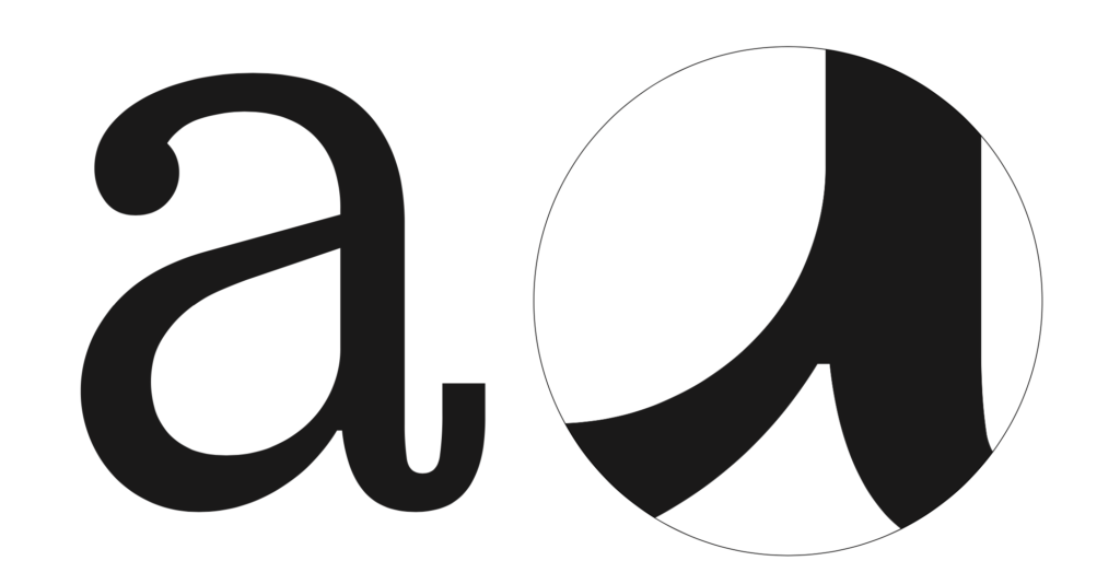
Its design is based on fat circular terminals, short ascenders and descenders, a vertical axis, a generous eye, little contrast, and minimal aperture. There is also a particularity that enriches the design of fonts for text, the optical adjustment, a kind of italic, applied to the inner corners of the characters.
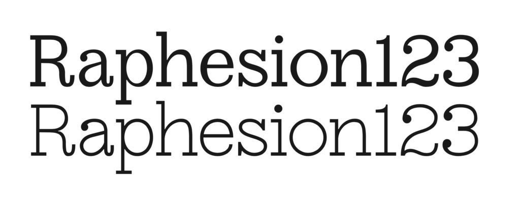
The variation axis developed resulted in a total reduction of character contrast, in order to counteract the solidity of the regular version and observe its behavior in text in a version with less weight and a more geometric trend.
This typeface was also presented during the last Typography Meeting. See the full booklet specimen here.