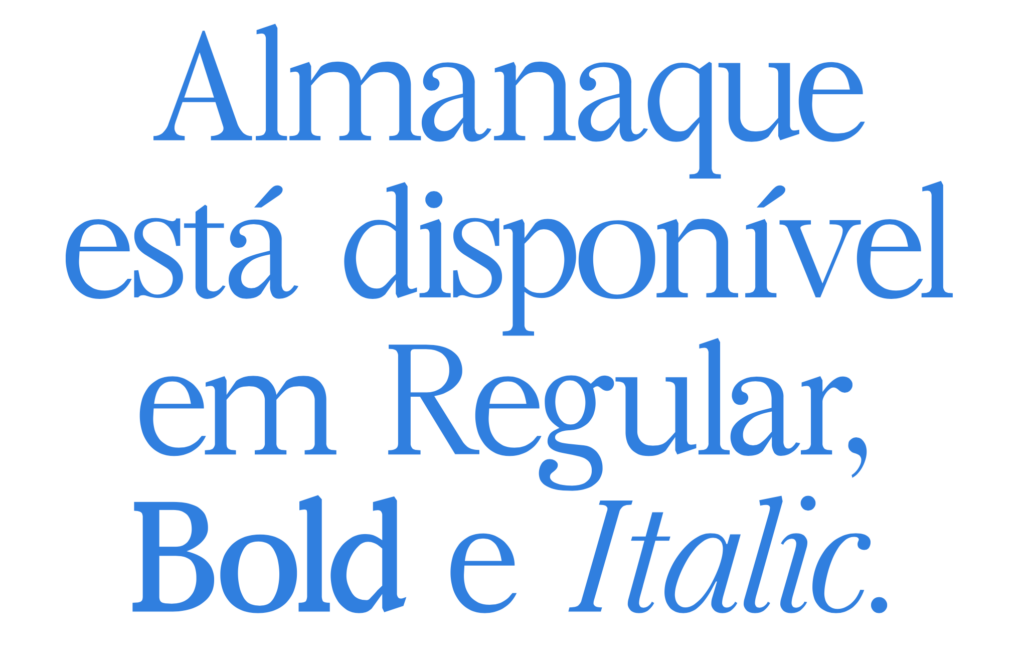
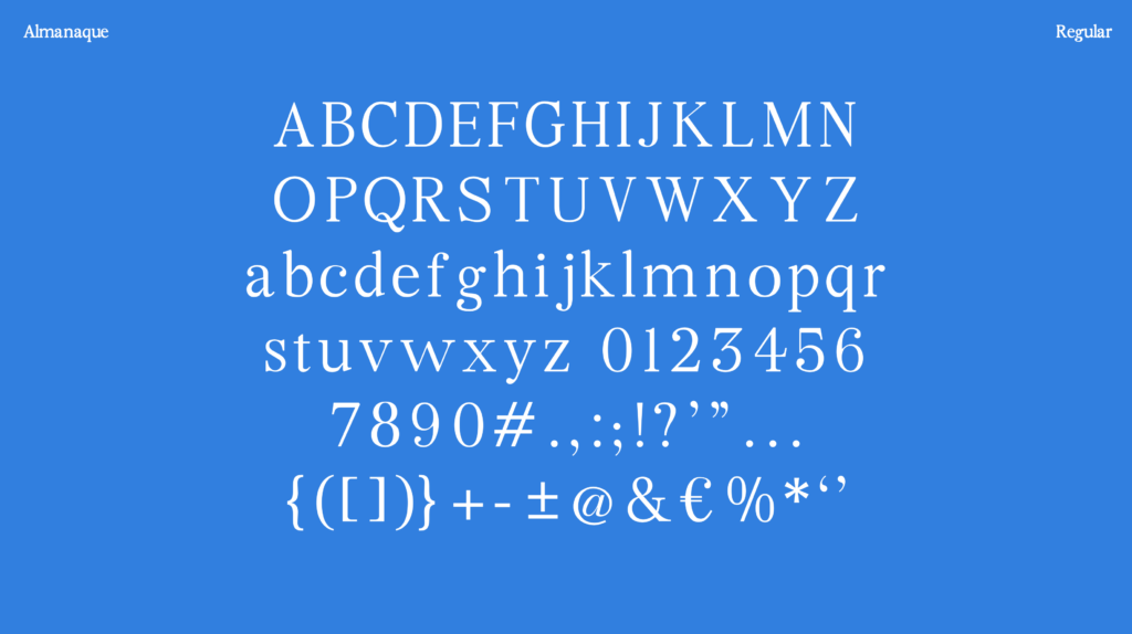
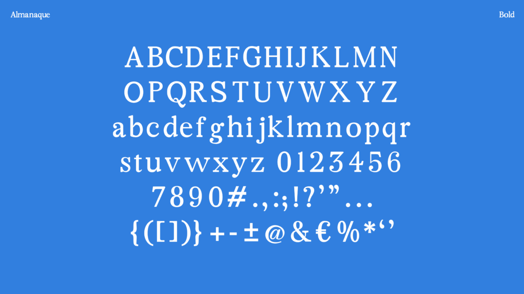
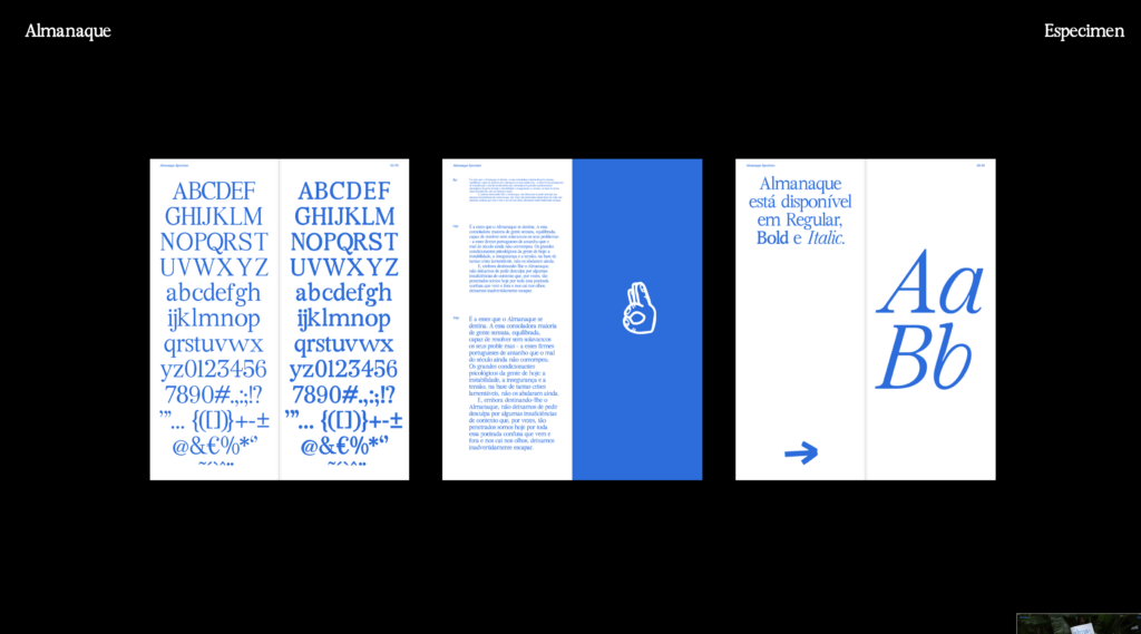
Almanaque is a digital typeface revival that varies in two styles and thicknesses, inspired by the old Portuguese almanacs. Designed by Alexandre Sousa, Leonor Aguiar and Marta Silva in 2023.
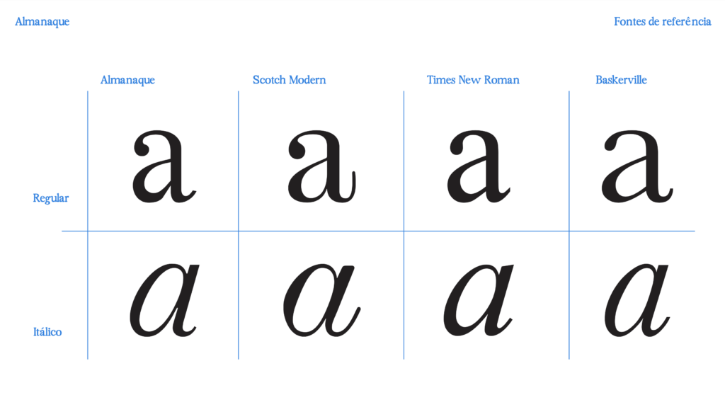
Classified between a transitional and rational serif, it results from a creative process that involved the research and analysis of various type designs used in manual printing of almanacs in the 19th and 20th centuries. (…) The Almanac combines the elegance of Scotch Modern with the symmetry of Baskerville and the usefulness of Times New Roman, adapted to the contemporary context.
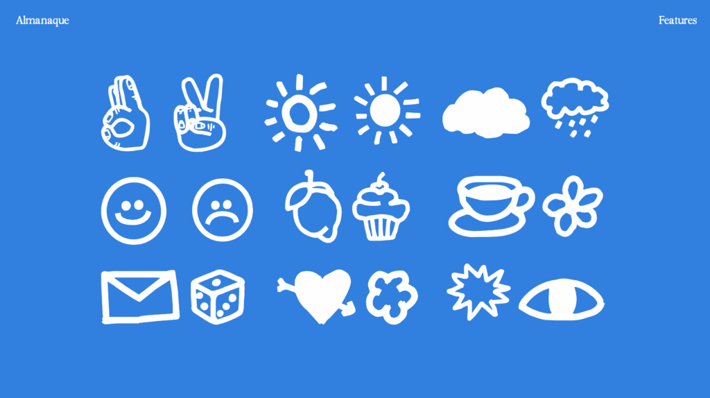
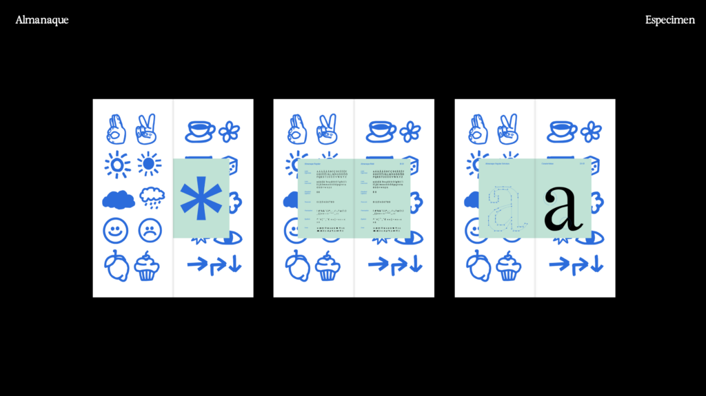
As a typeface it is intended to be a vehicle of connection between classic almanacs and the digital world, through a new Font that via reinterprets classics of manual printing. This typography seeks to rescue the tradition of old almanacs, which were used as sources of information and entertainment, and adapting it to new media
Adapted excerpt from the project presentation
of communication and technologies available.
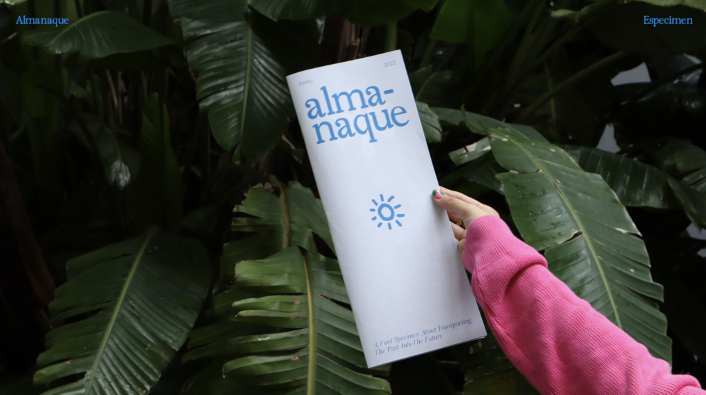
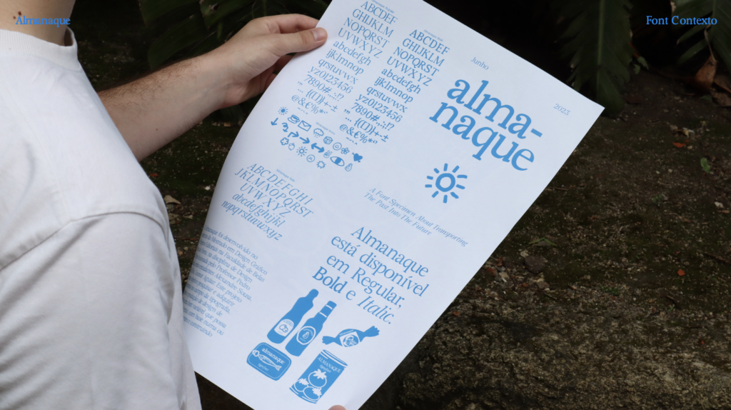
See the full specimen booklet here.