Primeira (1.ª) is a font that is born from the isolation of the characteristics that dictate the identity of a [Transitional] Scotch [Roman]. Designed by Catarina Ferreira & Ricardo Figueiredo in 2023.
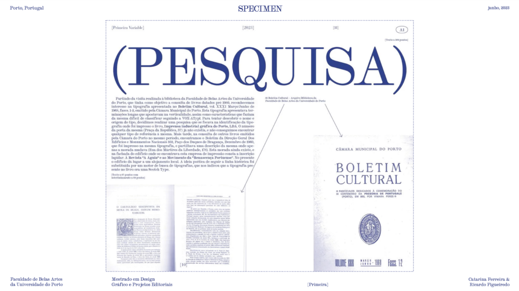
Starting from the visit made to the library of the Faculty of Fine Arts of the University of Porto, which aimed to consult books dated pre-1980, we recognized an interest in the typography presented in the Cultural Bulletin, vol. XXXI March/June 1968, fascs. 1-2, issued by the Porto City Council. This typography had long endings that bet on verticality (…) following the historical line was replaced by an online search engine, pointing towards Scotch Type(s).
(…)
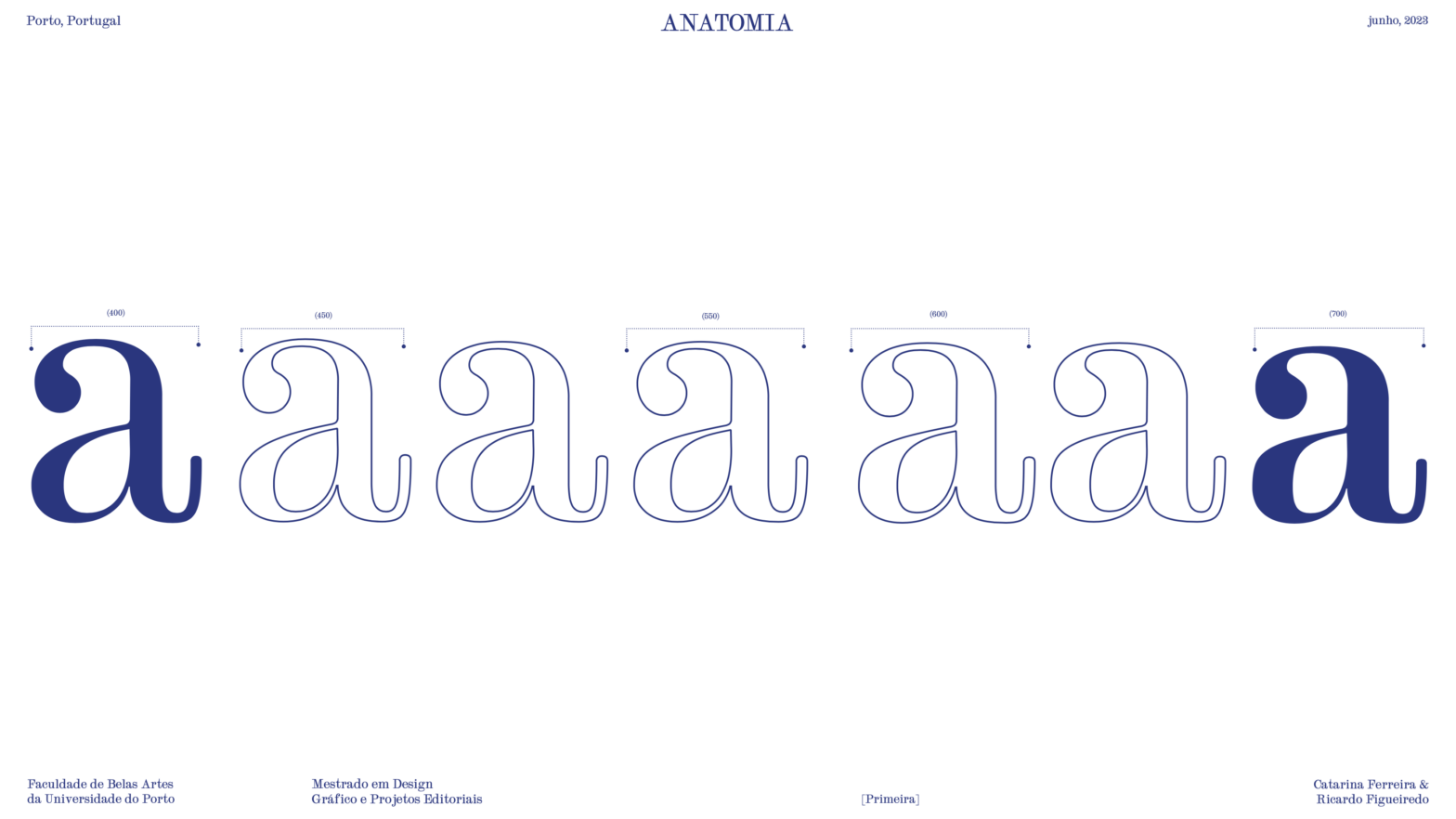
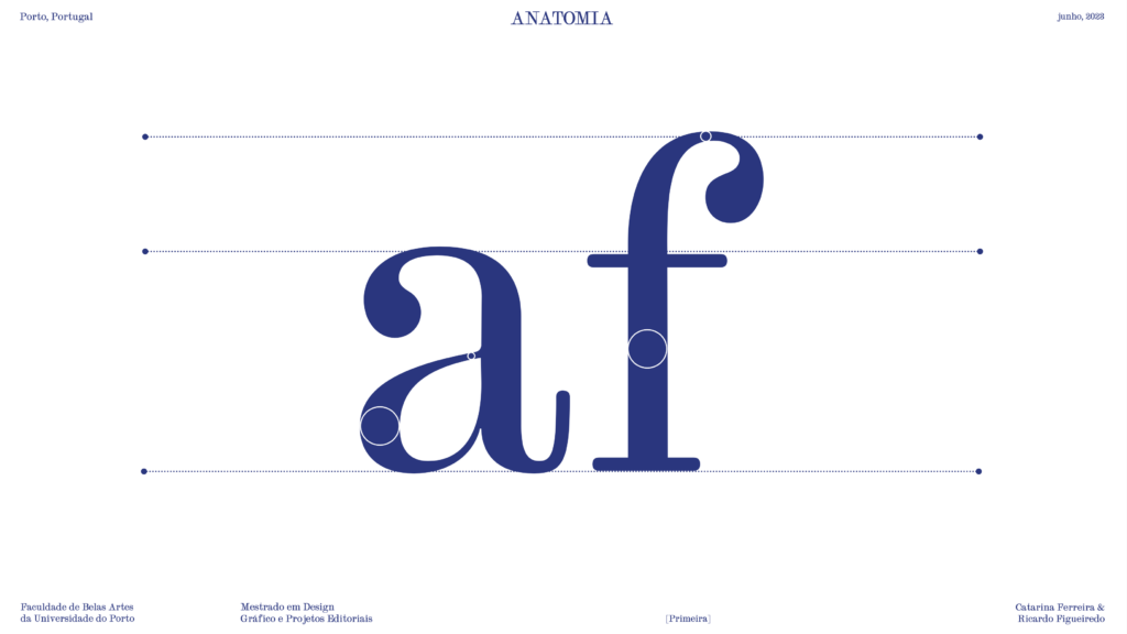
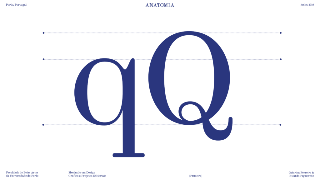
Starting from the isolation of the characteristics that dictate the identity of a Scotch, through the digitization of the pages of the book and isolation of each distinct letter present in the same, we began the process of redesigning these same characteristics, trying to bet even more on verticality, making the serifs completely vertical or horizontal, but maintaining a round ending. (…) Characteristics such as the relationship between the width of the letter stem and the length of its serifs were maintained. We changed some letters that used slightly curved diagonals, such as the spine of the “S”, and made them straight. (…) [Heavily] referring to Nick Shinn’s Scotch Modern regular, to try to understand (…) our interpretations.
(…) The digital design of the letters, consists of 178 glyphs of the Latin alphabet, and a bold variation implemented in a Variable Font.
Adapted excerpt from the project booklet
See the full specimen booklet here.