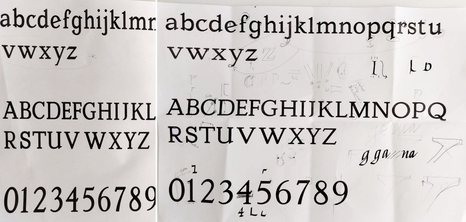
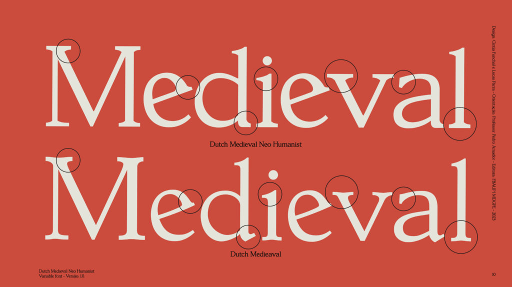
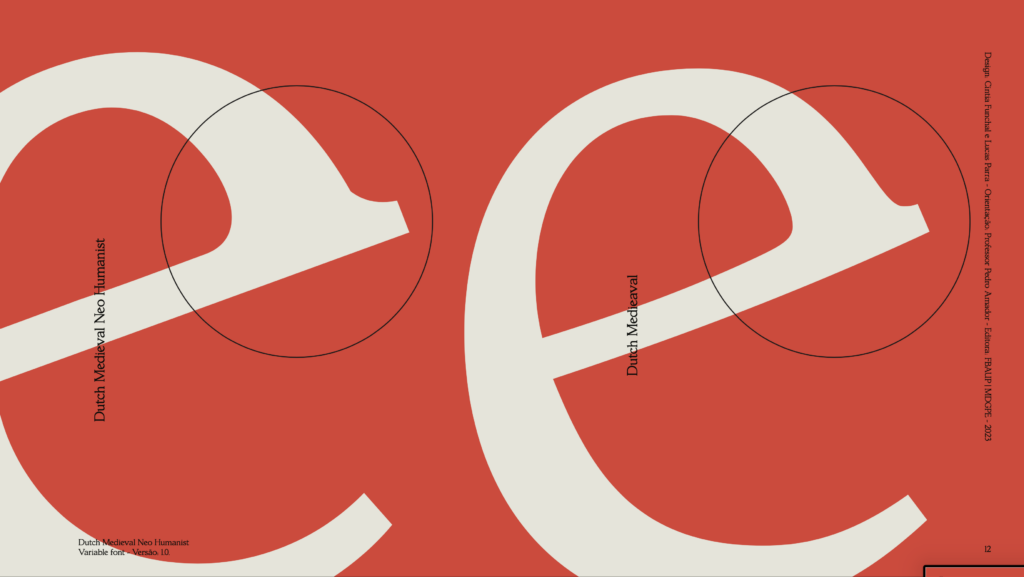
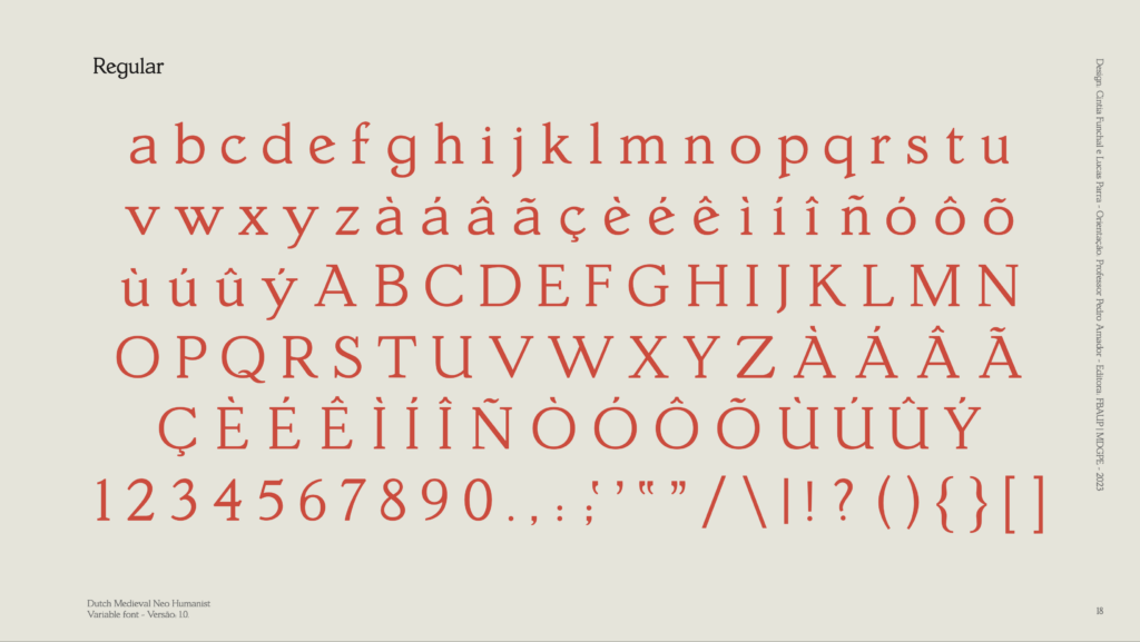
Dutch Medieval Neo Humanist is a revival interpretation typeface, designed by Cíntia Funchal & Lucas Parra in 2023, based on a printed copy of Hollandsche Mediaeval, originally created in 1912 by S. H. de Roos.
Hollandsche Mediaeval typography exerted a significant influence on the artistic milieu, leaving a lasting legacy in the history of typography. Its distinctive and ornate shapes added a touch of elegance and sophistication to artistic compositions of the time. In addition, the meticulous attention to detail and the search for visual harmony became hallmarks of this typography. Contemporary artists and designers continue to draw inspiration from this style, adapting it to new media and exploring its aesthetic versatility. The fusion of past and present provides a fascinating dialogue between tradition and innovation, making Medieval Dutch typography a rich source of inspiration in the artistic world.
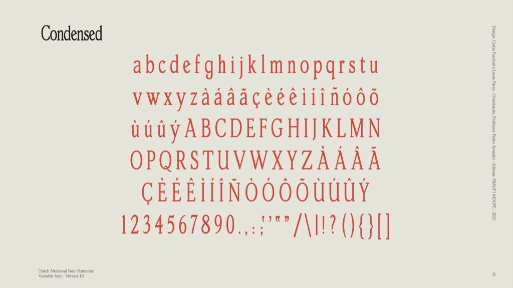
The design of Dutch Medieval Neo Humanist from the original Hollandsche Mediaeval offered a unique opportunity to explore the work of the type designer. (…) to re-signify several aspects present in the original font, especially in relation to the curves of the serifs, which referred to styles from a bygone era and the creation of a new style, the condensed one.
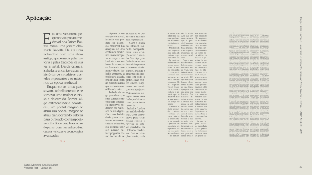
The central aim of the project was to preserve Hollandsche Mediaeval’s historic heritage while adapting the font to meet contemporary demands for readability and functionality.
Adapted excerpt from the project presentation
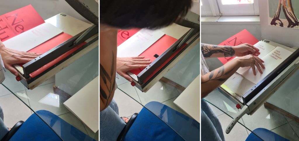
See the full regular specimen booklet and condensed specimen booklet here.