Author: Pedro Amado
-
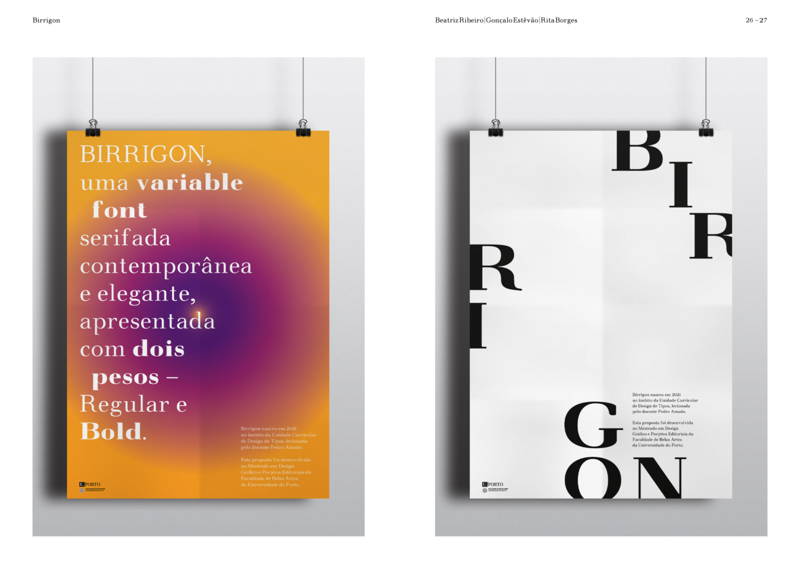
Birrigon
Birrigon is a quirky, old-style inspired, soft-corner text typeface revival. Designed and produced by Beatriz Ribeiro, Gonçalo Estevão, and Rita Borges during 2021. Birrigon merges 5 different typefaces and feature influences: Walbaum, Normande, Goudy Old Style, Verona, and Bembo. From these, special attention was dedicated to preserving the proportions and spacing, especially from Walbaum. Designed…
-
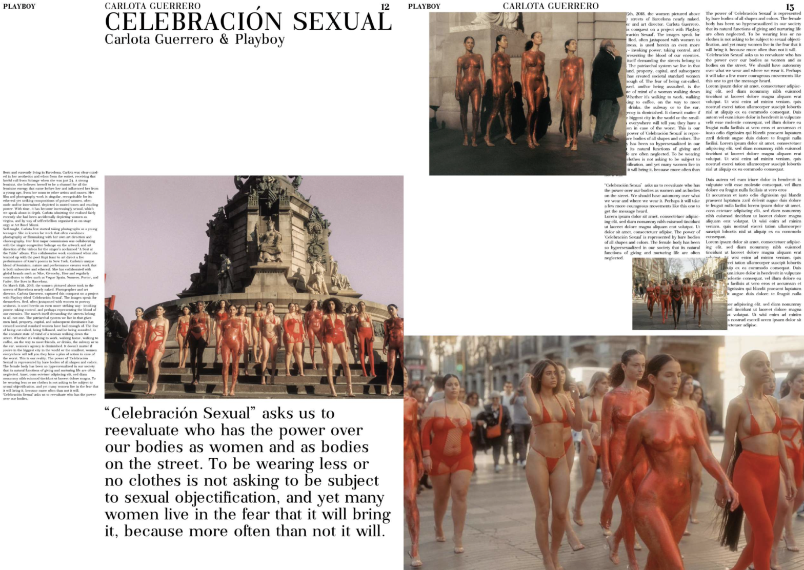
Suggia
Suggia is a didone serif typeface for general use. Designed and implemented by Marta Saraiva, Francisca Barros, Helena Barradas, and Margarida Tavares, Suggia font is characterized by the vertical axis, the narrow serifs, drop endings, and its great contrast. Suggia owes its name and design as a tribute to the famous cellist from Porto, Guilhermina…
-
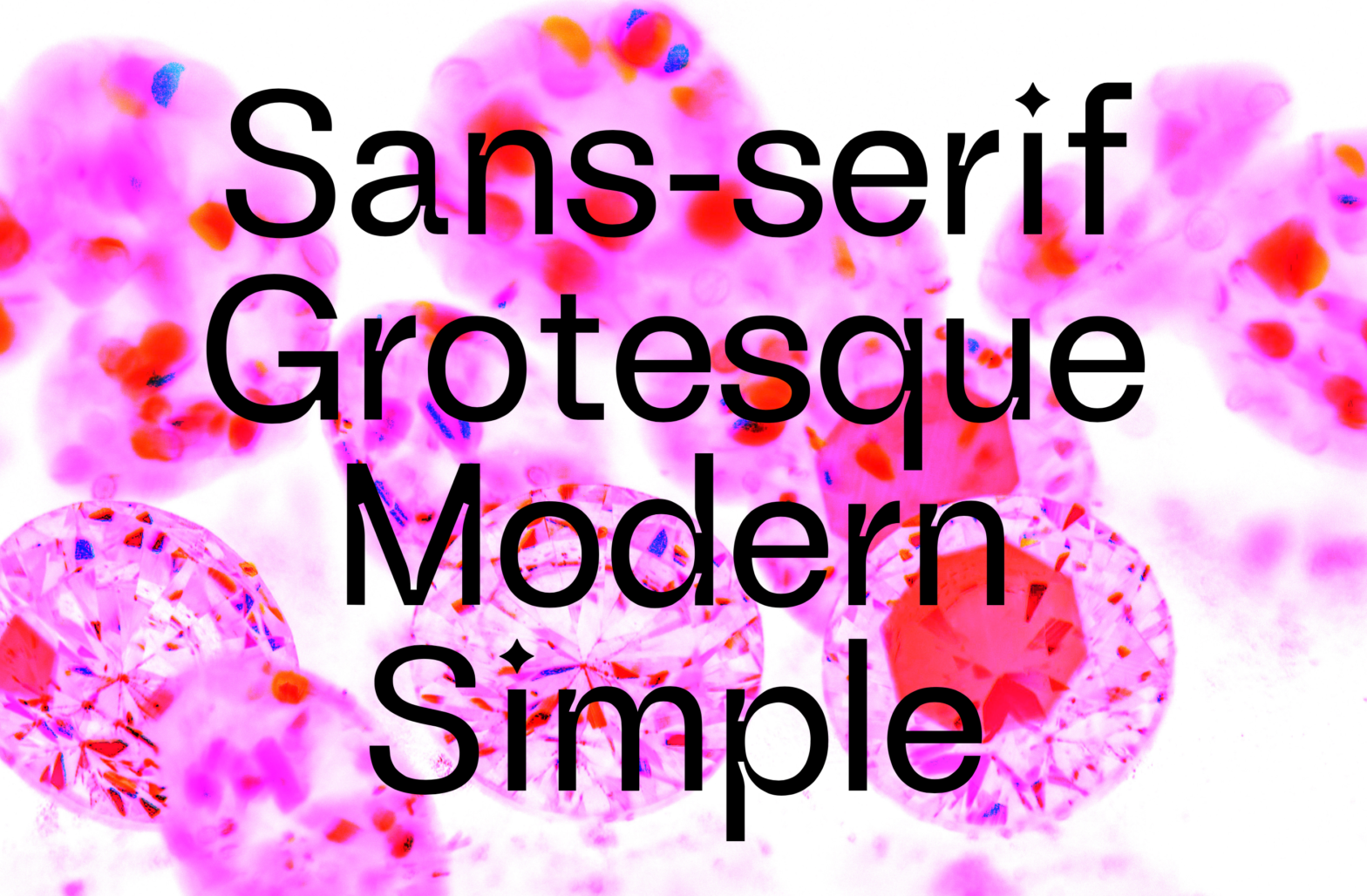
Diamond Grotesk
Diamond Grotesk was a typeface designed by Mariana Braga, Marco Antunes, Beatriz Lima during the hybrid sessions of 2021. Heavily inspired by Akzidenz Grotesk, this typeface explores the aesthetic quality of the ink traps and diamond shapes (dots & cuts). (…) The aim of this project was to develop a font based on the existing…
-

FBAUP @ 11ET
The 11th edition of the Typography Meeting (@encontrodetipografia) took place at Caldas da Rainha, from November 25 to 27. The program included very expressive participation from the FBAUP’s students (mainly the MDGPE’s students) and a Ph.D. researcher. In total, we conducted two workshops, presented three papers, and exhibited four posters. As usual, the conference started…
-
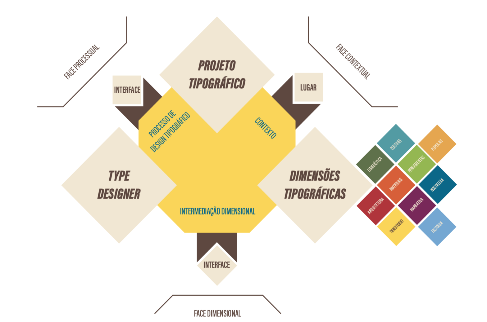
Typographic Identities (Ph.D. presentation)
Today, Thursday, September 9 a UFSC/FBAUP Ph.D. examination will take place online, at 1:30 pm. This is a very interesting a relevant research to the Type Design course of the MDGPE master program mainly because the candidate —the researcher and soon to be professor Eduardo Napoleão— has not only actively participated in our type design…
-
Euro
Wouldn’t it be great if a Type Designer worked at the European Union? Some thirty draft designs for a euro currency symbol were drawn up internally by the European Commission (…) Microsoft and other vendors have chosen to make glyphs for the symbol to be font and style specific (…) to make the euro symbol…
-
Nova Egmont
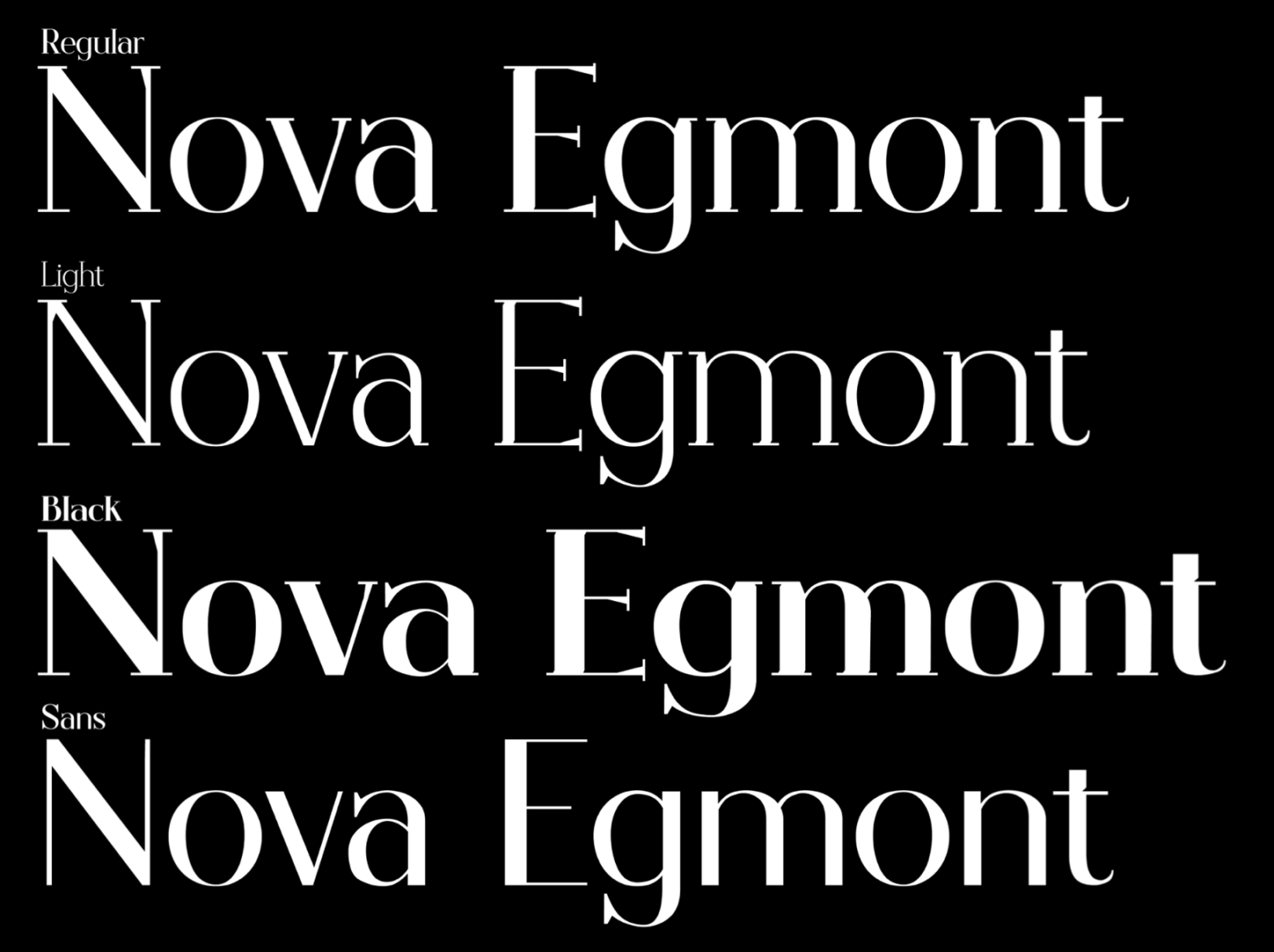
Nova Egmont is a modern serif font revival designed by Francisca Lopes, Miguel Moreira, and Pedro Correia in 2020, based on the original Egmont typeface designed Sjoerd Hendrik de Roos in 1930. The biggest challenge of this exercise was to perform a significant “customization” of the font without distorting the original reference. Initially, manual and…
-
GT Academy: Type Design Tutorials
The Grilli Type Foundry has been publishing a series of small bite-sized tutorials on type design: the GT Academy. Currently, it features 17 “issues” published ranging from drawing basics to advanced optical compensations. It starts in a slightly different approach from ours: with the letter “a”. But then, the method is almost the same. Starting…
-
Aferis
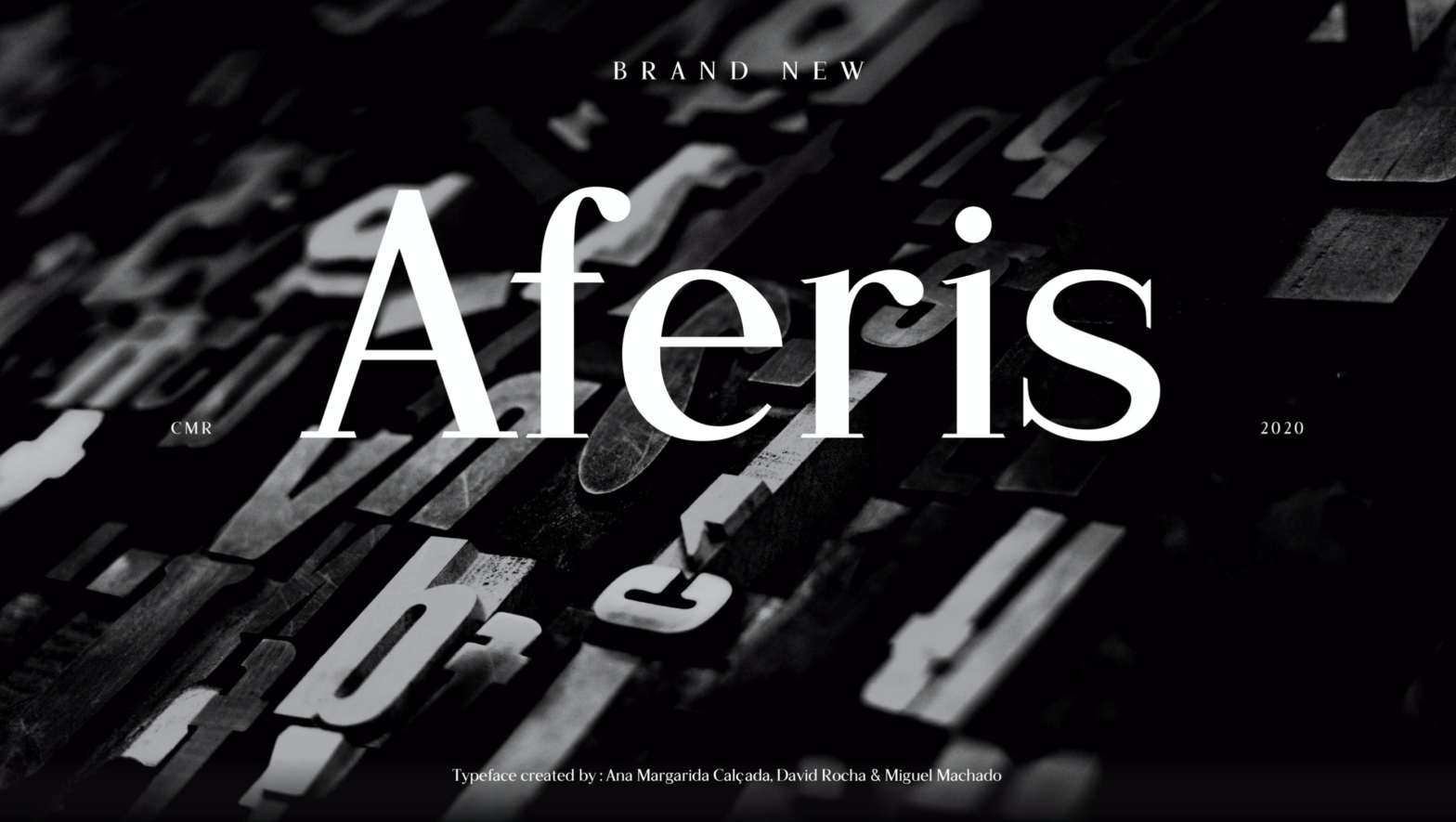
The Aferis variable font consists of a multi-weight serif typeface, whose name is a playful anagram from “Serif”. It presents an Experimental axis in defiance of the “Type for text” briefing. Designed by Ana Margarida Calçada, David Rocha and Miguel Machado in 2020. The first three masters in the weight axis are intended for small…
-
Invisible shapes
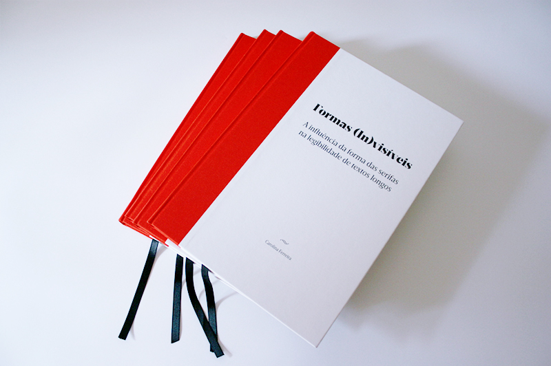
Although this is not a work produced directly in this course, it was a master dissertation research by Carolina Ferreira that started and was supervised by the previous professor of this course, the Type Designer Dino dos Santos. And by my current colleague, professor Diniz Cayolla. As I’ve had the opportunity to do before, this…