Author: Pedro Amado
-
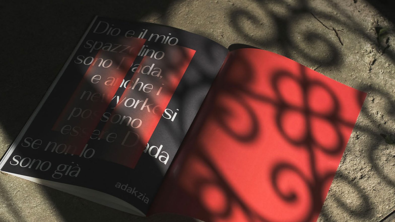
ADAKZIA
Adakzia is a Sans Serif “Frakenfont” Grotesque typeface revival, designed by Alessio Morelli, João Aveiro, and Rui Costa in 2022. The entire project developed around the idea of creating something controversial, almost chaotic, and in line with a Dadaist idea (…) to create a single file that contained two sides of the same coin from…
-
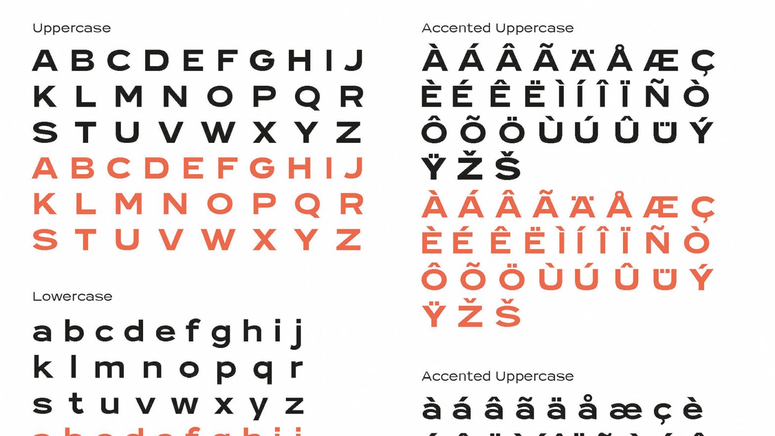
Industria Neue
Industria Neue is Sans Serif Grotesque typeface revival, designed by Inês Venâncio, Raquel Clemente and Sara Guerra in 2022. See the full specimen booklet here.
-
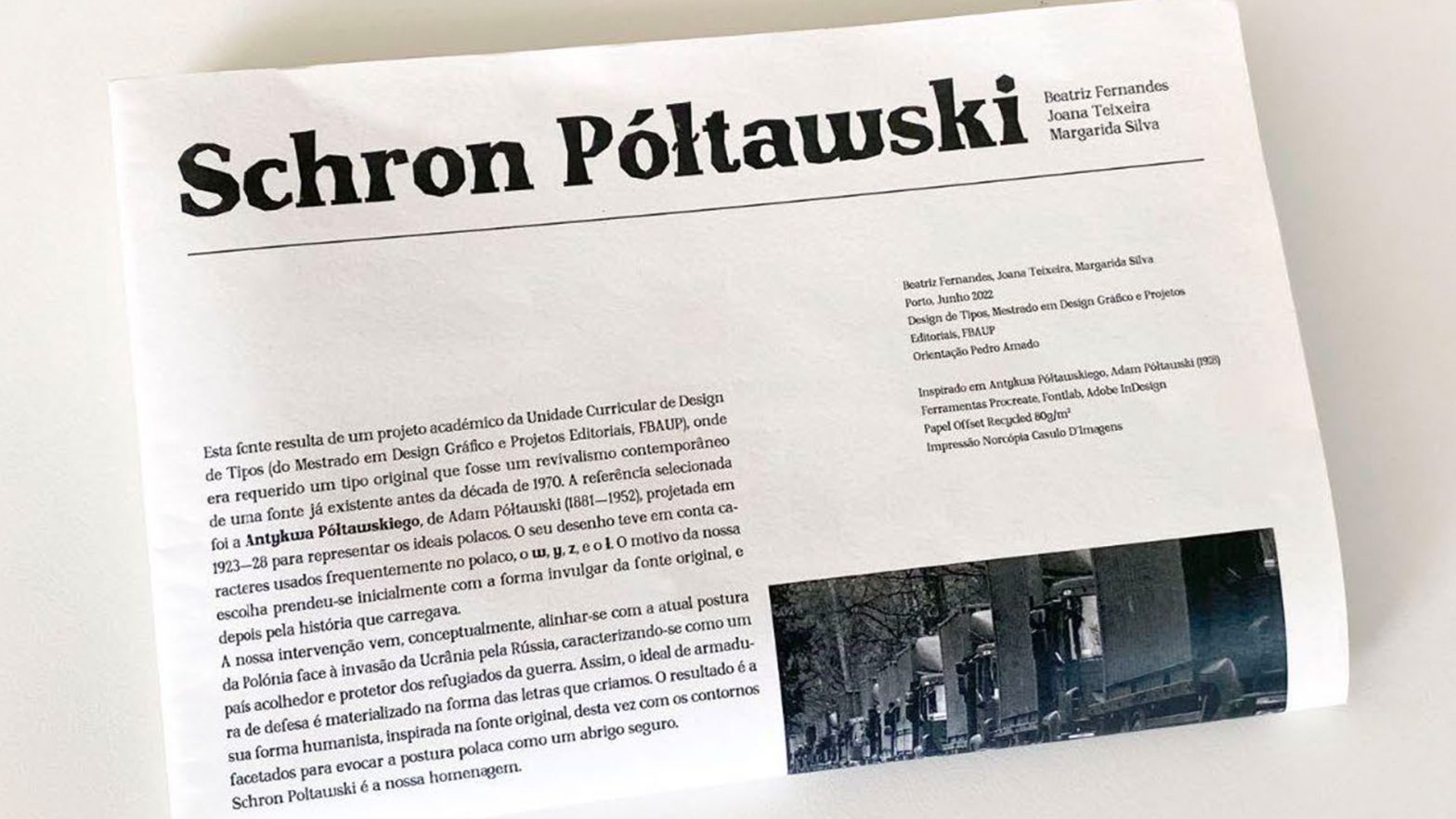
Schron Poltawski
Schron Poltawski is based on a Glyphic (Old Style Geometric / Graphic or highly angled type of) typeface optimized for text and headlines, designed by Beatriz Fernandes, Joana Teixeira and Margarida Silva in 2022. This typeface was also presented during the 12th edition of the Typography Meeting. And was included in the respective book of…
-
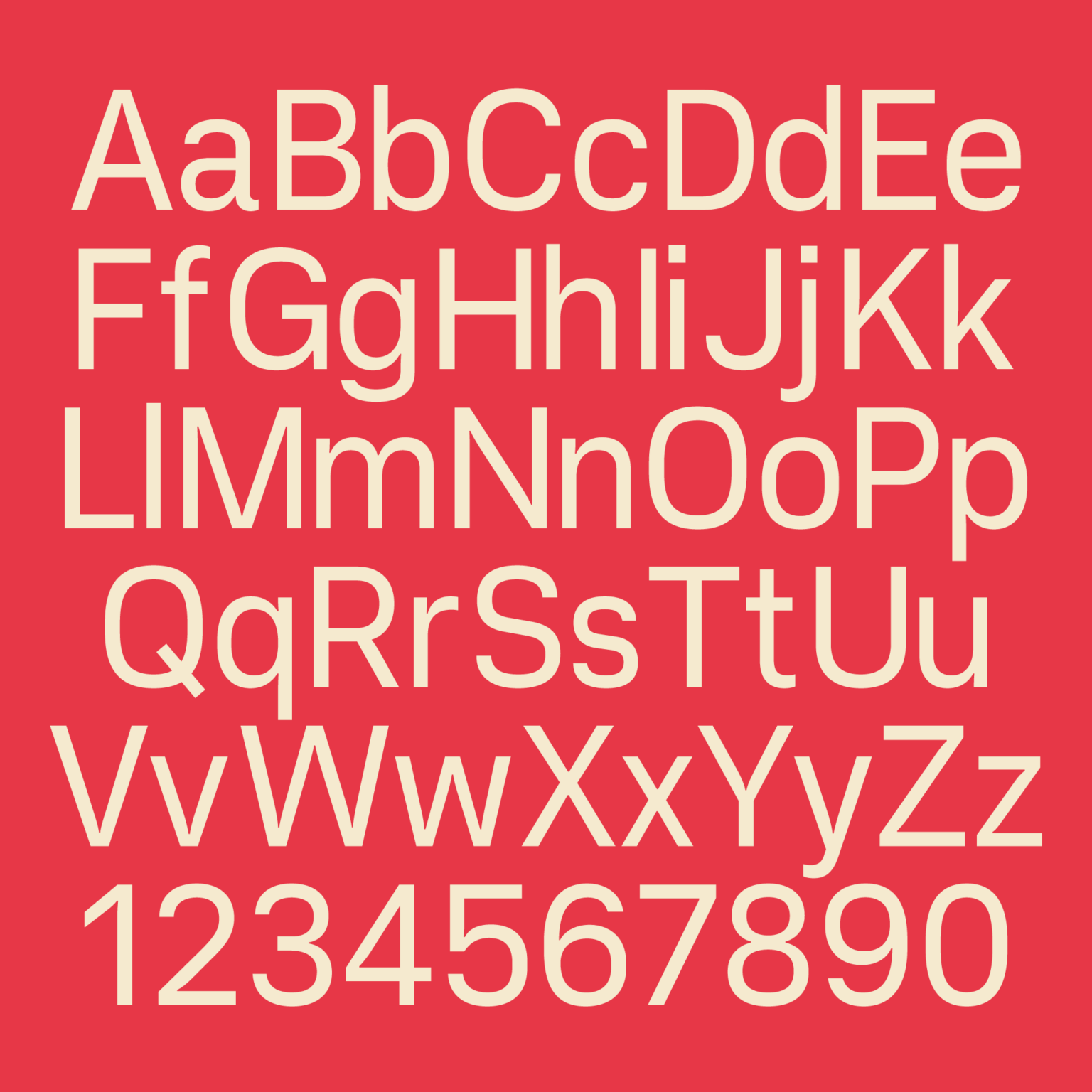
Vercetti Regular
A nice new type from Filippos Fragkogiannis that reminds me of Kobalt, the final master’s project from Teresa Zagalo. Not only this is an interesting new font, but also the online specimen is very well put together. Free to download and use (if only there was a variable font version!…) Vercetti is a sans serif…
-
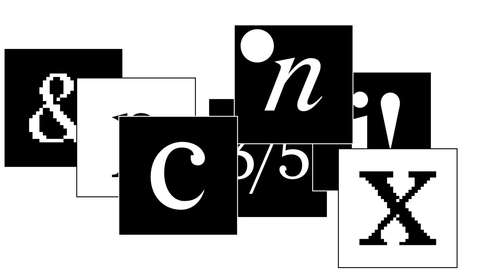
Redaction: an original approach to variable font masters
This year’s edition of the Fontstand Conference was an amazing one-day event! The culture, design, and typefaces presented by internationally acclaimed type designers were mind-blowing. One such presentation was Jeremy Mickel’s. He presented us with this fantastic typeface. As a hybrid revival of Times and Century, it is an excellent Case Study to be further…
-
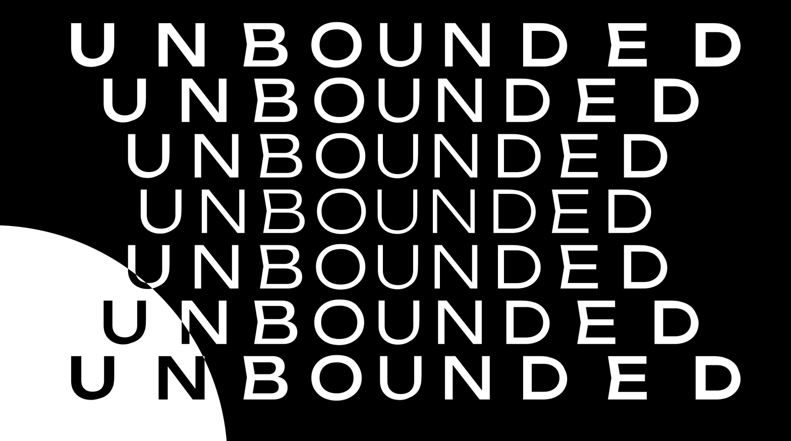
Unbounded: a new open source variable font
Unbounded, a recent typeface constitutes the kind of work expected from FBAUP’s typeface design students. Especially considering the contents and presentation in the interactive digital specimen. Although not explicitly sourced from historical exemplars (thus… not really a revival as we do in the master’s course), the type specimen presents the concept, anatomy features, character set,…
-
Typeface Design Evaluation Criteria
The quality assessment (QA) or the evaluation of the quality of a typeface design is a very complex task, as it requires assessing the design’s technical, contextual, and aesthetic qualities.
-
Specimen showcase
Today was the first-semester class. During the next 15 weeks, I will [try to] bring a sample of different physical/printed type specimens to class. The only criteria are that they have to be bound books, booklets, magazines, journals, newspapers, or another book (ish) or editorial-based media. Class 1, 2022-01-08: Adobe Originals: Garamond Pro and Arno;…
-
Legibility paper
João Figueiredo (Superv. Aprígio Morgado) Exercício sobre a (i)legibilidade da letra — Desenvolvimento de uma metodologia para a construção de tipos de letras reducionistas (paper published in the 11ET, and soon to be published dissertation research) This (paper) research presents a very clear and detailed methodology for conducting legibility studies with “semi-randomized” options. The theoretical…
-
Ogee Curves
This is a character design pattern learned last week during John Stevens Capital’s Immersion Class — the Ogee Curve. Stevens used it to describe the small inward cup, or “dip” present in the Monumental Capital (AKA Trajan) top stem serif.