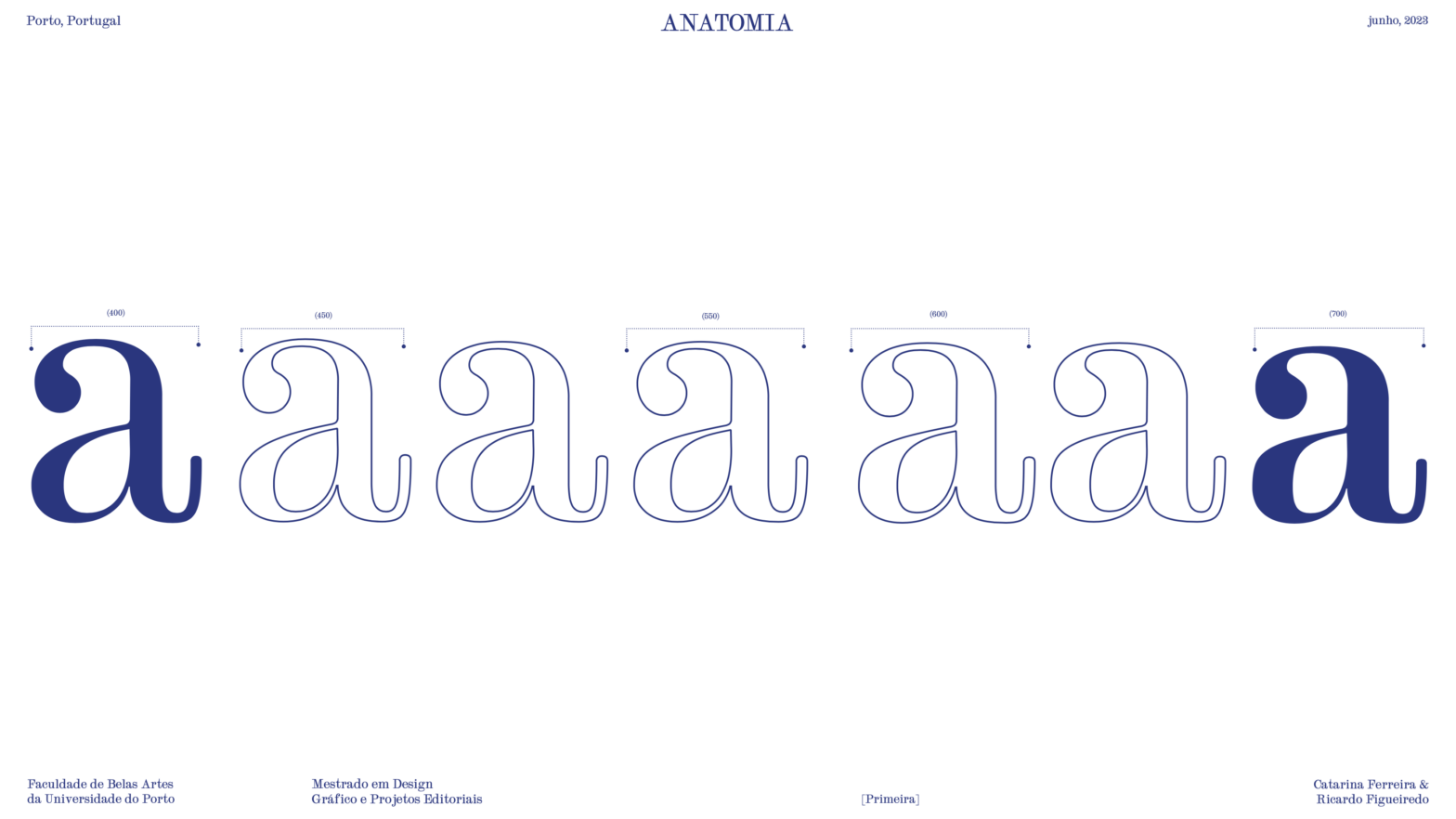
Primeira (1.ª) is a font that is born from the isolation of the characteristics that dictate the identity of a [Transitional] Scotch [Roman]. Designed by Catarina Ferreira & Ricardo Figueiredo in 2023. Starting from the visit made to the library of the Faculty of Fine Arts of the University of Porto, which aimed to consult… Continue reading Primeira (1.ª)
Category: Project 2
Dutch Medieval Neo Humanist
Dutch Medieval Neo Humanist is a revival interpretation typeface, designed by Cíntia Funchal & Lucas Parra in 2023, based on a printed copy of Hollandsche Mediaeval, originally created in 1912 by S. H. de Roos. Hollandsche Mediaeval typography exerted a significant influence on the artistic milieu, leaving a lasting legacy in the history of typography.… Continue reading Dutch Medieval Neo Humanist
Antoinette
Antoinette is an original Garalde (AKA Aldine) typeface revival based on in the forms of the original Garamond typeface, by Beatriz Martinez, Carolina Ferreira, & Daniela Oliveira, in 2023. The family consists of two fonts, Antoinette Regular and Antoinette Slant to be used in small sizes like those of a running text. Attention to detail… Continue reading Antoinette
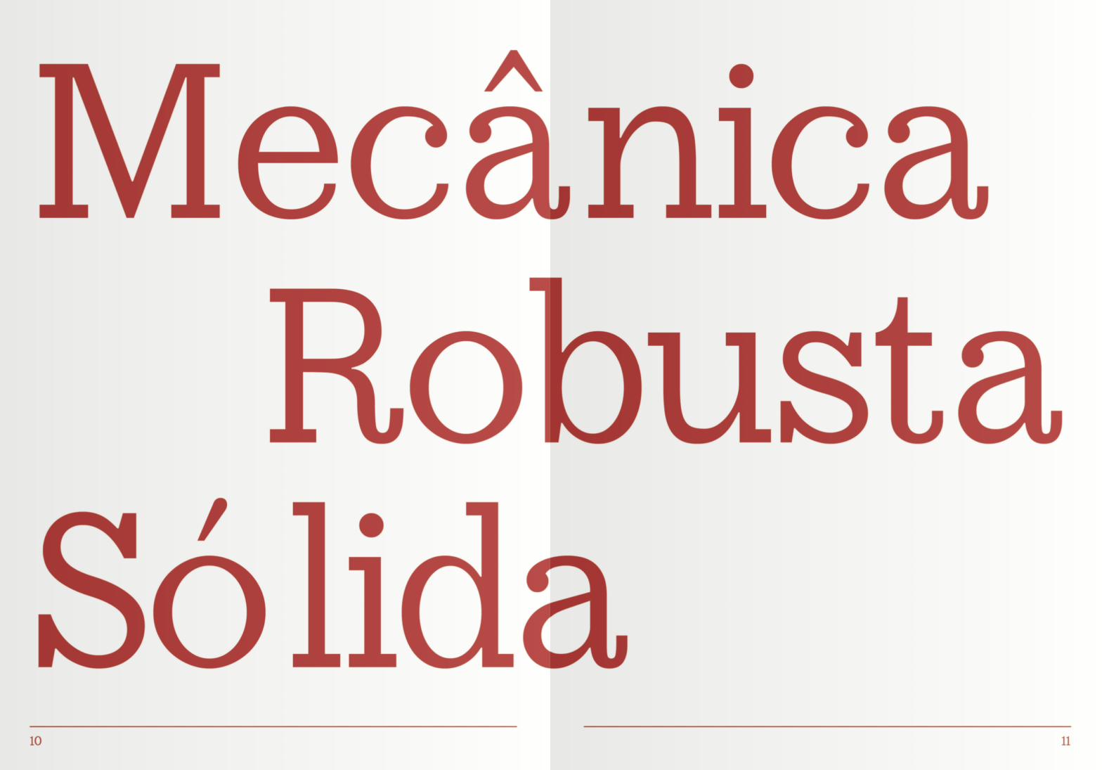
Whitney
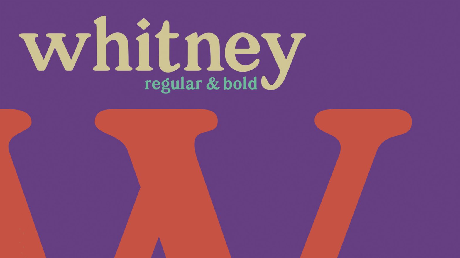
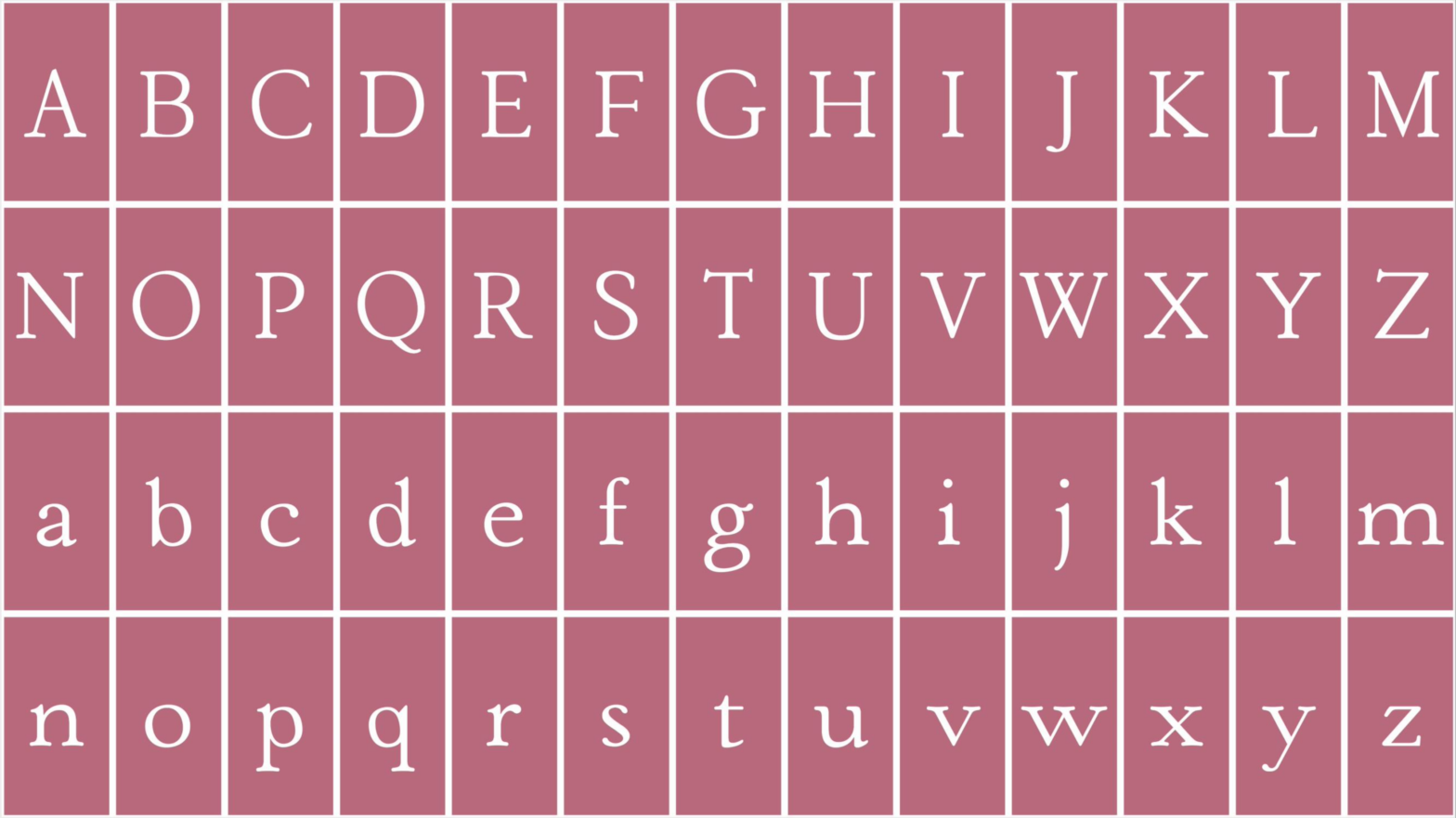
Whitney is a Classical (soft nineteenth-century) Serif typeface revival designed by Ana Paula Hentges, Margarida Almeida, and Vitória Santos in 2022. The project had as its premise of developing a complete text typeface, from a printed copy before the 1980s. The chosen font was Windsor, launched in 1905 and created by Eleisha Pechey. Due to… Continue reading Whitney
ADAKZIA
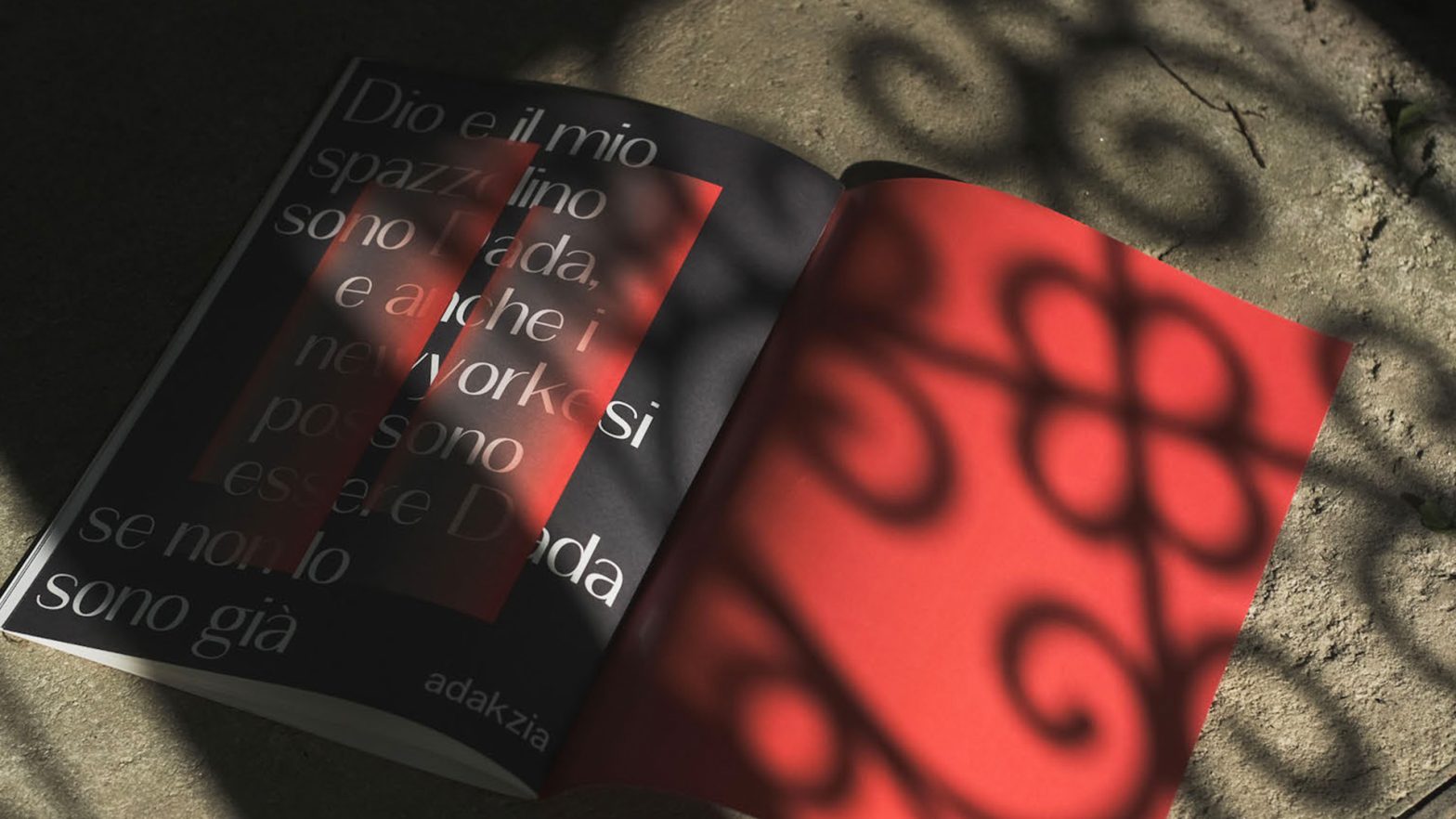
Adakzia is a Sans Serif “Frakenfont” Grotesque typeface revival, designed by Alessio Morelli, João Aveiro, and Rui Costa in 2022. The entire project developed around the idea of creating something controversial, almost chaotic, and in line with a Dadaist idea (…) to create a single file that contained two sides of the same coin from… Continue reading ADAKZIA
Industria Neue
Industria Neue is Sans Serif Grotesque typeface revival, designed by Inês Venâncio, Raquel Clemente and Sara Guerra in 2022. See the full specimen booklet here.
Schron Poltawski
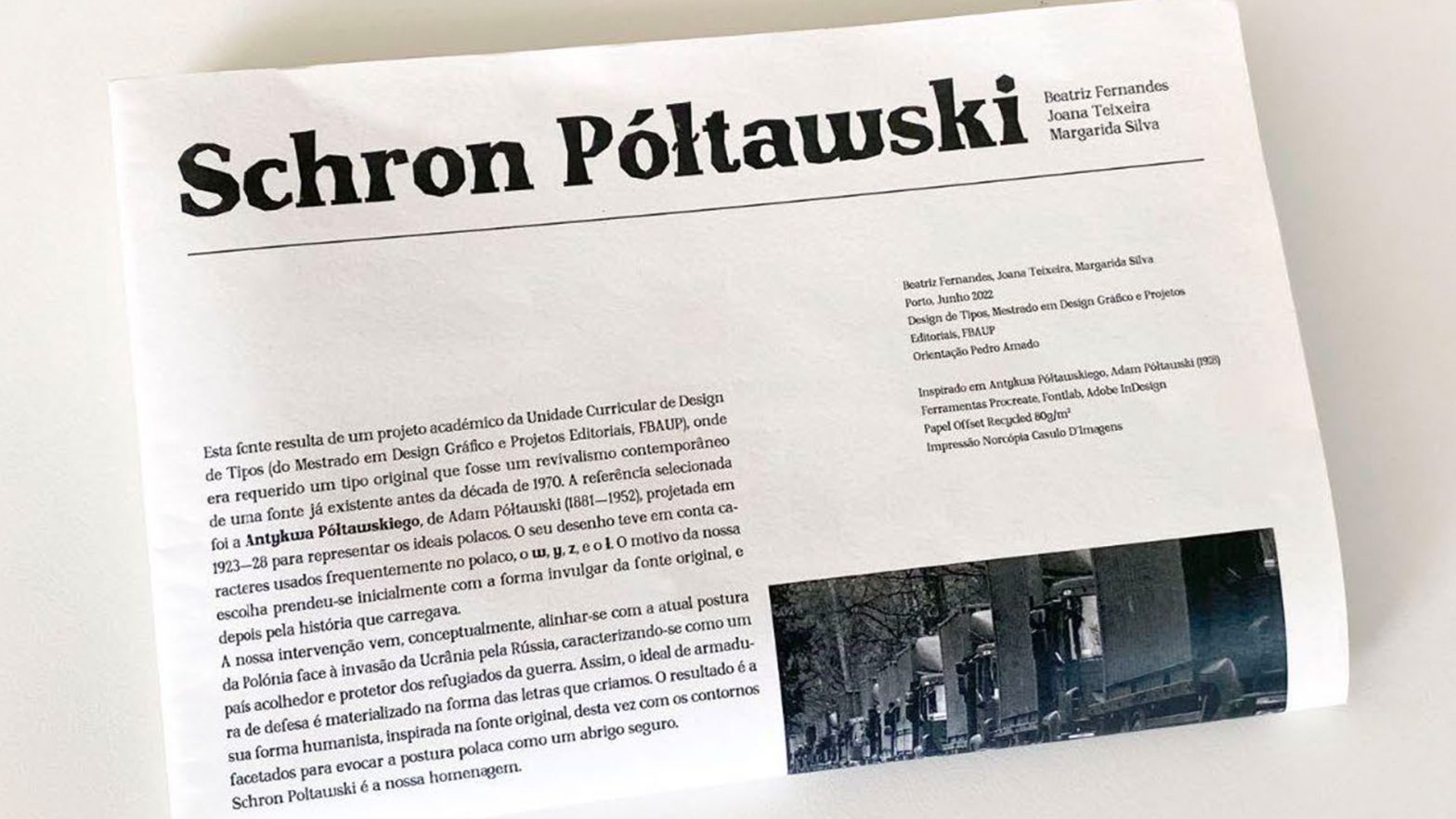
Schron Poltawski is based on a Glyphic (Old Style Geometric / Graphic or highly angled type of) typeface optimized for text and headlines, designed by Beatriz Fernandes, Joana Teixeira and Margarida Silva in 2022. This typeface was also presented during the 12th edition of the Typography Meeting. And was included in the respective book of… Continue reading Schron Poltawski
Chiswell
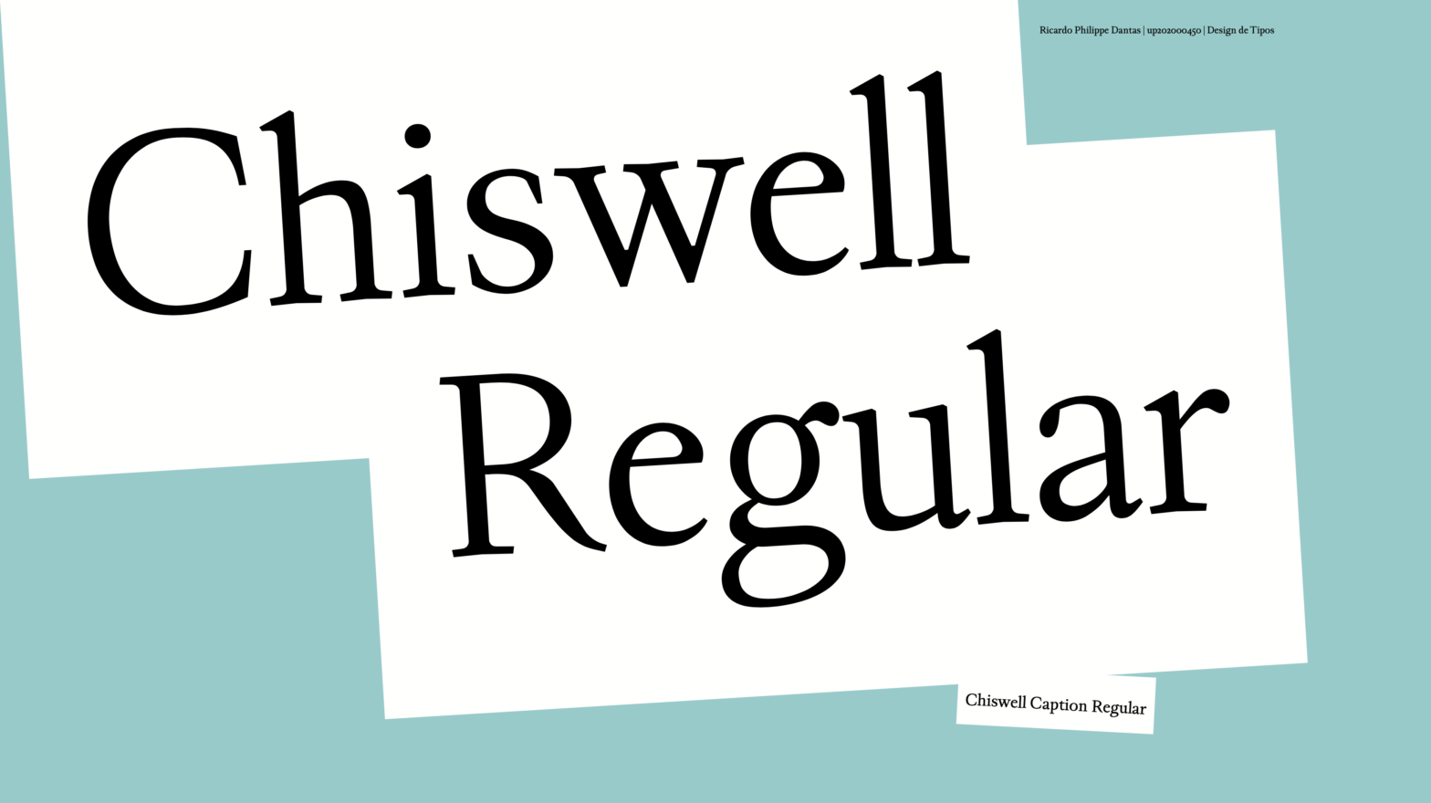
Chiswell is a Garalde typeface optimized for text and captions, designed by Ricardo Dantas in 2021. Its concept derives from the intersectional design space of two famous typographers – Caslon and Fournier. It aims for a sharp x-height and classic features providing an optical variation axis for small text size compositions, such as captions and… Continue reading Chiswell
Claredon*t
Claredon*t is an Egyptian [clarendon] typeface designed by Ana Rita Antunes, Beatriz Gomes, Diana Pereira in 2021. The final module of the course program is usually distributed over a period of six to eight weeks. During this module, students are encouraged to work in groups. They are required to design a text typeface based on… Continue reading Claredon*t
Moderna
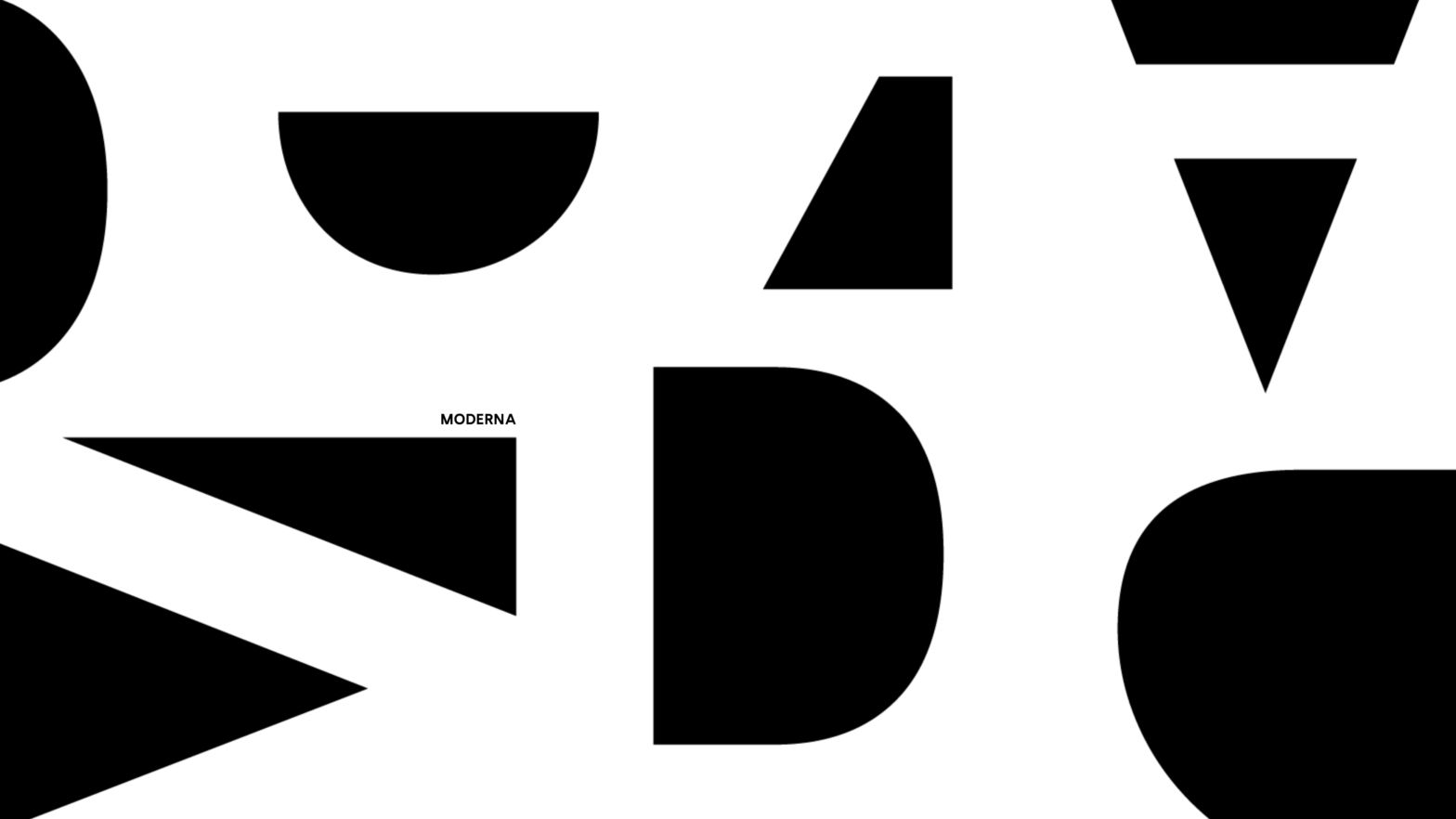
Moderna is a geometric, linear, sans-serif, one-axis Variable Font. Heavily influenced by the geometric typefaces from the early twentieth century it provides an even color to text compositions. Designed by Beatriz Almeida, Diana Ferreira and Gabriela Moreira in 2021. Its main influences are fonts such as Futura (1927) by Paul Renner, Kabel by Rudolf Koch… Continue reading Moderna